Watch the video below for more examples:
Let’s Get Started
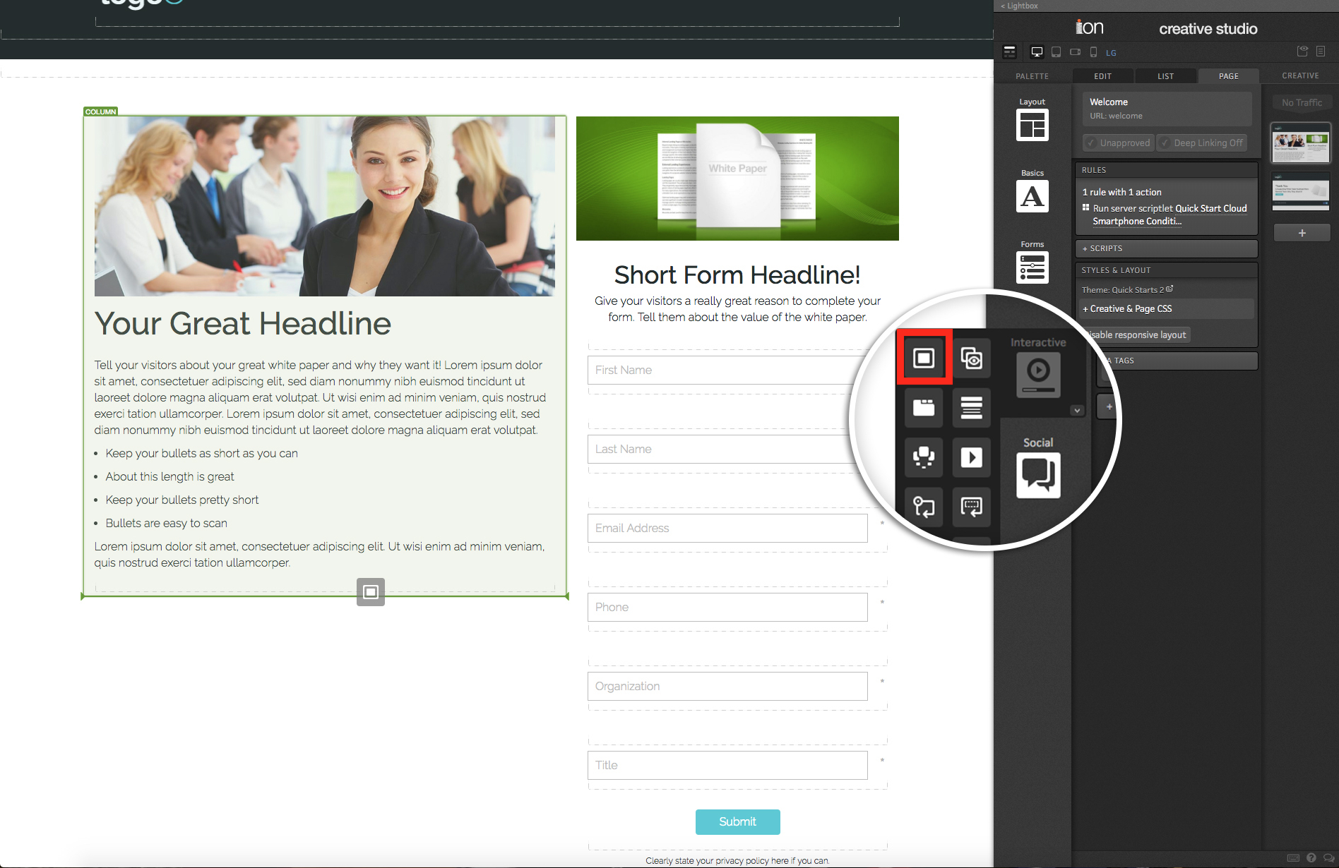
To start using the Lightbox component, simply drag the Lightbox icon into any container on your page.

Once in place, you will see a Lightbox container selected with a button in it. The container that is added to the page is the Lightbox container and includes settings to specify what is displayed in the Lightbox window and how.
You can publish virtually any type of content into the Lightbox container. So if you want to open the Lightbox when someone clicks an image thumbnail, for example, you can delete the button and drag an image into the Lightbox container.

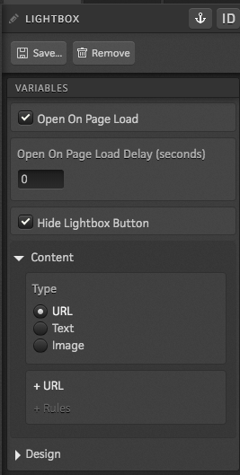
Open On Page Load
When this setting is enabled, your Lightbox will load automatically without the need for someone to click anything.
You will also see an option to set a delay when this is enabled. If you want the Lightbox to open as soon as the page loads, you can keep this set to 0. If you want the Lightbox to open 5 seconds after the page loads (for example), simply increase the delay to 5.
The “Hide Lightbox Button” option can be enabled to hide the contents of the Lightbox container when you view the page live. This can be helpful if you want to trigger a Lightbox to open on page load, but do not necessarily want to have a button on the page for respondents to click to open it.
Content
The Content settings are where you will specify what to show within the Lightbox.
By default, the URL option is selected. You can use this option to display another page from your creative in the Lightbox or an external site.
If you switch to the Text option, you will be able to open a textbox to type the message you would like to display within your Lightbox window.
When the Image option is used, you will be able to select an image from your console’s Image Library to display within the Lightbox.
Design
There are a ton of design options for the Lightbox window itself. After clicking into the Design tab for your Lightbox container, you will be able to set an animation for the Lightbox when it opens, specify the width and height, adjust the vertical alignment, border radius, the background color, overlay color and more.

Behaviors
As noted earlier in the post, you can publish any type of content you want within the Lightbox container – that includes content that you might not want to necessarily trigger the lightbox to open.
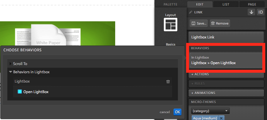
The “Open Lightbox” behavior will need to be applied to each individual element that you want respondents to be able to click in order to open the Lightbox window.

*Note: Anything published within the Lightbox container with this behavior assigned to it will disregard any actions that are assigned to that element and will instead reference the Lightbox container settings for what page to open within the Lightbox window.
If you have any questions, please contact us on [email protected].


Social Profiles