Remember to have this added to a responsive grid, as any other element, the tab element should follow a hierarchy to facilitate responsiveness.
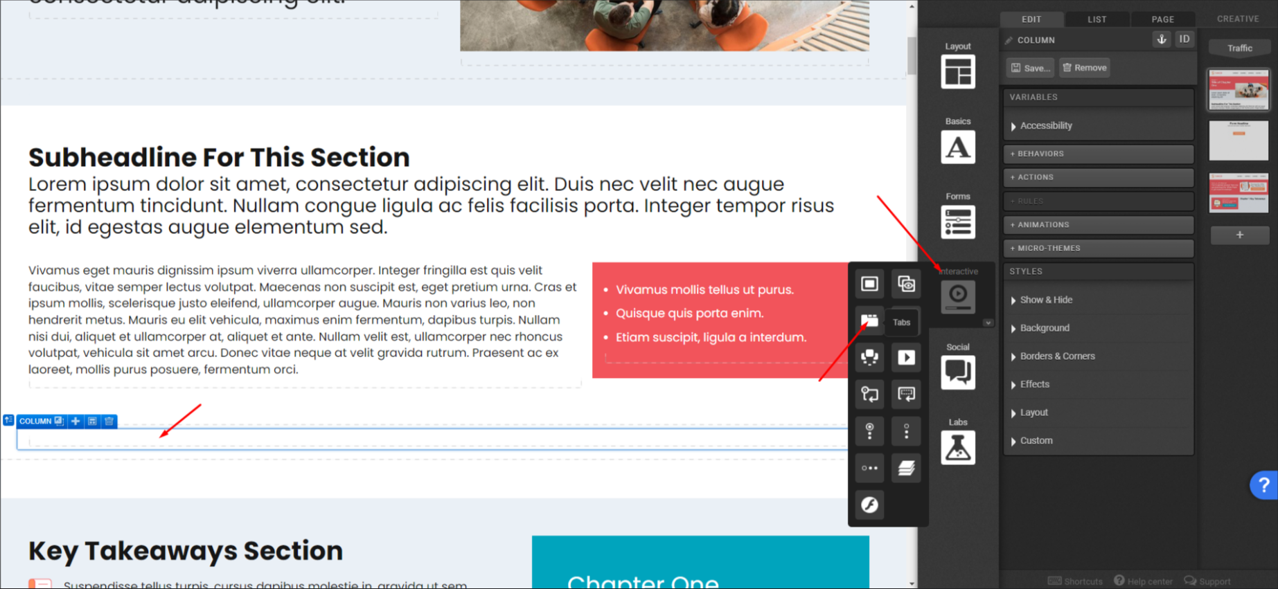
First, add an empty column and navigate to the interactive components section to drag the tabs’ element to the column.
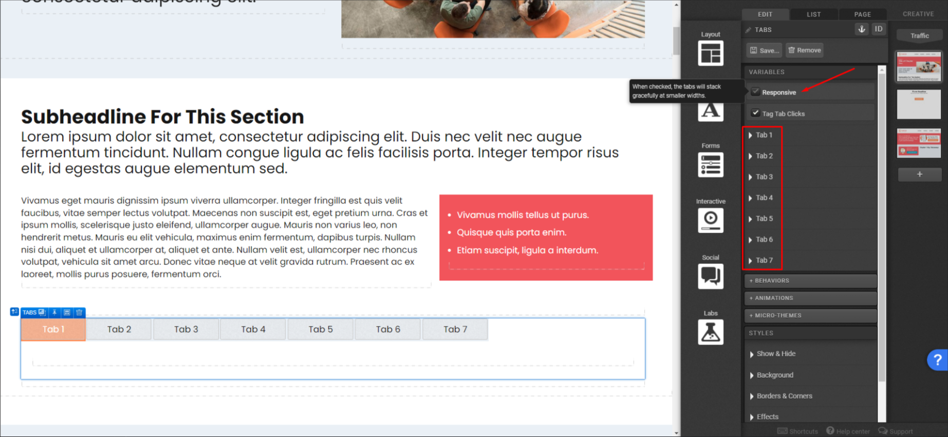
You can select or not the responsive setting of the tabs’ element. Tabs have a pre-defined number of sections (7) and currently there is no option to include an 8th tab and so on.
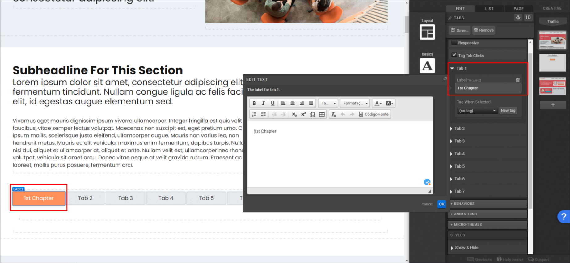
Once you open any tab settings, you’ll be able to add a label to it.
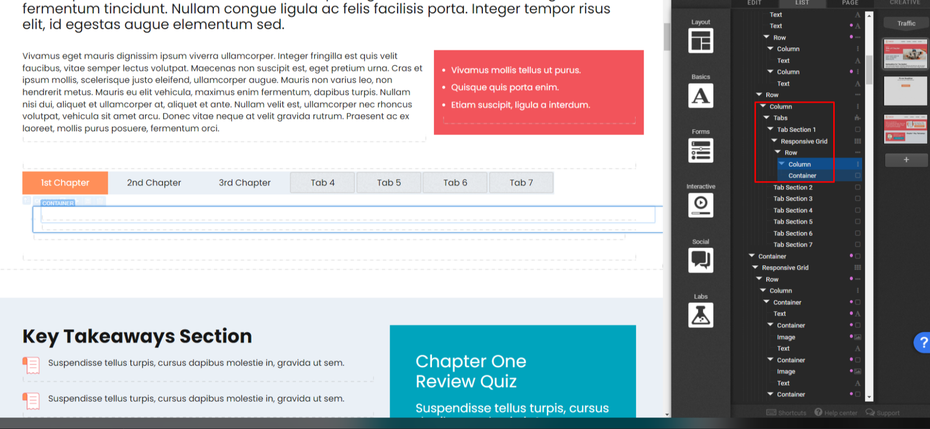
Now select the tab section to insert new components. You can navigate through the tabs to edit each content. You can add a responsive grid to the tab section and many other elements, it is up to you.
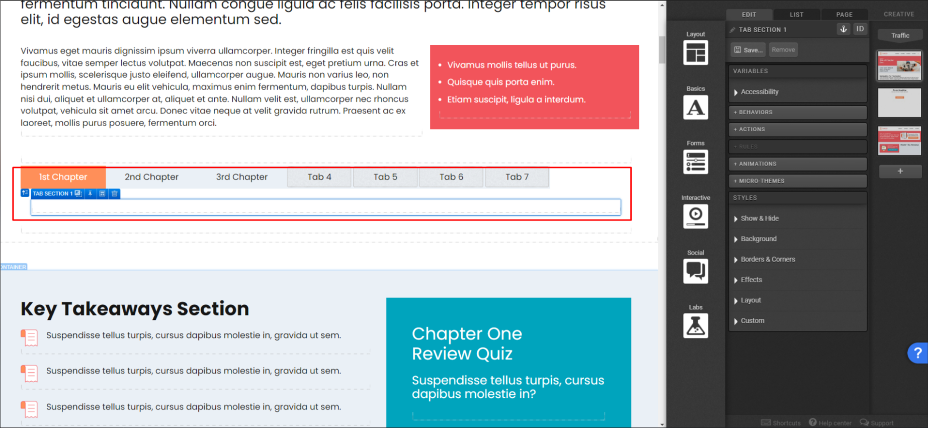
This is how the hierarchy looks like on this example:
And this is how it looks after inserting content.
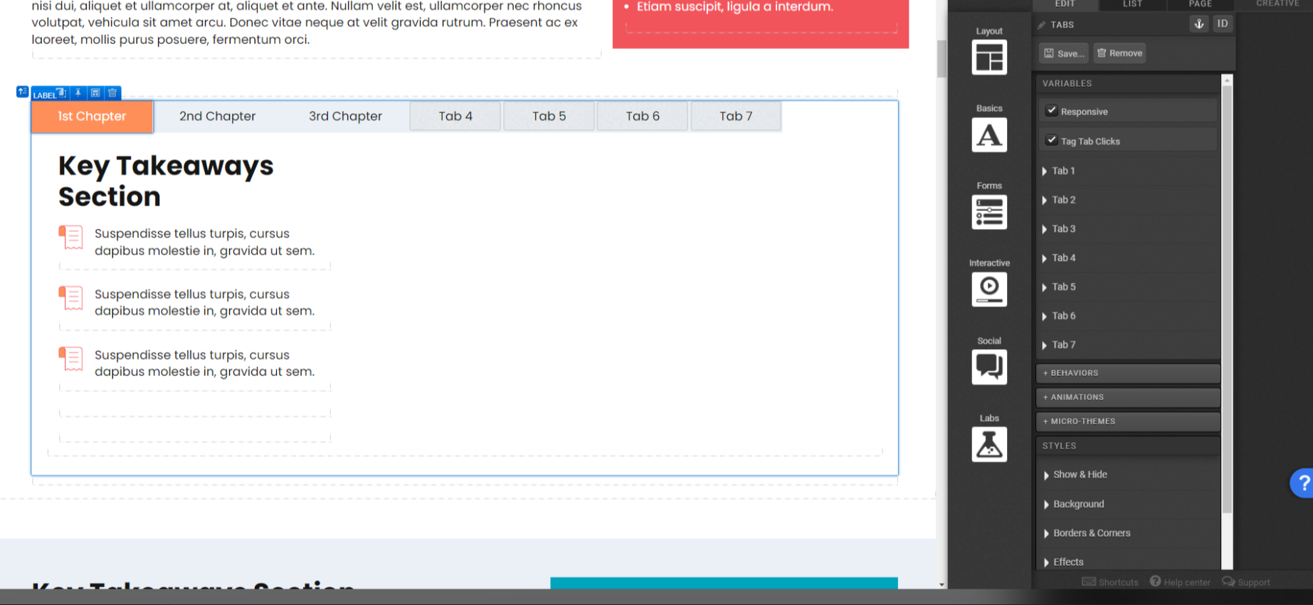
*NOTE: that you don’t need to use all the tabs, the blank tabs will not be shown to the final user.
If you have any questions, please contact us on [email protected].


Social Profiles