Before We Begin
Please make sure that all of the data fields you need for your form have been created within your Data Collection screen.
If the fields you want to include on your form are already part of ion, and you just want to create a new form using those existing fields, keep on reading. If you want to create new/custom fields (e.g., questions and answers) for your form, read more about creating data fields here.
Let’s Get Started!
To create a form
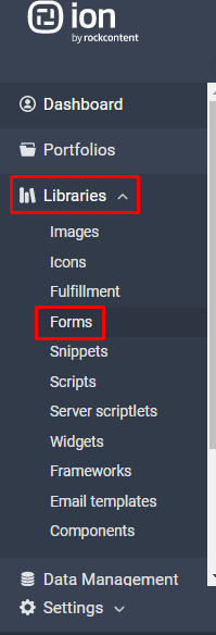
Library forms are set up at the global level so they are available for any page. Just select ‘Forms’ from the ‘Libraries’ tab in your console’s side nav to get started.

- Click the green ‘New category’ button to create a new form category or click the title of an existing category name to add a form to an existing category. Categories are just a way to group and organize your forms (e.g., Contact Forms, Survey Forms, etc.) Descriptions may also be added to categories.
- Click the green ‘New form’ button then choose a unique form label (title) and optional description. Before clicking save, you have the option to copy form fields from an existing form. If you copy a form, you will still be able to make changes to it; this is a convenient option if there is a similar form already in your library or when creating several versions of the same form.
- Save the form, then click the green ‘New form field’ button to begin adding the form fields to appear on your form.
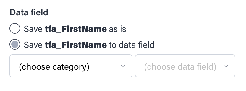
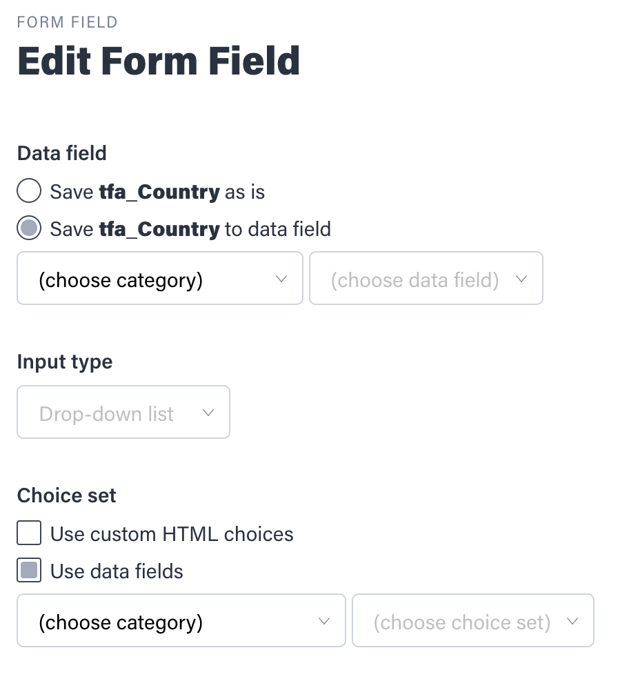
- Choose a data field category from the first drop-down menu, then choose the data field from that category in the second drop-down menu.
- Choose the input type for the field—this will determine how the user will provide information on the form. You may choose from single or multi-line text (for free-form questions), checkbox (for multiple choice questions), listbox (for choices to appear in a selector box), radio buttons or dropdown list (for single choice questions). The type of question you are asking will determine the input type.
- For single or multi-line text fields, choose the input style—standard, narrow or wide fields. For multi-line text, you can also specify the line height to be 2-10 lines.
- For radio buttons, drop-down list or listbox, select the choice set category from the first drop-down menu, then choose the choice set to use for this field in the second drop-down menu. For a listbox, you can also specify the input style (narrow, standard or wide) and the line height to be 2-10 lines.
- Check the ‘Required’ box if a respondent must fill out this field to submit the form. NOTE: as a best practice, add an asterisk (*) or another visual indicator in front of the field label text to clearly distinguish this field from optional fields on the form.
- Enter your label text—this the text that a respondent will see before the form field.
- Add a field hint (optional)—this will appear below or to the right of the field, depending on the form size.
- Add pre-field text (optional)—this is useful to give form information or instructions at the top of the form. (e.g., * indicates required fields)
- Add post-field text (optional)—this will appear below the field label on the form.
- Check the ‘Seperator’ box if you would like to insert a line separator after a field on the form—this is useful to visually group related fields on a form.
- Click Save and continue adding the remaining fields on your form.
- After you add fields to the form, you can easily reorder them by using your mouse to click and drag the fields to the desired position. Questions on the form will appear in the same order they appear in the form field list. Your form is now ready to use on any path in the ion console! Remember, it’s always a good idea to test your form using preview to make sure it’s configured the way you intended. And now that the form is set up, the next step is to create an export for the data you’re collecting.
To edit a form
Click the title of the form you’d like to edit.
- To edit the form name, click the Form Actions dropdown menu and then click “Edit form.”
- To edit a form field, click the form field title.
- To delete a field on the form, click the trash can at the far right of the field row.
To delete a form
Simply click the trash can at the far right of the form row from within the form category screen.
Create choice set filters
Ex. “Step 1” form collects country and state, then the “Step 2” form on a subsequent page shows a choice set of stores limited to that country and state combination.
You can use choice set filters for any multistep form process that has conditional choice sets.
Here are the steps involved:
1. Format a .CSV file of your choice set
Column A: [Choice Names] – choices that will be shown in choice set
Column B: [Choice Values] – values stored into ion database
Column C: [Filter 1]
Column D: [Filter 2]
Column E: [Filter 3]
*NOTE: Column headers are not necessary. Filters are limited to three per choice set.
Ex.
Jane Street Center, JSC, AL, US
Town Center Shops, TCS, AL, US
Red Square, RSQ, AL, US
Golden Circle, GDC, AK, US
*NOTE: You may also build choice set filters directly in your ion choice set by entering the above information into the corresponding columns when editing a given choice within your choice set.
2. Upload choice set .CSV to ion
- Navigate to Data Management > Data Collection > Choice Sets
- Navigate into an existing choice set category, or add a new category
- Add a new choice set and label it accordingly
- From the Choice Set Actions dropdown in the top right, choose Import Choice Set
- Choose file to import, click ‘save’

3. Create forms in your ion console
1. Under Libraries > Forms, navigate into an existing form category, or add a new category using “New category” button
2. Create a form for each step
- Ex. “Step 1” form collects country and state, then the “Step 2” form on a subsequent page shows a choice set of stores limited to that country and state combination.
3. Add filters to checkbox(es), drop-down, listbox or radio button input types
- You can input static or dynamic filters. To filter dynamically, enter {% raw %}{{data_name}}{% endraw %}. The data name can be confirmed under Integration > Data Collection > Data Fields.
- To filter store locations by the Country and State previously selected, add two choice set filters to the form:
- Choice set filter 1: {% raw %}{{Country}}{% endraw %}
- Choice set filer 2: {% raw %}{{State}}{% endraw %}
4. Add forms to your pages in your ion console
- Navigate into the form page within the creative
- Insert your “Step 1” form into the creative via the library form editor (choose from category/form drop-down)
- Assign an action to the form to take respondents to the “Step 2” page when the form is submitted
- Be sure to add a tag so you can track respondents as they navigate through the form experience (ex. “Step 1 – Complete)
- “Mark respondent as converted” should be checked off on the final form submission, marking your visitor as a conversion within ion
Library Forms: Create custom HTML forms

With an HTML form, you provide the complete HTML for the form — the ‹form›‹/form› tags and everything in between. (You may also include non-editable content outside the ‹form›‹/form› tags.)
By default, ‹input› and ‹select› tags will be saved with the names of their IDs, although you can override those and assign them to Data Collection fields if you prefer when editing fields from the next page.
The choices for checkboxes, radio buttons, drop-downs and list boxes should be included in your HTML. However, you can optionally substitute the choices in ‹select› drop-downs and list boxes by assigning them a choice set when editing fields from the next page. Note that currently all ‹option› tags in your HTML must have closing ‹/option› tags.
The data collected on your custom HTML form will be saved into the ion database upon form submission. You can also export the data collected on a custom HTML form using any export format supported by the ion platform. Form-level advanced rules will be available to leverage, as well!
You must provide your own button to submit the form.
You may also include ‹style› and ‹script› blocks, usually in front of the ‹form› tag, to impact the look-and-feel and behavior of the form. (Be careful to avoid CSS and Javascript conflicts with your master page templates and themes.)
Get started with these steps:
1. Navigate to the ‘Forms’ library and select the category you would like to add your custom form to (or create a new category). Add a new form by selecting the green ‘New form’ button.

2. Give it a unique ‘label’, optional ‘description’ and select ‘HTML’ from the ‘Form type’ drop-down menu. Put your form code (be sure to include the ‹form›‹/form› tags) within the ‘Custom HTML’ field.

NOTE: if you have a script and it is using the name of the form as a reference, it will not work because the platform removes the name attribute of the form. Instead you can use the ID of the form as a reference.
3. Assign a custom class (by default the class is: pf_field_row_bad) to handle any ‹input› tags with errors (i.e. used for validation).

4. Click on Save, and you will be brought to the Form Setting Page. You can preview the form by clicking the “Preview” button within the Form Actions dropdown menu. To edit the custom form, click “Edit form” within the Form Actions dropdown menu.

NOTE: If you do not see the fields of your HTML form, you need to check your input fields. They should have a name or an ID attribute. If you specify both attribute name and ID, ID will appear under “Field Name”. It is a good practice to make your ID or name to be descriptive so it will be mapped easily to your fields.
Mapping Custom HTML Form Fields
Mapping your HTML fields to ion fields will let you direct the data collected from your custom HTML form to the ion field that you would like the data to be exported to. This will then be included in your exported data.
You will need to map your custom HTML form to make sure the data collected makes it into the right place within your ion database. If you have a field that you don’t need to keep track of, it is ok not to map it to ion field.
Follow these steps to map your form to a ion data field:
1. Click the * save as is * link associated with the field you would like to map.

2. Inside the edit form fields select the “choose category” option, then choose the data field you want your field name to be mapped.

3. If you are mapping a dropdown field (‹select›) you have the choice to use what is in your custom HTML form or an ion choice set. Click “save” and you are done!

Additional Guidelines:
If you have ‹H1›, ‹DIV› and other HTML elements within the custom HTML form code, it’s recommended you add classes to them. This will prevent overriding element styles within the framework theme.
Styling Custom HTML Forms Within Your Framework Theme Style
You can stylize your custom HTML forms to blend in with your theme by including all the ion form-specific CSS classes within your form code.
For instance, to stylize an input textbox add the class “pf_text” to the input textbox like the following:
‹input type="text" id="first_name" name="first_name" class="pf_text" /›
- .pf_text is the standard size of a text field (default 130px wide).
- .pf_text_narrow is the narrow size of a text field (default 75px wide).
- .pf_text_wide is the wide size of a text field (default 250px wide).
NOTE: The width (and style) of these fields can be adjusted at the theme level or within your custom html form code.
For theme control of the field labels, add the class “pf_label_text”. For instance:
‹label class="pf_label_text"›First Name*‹/label›
For theme control of the submit button, add the class “pf_submit_button”. For instance:
‹input type="submit" class="pf_submit_button" value"Register" /›
If you are using hint text on your form, you can use this class “pf_hint_text”. For instance:
‹span class="pf_hint _text"›enter phone number with dashes xxx-xxx-xxxx‹/span›
Sample custom HTML form (with no theme control):
‹form›
‹label class="pf_label_text"›Name:‹/label›
‹input type="text" name="lbform_name" id="lbform_name" class="pf_text" value="" /›

‹label class="pf_label_text"›E-mail:‹/label›
‹input type="text" name="mail" id="lbform_mail" class="pf_text" value="" /›

‹label class="pf_label_text"›Comment:‹/label›
‹input type="text" name="comment" id="lbform_comment" class="pf_text" value="" /›
‹span class="pf_hint_text"›Up to 100 characters‹/span›

‹input type="submit" class="pf_submit_button" value="Send"›
‹/form›
Complete reference of the form-specific CSS classes.
.pf_form_table: CSS class for form table
.pf_field_row: CSS class for field rows
.pf_field_row_bad : CSS class for bad field rows
.pf_label_cell: CSS class for label cells
.pf_label_cell_bad: CSS class for bad label cells
.pf_label_text: CSS class for label text
.pf_label_text_bad: CSS class for bad label text
.pf_field_cell: CSS class for field cells
.pf_field_cell_bad: CSS class for bad field cells
.pf_hint_cell: CSS class for hint cells
.pf_hint_text: CSS class for hint text
.pf_hint_text_bad: CSS class for bad hint text
.pf_hr_cell: CSS class for ‹hr› separator cell
.pf_hr: CSS class for ‹hr›
.pf_prefield_cell : CSS class for pre-field cells
.pf_prefield_text: CSS class for pre-field text
.pf_postfield_cell: CSS class for post-field cells
.pf_postfield_text: CSS class for post-field text
.pf_text: CSS class for regular ‹input› text
.pf_text_narrow: CSS class for narrow ‹input› text
.pf_text_wide: CSS class for wide ‹input› text
.pf_dropdown: CSS class for ‹select› drop-down
.pf_dropdown_narrow: CSS class for ‹select› drop-down narrow
.pf_dropdown_wide: CSS class for ‹select› drop-down wide
.pf_multiline: CSS class for ‹textarea› multiline text
.pf_multiline_narrow: CSS class for ‹textarea› multiline text narrow
.pf_multiline_wide: CSS class for ‹textarea› multiline text wide
.pf_listbox: CSS class for ‹select› listbox
.pf_listbox_narrow: CSS class for ‹select› listbox narrow
.pf_listbox_wide: CSS class for ‹select› listbox wide
.pf_checktable: CSS class for ‹table› of checkbox ‹input› options
.pf_radiotable: CSS class for ‹table› of radio ‹input› options
.pf_submit_cell: CSS class for submit button cell
.pf_submit_button: CSS class for submit button
.pf_submit_image: CSS class for submit image
.pf_upleft_corner: CSS class for top left form hook
.pf_upright_corner: CSS class for top right form hook
.pf_loleft_corner: CSS class for bottom left form hook
.pf_loright_corner: CSS class for bottom right form hook
Custom HTML Form Validation
For instance, in the following example, custom JavaScript is being used to validate a custom HTML form. You can add the onsubmit event to the form and execute the form validation as such.
‹script type="text/javascript"›
 	function validateForm() {
 		var x=document.forms["myForm"]["fname"].value;

if (x==null || x=="") {
alert("First name must be filled out");
	return false;
}
}
‹/script›


‹form id="myForm" onsubmit="return validateForm()"›
     First name: ‹input type="text" name="fname"›‹input type="submit" value="Submit"›
‹/form›
Or, to use Ion’s built-in validation, map the HTML form fields to ion form fields.
By default, when mapping your HTML form field to an ion field, it will pick up ion’s validation patterns.
NOTE: When using ion’s validation patterns, include the following error handling classes to the form elements and stylize as desired. These classes will highlight or call attention to the form field if validation fails.
.pf_field_row_bad: CSS class for bad field rows if form built in table format
.pf_label_cell_bad: CSS class for bad label cells if form built in table format
.pf_label_text_bad: CSS class for bad label text
.pf_field_cell_bad: CSS class for bad field cells if form built in table format
.pf_hint_text_bad: CSS class for bad hint text
NOTE: ion will only allow you to delete an unused form, it cannot be referenced by any creative.
If you have any questions, please contact us at [email protected].


Social Profiles