The Ion platform gives you the ability to move an entire page’s worth of content across the screen as respondents move through your experience using the Full-Page Slider.
Let’s get started
To get started, drag the Full-Page Slider icon into any container on your page.
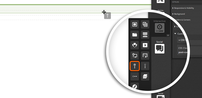
Your Full-Page Slider will include two sections by default, but you can add as many sections as you would like! To add another section to your Full-Page Slider, simply drag the Full-Page Section icon into your Slider.
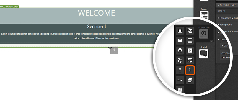
Each section within the Slider includes a container that you can use just like any other container on your page. This allows you to add responsive grids to define column structure, text, imagery, forms and even other interactive components to your Full-Page Slider Sections!
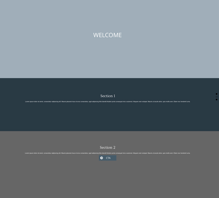
Subsections
You can also add subsections to your Full-Page Slider sections! Subsections allow you to get even more creative with your slider, as it allows you to insert content that will scroll horizontally within a given section.
To add a subsection to your Slider, drag the Full-Page Slider Subsection icon into one of your Full-Page Slider sections.
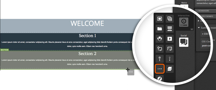
The content published into a single subsection will render on a single horizontal slide. To get the horizontal scrolling effect, you will want to add more subsections to your Full-Page Slider sections.

Behaviors
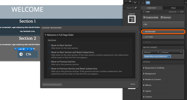
When editing any clickable element within the Full-Page Slider, you will see the option to define a “behavior.” Behaviors allow you to define an action for a given element within your Slider. For example, if you want a link or an image to take respondents to the next section when clicked, you would define this as a behavior for that element. To set a behavior, simply click the “Behaviors” button when editing your content.
Styling and Transition Effects
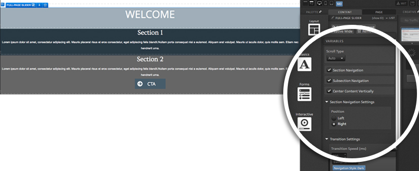
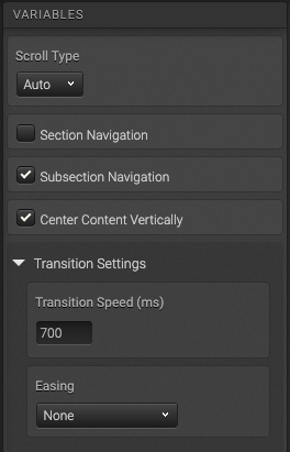
When editing the Full-Page Slider, you will see styling and transition effect options that include:
Scroll Type
- Auto – The “Easing” effect will be seen when respondents scroll through sections.
- Native – Uses the browser’s native scrolling to view sections.
- None – Respondents would only be able to view other sections by clicking elements with corresponding behaviors set.
Section Navigation – When checked will show dots that respondents can click to get to corresponding Full-Page Slider sections.
- When enabled, you will also have the option to place the dots on the left or right side of the Slider.
Subsection Navigation – When checked, adds arrows to subsections for respondents to use to view different subsections. If not enabled, behaviors would need to be used in order to navigate through subsections.
Transition Settings
- Transition speed (ms) – Sets the speed of transition effects (in milliseconds) when going from section to section within the Full-Page Slider.
- Easing – Controls the effect seen when visitors navigate from section to section within the Full-Page Slider.
If you have any questions, please contact us on [email protected].




Social Profiles