The Social Media Calculator is an interactive experience that features micro animations such as fade-ins, color and zoom on hover. This calculator includes seven inputs that help users calculate their ROI. On the landing page, resources and a lead gen form are featured to provide and offer user’s additional resources and subscribe to more content. Completing the calculator, results in four output calculations and the opportunity to recalculate again. The Social Media Calculator is a desirable experience for clients looking to create a simple calculator that features icons and inputs, resources, and forms.
- Type: Calculator
- Complexity: Low, Medium, High, Expert
- Use case: Brand Awareness, Education, Engagement, Lead Generation, Sales Enablement
Features available
Here are the major features, abilities, and interactive elements used in this template.
- Additional form field
- Animations
- Bullet styling
- Calculator input
- Image positioning
- Overlapping sections
How-to use
Here is a helpful guide on how to handle all the major features, abilities, and interactive elements available to make the most out of this template.
Additional form field
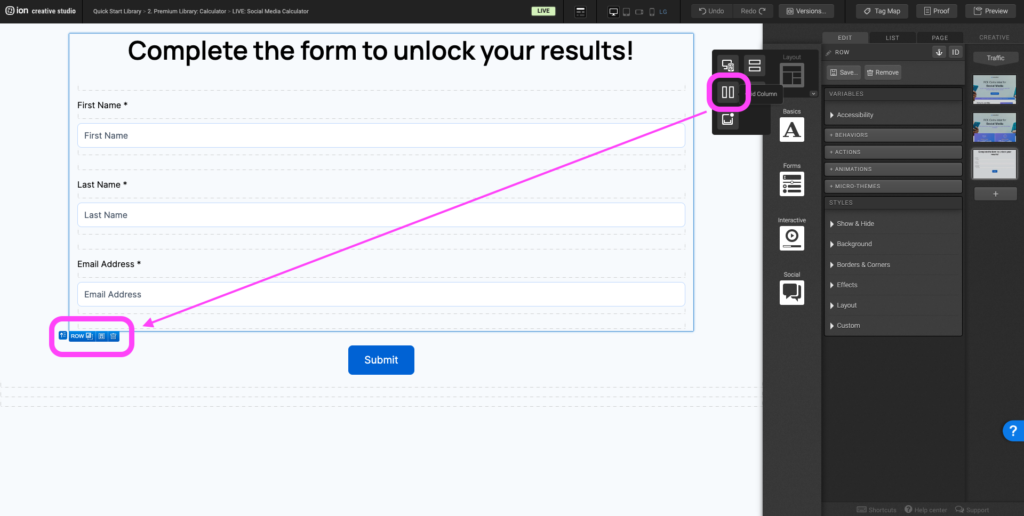
Step 1: Drag in a grid column into the row that the form lives within.
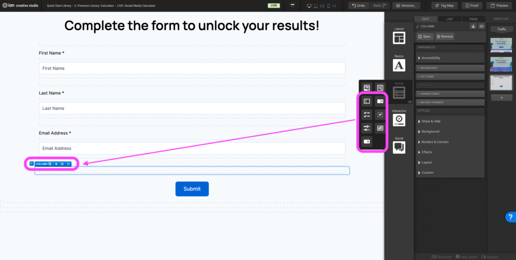
Step 2: Drag in a form input element from the Forms component into the column.
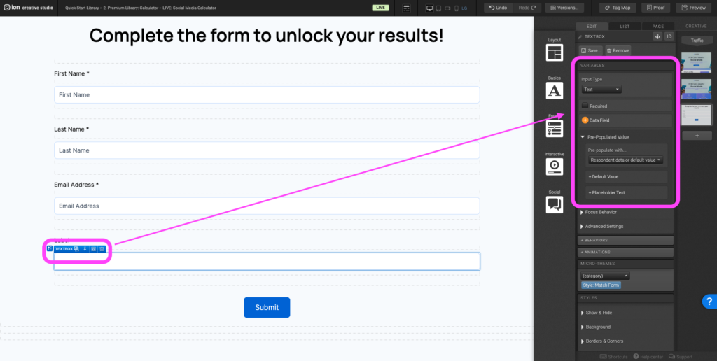
Step 3: Edit the default label text by double clicking and opening the text editor. Edit the form field by selecting the form element (textbox). In the Variables panel, set the input type, required checkmark if required, data field, and set a placeholder text by expanding the Pre-Populated Value panel and clicking + Placeholder Text.
Animations
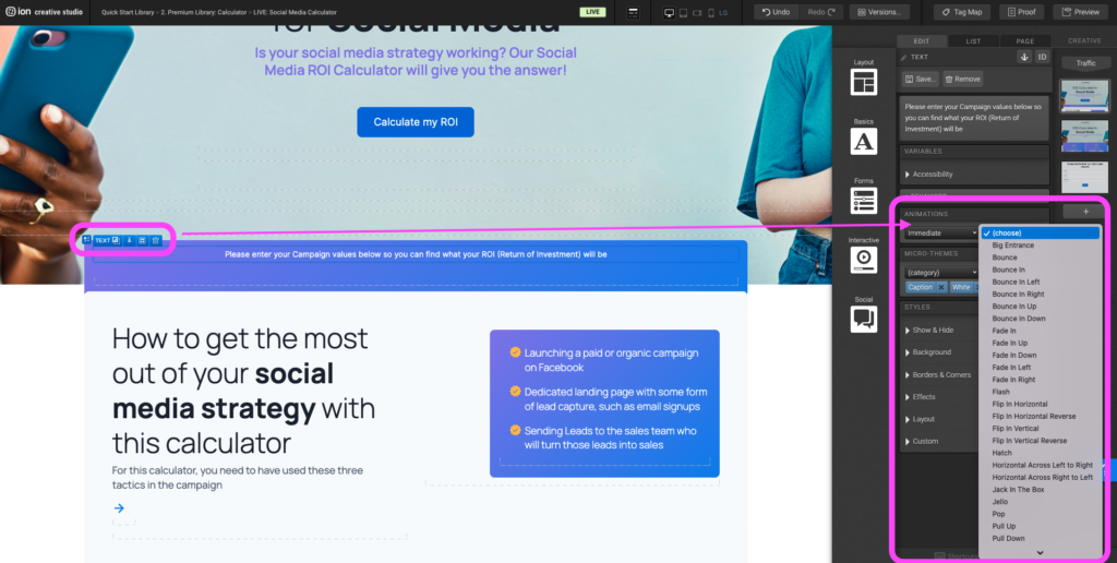
Step 1: To add an animation select the element you would like to apply the animation to. Navigate to the +Animations panel. Select a trigger (ex. Scroll into view, hover, etc.) in the dropdown, then in the second dropdown select the type of animation you would like the element to perform.
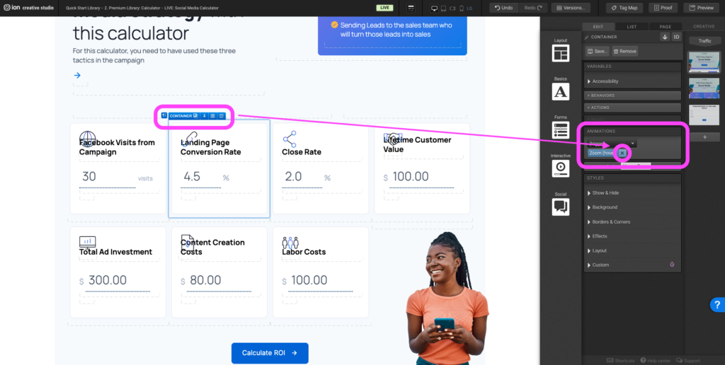
Step 2: To remove an animation select the element with the animation already applied to it. Navigate to the +Animation panel and click the X symbol to remove the animation.
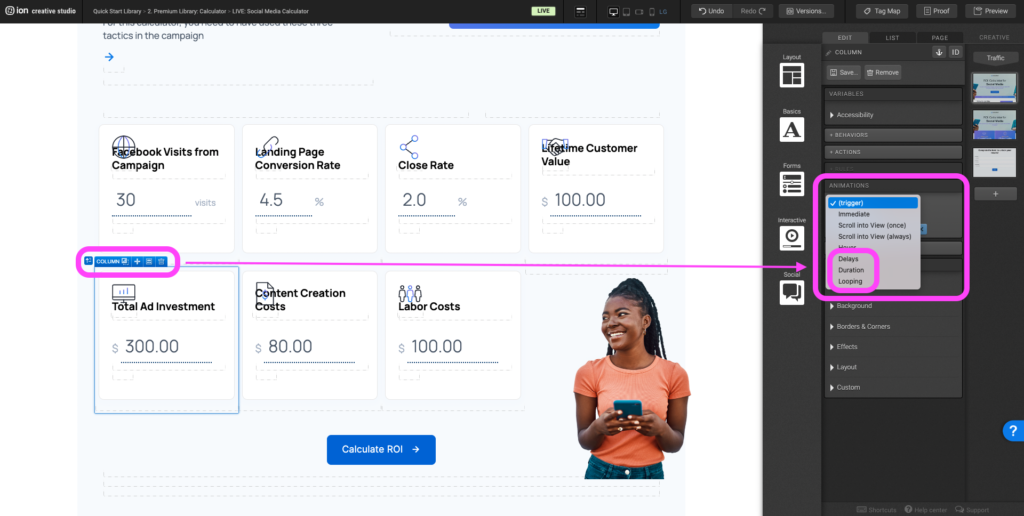
Step 3: Animation triggers such as delays, duration, and looping can be applied with other triggers. These triggers can be applied to set durations, timing delays, and animation repetition.
Bullet styling
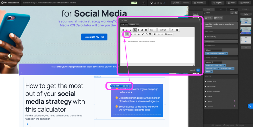
Step 1: Bullet styling can only be applied to text that uses bullet styling/formatting in the text editor. With the text editor open, before typing out the text select the bullet list icon or if text already exists, highlight the existing text and select the bullet list icon.
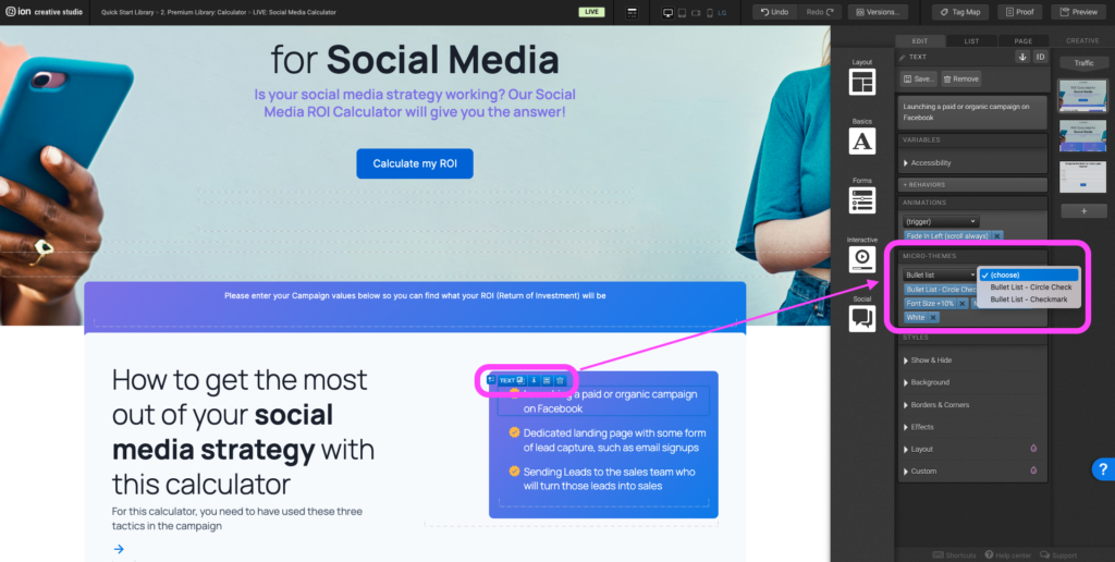
Step 2: To apply bullet outside of the default styling, select the text with the default bullet styling on it and navigate to the Micro-themes panel, under the Category dropdown select Bullet List, and in the second dropdown select the alternative bullet styling.
Calculator input
Step 1: To align two elements next to each other such as a form field input and a numerical symbol add a fixed width to the form field input container by navigating to the Layout panel and add a width under Width and Height. If you would like to make the form field input larger, increase the width percentage. Note: If the percentage is too large and you have a second element placed inline-block next to it then this might push the second element below it rather than next to it.
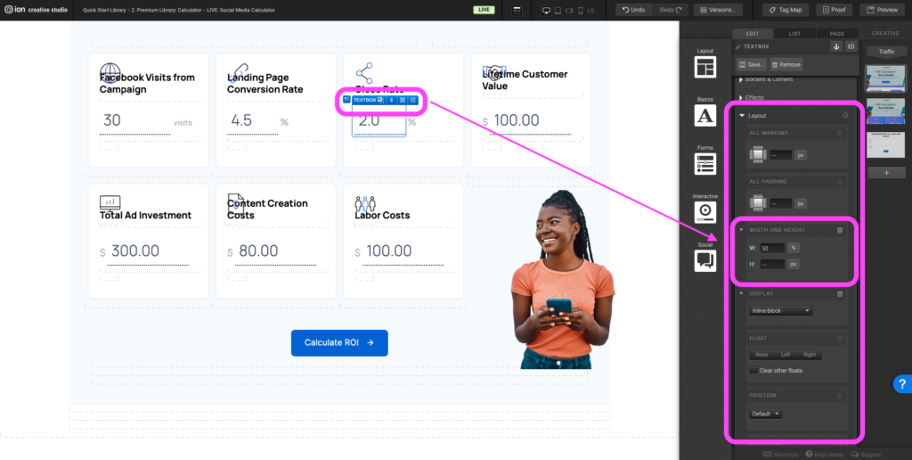
Image positioning
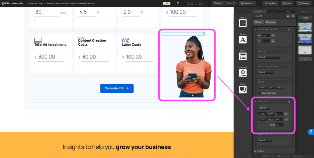
Step 1: Images positioned outside of the responsive grid use layered positioning which allows it to break outside of the default grid set up. Select the image and navigate to the Layout panel, scroll to the Layout panel to adjust the top and right numerical values. The greater the top value, the lower the image will move. The greater the right value, the further left the image will move.
Overlapping sections
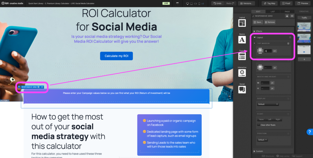
Step 1: Select the first responsive grid within the section container directly below the Hero Wrapper. Navigate to the Layout panel and under top margin adjust the numerical value. The lower the value (ex. – 5em) the higher the responsive grid will move upwards overlapping the hero section.
Content Writing Template
Here is the content structure’s template to make it easier for you when providing content guidelines or creating the copy for this template, from understanding the content structure to getting to know the amount of words needed to each text piece.
Related templates
If you like this template, you might want to check out these other similar models.
Have a question?
Still have questions or are facing troubles when handling this template? Please do not hesitate to send any additional questions to [email protected], so we can make sure to have this article constantly up to date.


Social Profiles