The Robust Assessment is an interactive experience that consists of 16 questions. This experience displays many micro-animations and utilities interactive components such as accordions, flows, and reveals. Aside from using Ion default components, the assessment itself provides users with custom results and suggestions.
- Type: Assessment
- Complexity: High
- Use case: Lead Generation
Features available
Here are the major features, abilities, and interactive elements used in this template.
- Accordions
- Animations
- Choice group
- Reveal
How-to use
Here is a helpful guide on how to handle all the major features, abilities, and interactive elements available to make the most out of this template.
Accordions
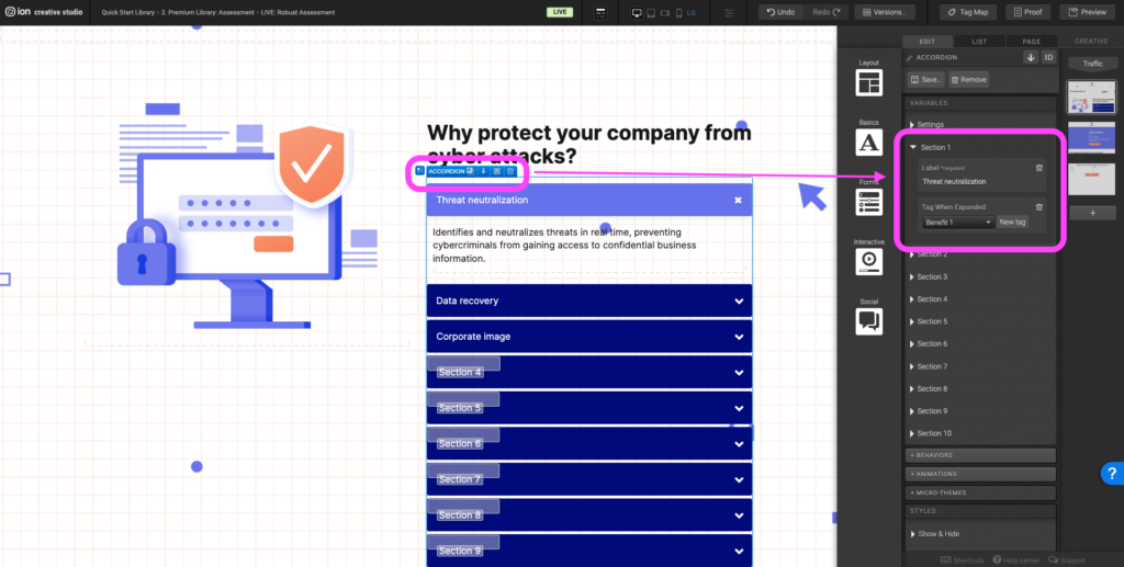
Step 1: To edit the accordion title, select the Accordion and navigate to the Variables panel. Expand the Section you would like to edit, double click on the Label to edit the accordion title. Don’t forget to also update the tag.
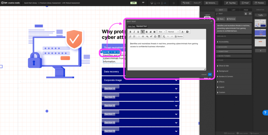
Step 2: To update the description within the accordion sections, expand the corresponding accordion section, and double click on the text. The text editor will open and you can edit the text accordingly.
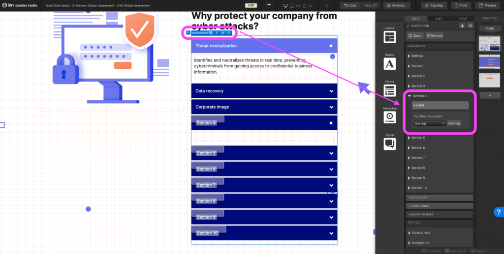
Step 3: To add an additional accordion section, select the Accordion and navigate to the variables panel. Expand the next empty accordion section. Click +Label to add an accordion title and don’t forget to add a tag.
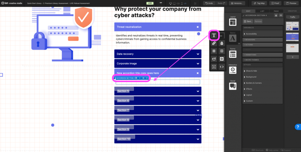
Step 4: Navigate to the Basics components and drag a text element into the new accordion section.
Animations
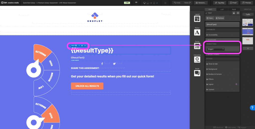
Step 1: To add an animation to an element, select the element and navigate to the +Animations panel. In the first dropdown select the trigger (scroll into view, immediate, etc.) and in the second dropdown select the animation type.
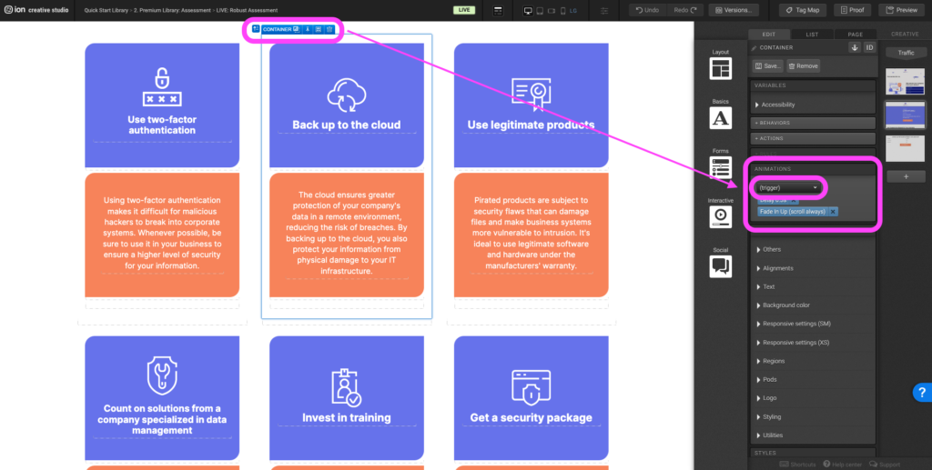
Step 2: To remove an animation, select the element with the animation already applied to it. Navigate to the Animations panel and click on the “x” icon.
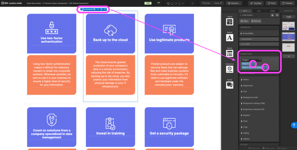
Step 3: To adjust an already existing animation, select the element with the animation already applied to it. Navigate to the Animations panel, in the first dropdown select the new trigger and in the second dropdown select the new animation type.
Choice group
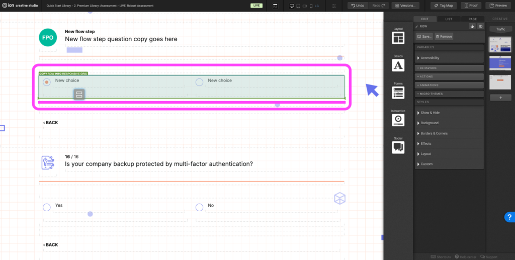
Step 1: Select an already existing choice and duplicate it by holding the Options key on Mac or the Alt key on Windows, and place the choice into an empty column. If an empty column doesn’t exist, navigate to the row that the choice group lives within. Duplicate the row into the Responsive Grid.
Step 2: Update the choice copy.
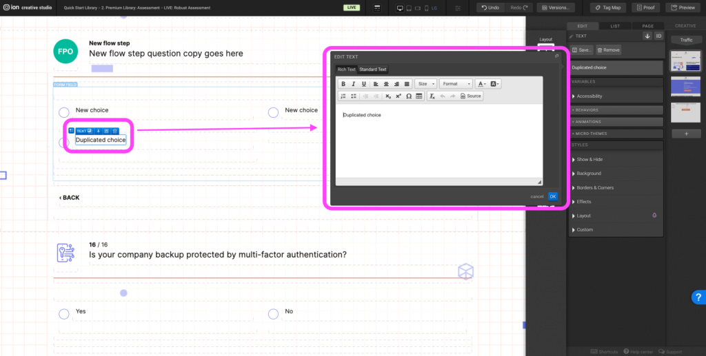
Step 3: Select the new choice and update the Data Value.
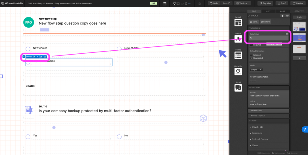
Reveal
Step 1: To edit the Resource icon, select the image within the Reveal Trigger. Double click on the image, select <reselect image and upload the new image.
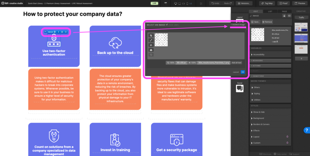
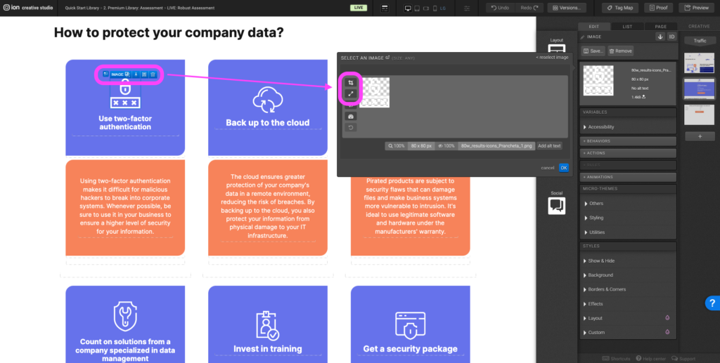
Step 2: Be mindful of the icon size. Ideally for this experience icons should be 80px x 80px. If the new image is greater or less than 80px x 80px, resize and crop the image to the ideal dimensions.
Content Writing Template
Here is the content structure’s template to make it easier for you when providing content guidelines or creating the copy for this template, from understanding the content structure to getting to know the amount of words needed to each text piece.
Related templates
If you like this template, you might want to check out these other similar models.
- Maturity Assessment
- Interactive Survey
- Assessment with Benchmark Results
- Crawl-Walk-Run-Fly Assessment
Have a question?
Still have questions or are facing troubles when handling this template? Please do not hesitate to send any additional questions to [email protected], so we can make sure to have this article constantly up to date.


Social Profiles