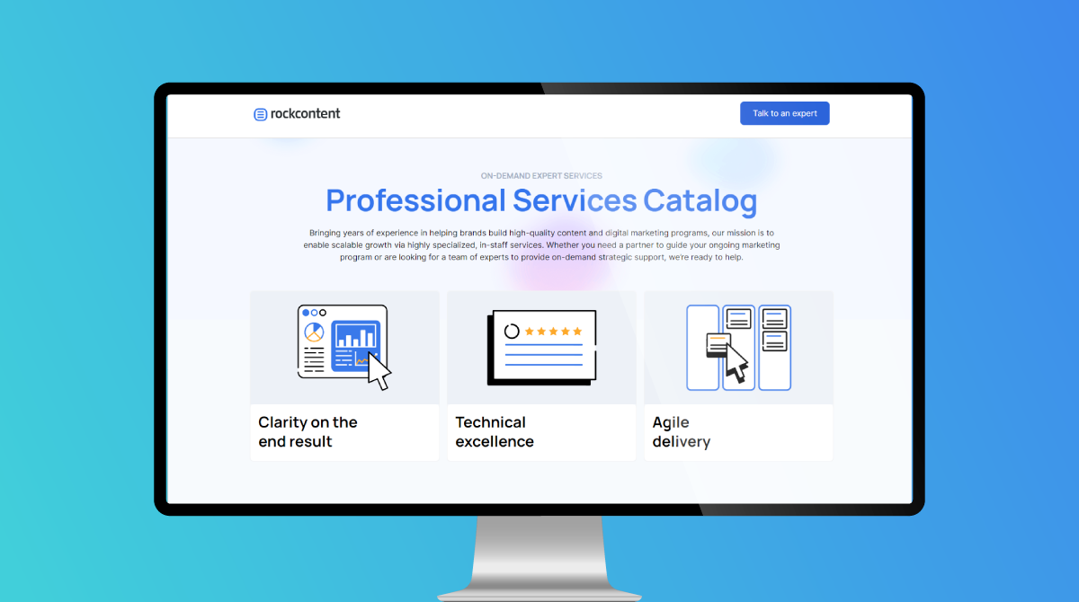
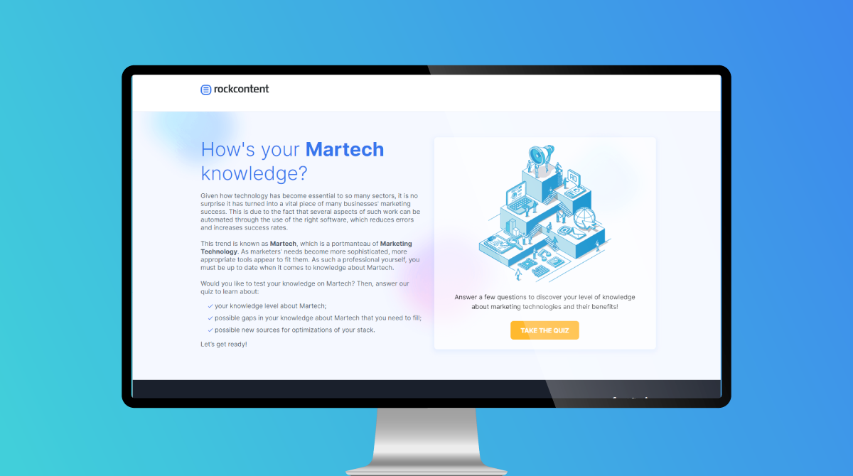
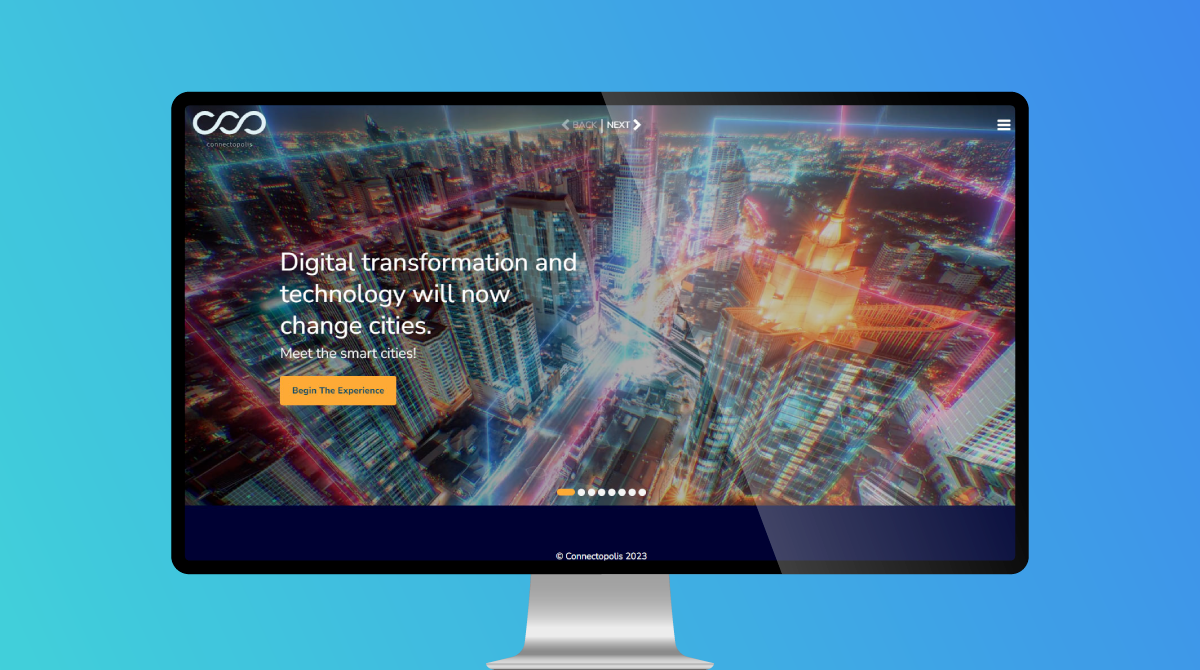
The Resource Library with Filters quickstart is a gated content hub experience displays a variety of resources such as articles, videos, and free resources. Visitors are presented with a gated form in the hero section of the landing page and additional facts below displayed using reveals and micro animation. Upon completing the form, the experience becomes ungated and all resources are now visible. By default all assets are visible but visitors can explore by filtering and view only the assets that are checked off. This content hub encourages visitors to interact with the filters and view assets that relate to their search.
- Type: Content Hub
- Complexity: Medium
- Use case: Lead Generation
Features available
Here are the major features, abilities, and interactive elements used in this template.
- Add choice
- Asset icon
- Background gradient
- Reveal animation
How-to use
Here is a helpful guide on how to handle all the major features, abilities, and interactive elements available to make the most out of this template.
Add choice
Step 1: Select the column where you would like the new choice to be placed next too. Click the “+” icon and a new column will appear.
Step 2: Adjust the column width by selecting the column and dragging either the left or right ends of the column. This will impact the other columns but if you want all columns to have the same width then navigate to the row level, select the grided boxes icon, adjust the column setting in each viewport.
Step 3: Navigate to the Form panel and drag in a choice element. Place the choice inside the empty column.
Step 4: With the new choice selected navigate to the Variables panel. Give the choice a Data Value and set the Default Selection to Selected.
Step 5: In the same Variable panel add a Form Submit Action. Under Go to Page, in the dropdown select the current page you’re on, Click add a hashtag and set the hashtag as the anchor to the asset section. *Don’t forget to add a tag.
Asset Icon
Step 1: Select the icon and open the Text Editor. In the Text Editor select Standard Text, change the format to HTML at the bottom left of the Text Editor, and paste in the new HTML for the icon replacement. *Icons can be found on: https://fontawesome.com/v4/icons/
Step 2: You can update the color of the icon using the Micro-Themes in the right hand panel under the dropdown Color. You can update the spacing between the icon and the text next to it by navigating to the Layout panel under margin, either increasing or decreasing the value.
Background gradient
Step 1: Select the container within the background image container. Navigate to the Background panel. *If you use the arrow keys on your keyboard select the background image container, press the next arrow and that is the gradient background overlay container.
Step 2: Select the colors and adjust to your desired palette. When the color palette opens enter the hex code or choose using the color picker. Use the slider to adjust the opacity.
Step 3: In the same Background panel, you can adjust the gradient direction by selecting the different arrows under Gradient direction.
Reveal animation
Step 1: Select the reveal container. Navigate to the Micro-Themes panel, select Reveal from the dropdowns. From the Reveal, there are 3 different transition drop-down you can choose from.
Content Writing Template
Here is the content structure’s template to make it easier for you when providing content guidelines or creating the copy for this template, from understanding the content structure to getting to know the amount of words needed to each text piece.
Related templates
If you like this template, you might want to check out these other similar models.
Have a question?
Still have questions or are facing troubles when handling this template? Please do not hesitate to send any additional questions to [email protected], so we can make sure to have this article constantly up to date.


Social Profiles