The FinTech landing page is an engaging experience with bold text and large images to capture and maintain the visitors’ attention and immersing them in your content. With scroll-to buttons and animations along the way, the visitor is guided down the page with seamless fluidity. They will encounter a number of interactive elements which includes rotators, and accordions. At the end of the experience, the visitor is presented with a form to get in contact with your company.
- Experience type: Landing Page
- Complexity: Low
- Use case: Brand Awareness
- Use case: Brand Awareness
Features available
Here are the major features, abilities, and interactive elements used in this template.
- Accordion
- Animations
- Flows
- Form
- Scroll-to Sections
How-to use
Here is a helpful guide on how to handle all the major features, abilities, and interactive elements available to make the most out of this template.
Accordion
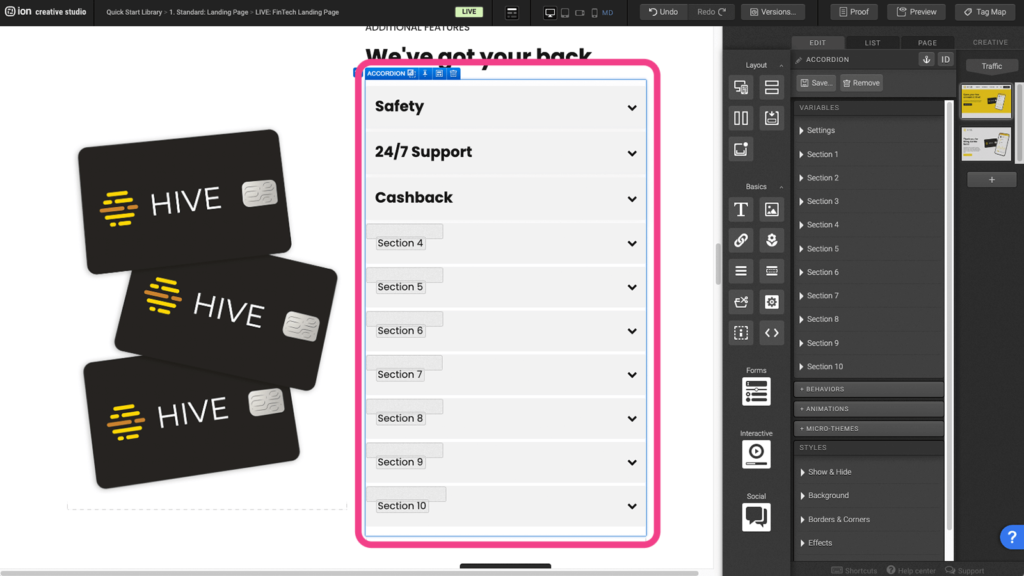
Step 1: To update the content within your Accordion, begin by selecting it on the canvas.
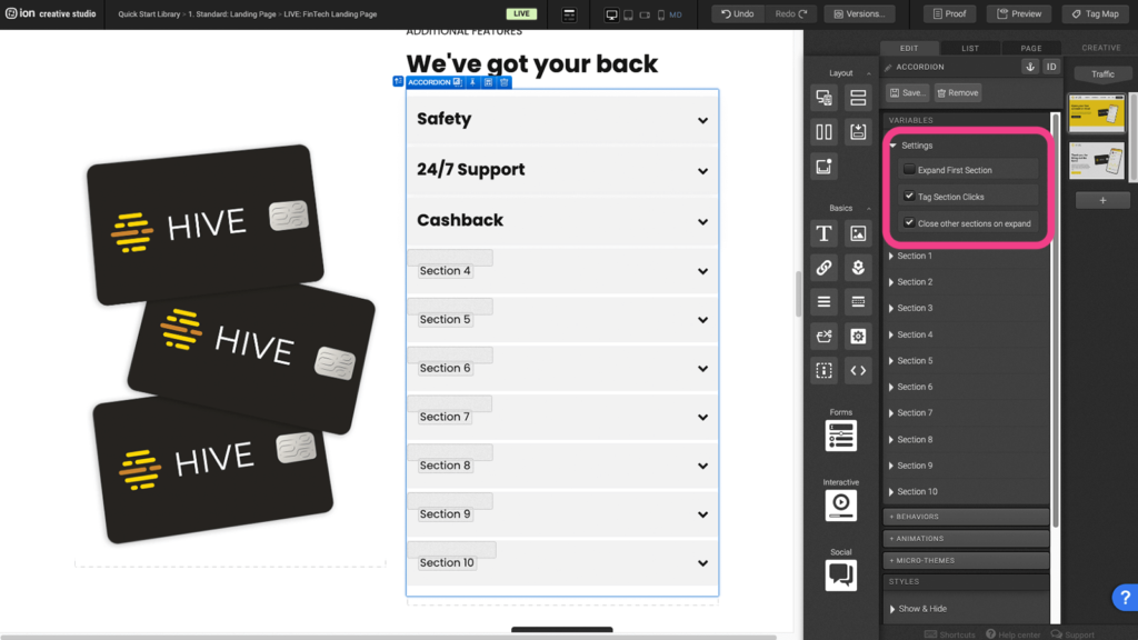
Step 2: As a side note you are able to edit the Settings for the Accordion itself by always having the first section expanded, tagging each accordion section when it is clicked on (which is done by default), and closing an accordion section when anothis is expanded.
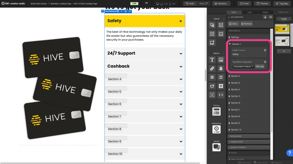
Step 3: Select an Accordion Section by clicking on it on the Canvas or by selecting in the Variables menu. Here in the Variables section you are able to update the Label for the specific Accordion Section, which is the front face title, and you are also able to provide it with a Tag.
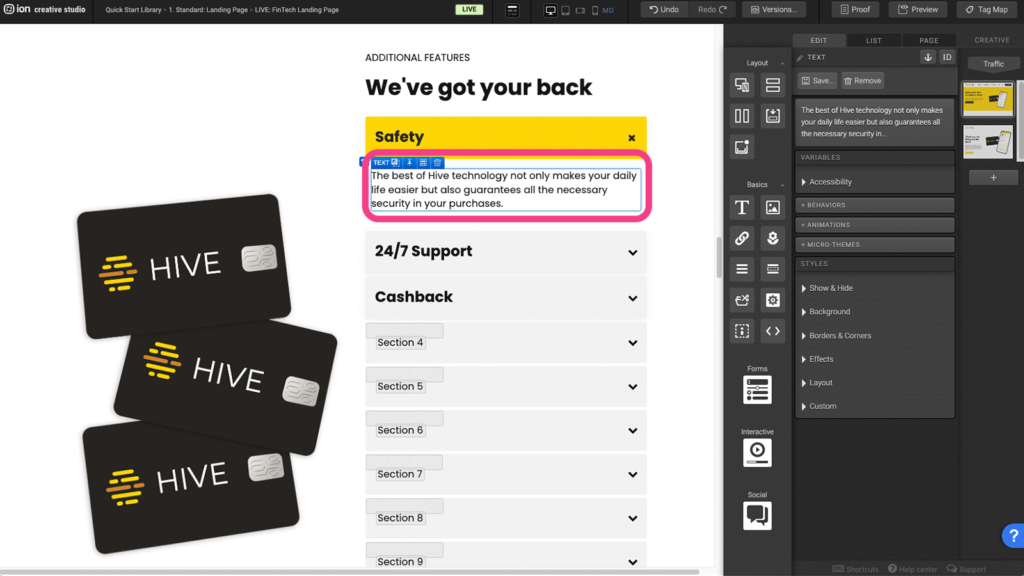
Step 4: With the Accordion Section expanded on the Canvas, you can double-click on and edit the Text element, or add or remove content from within the Section.
Animations
Step 1: To change or remove an Animation, begin by selecting the element on the Canvas.
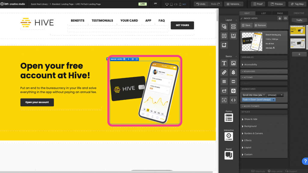
Step 2: To remove the Animation, click on the blue X to the right of the active Microtheme. To change the Animation, click on the Trigger dropdown above the active Animation and select a Trigger.
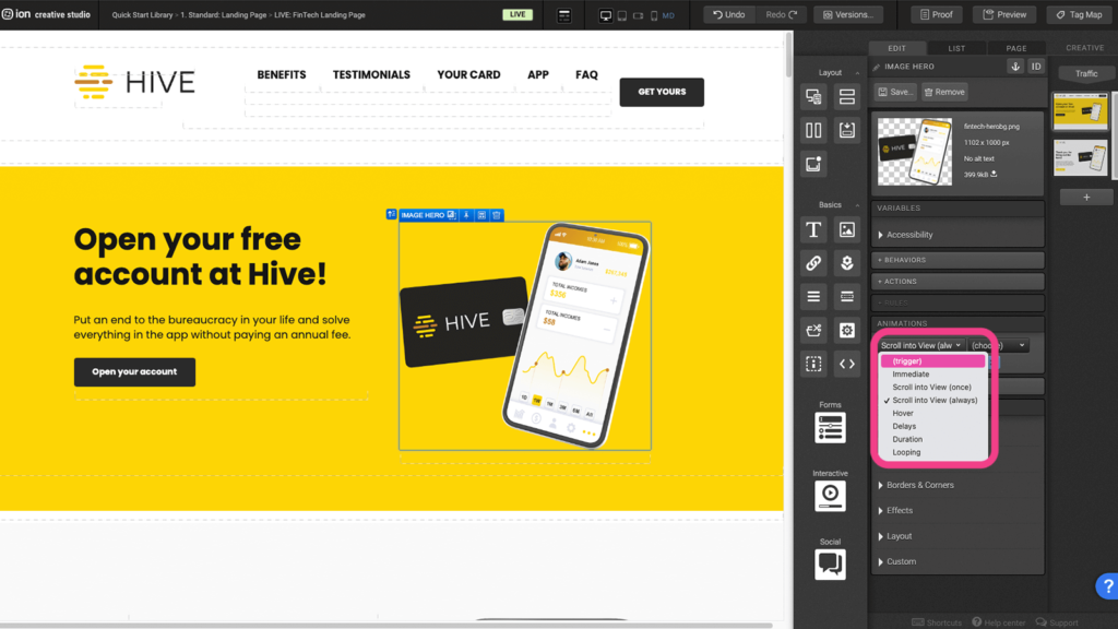
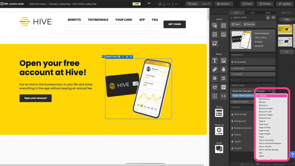
Step 3: From the second dropdown that appears, select an Animation from the available options.
Flows
Step 1: To update the content within your Flow, begin by selecting it on the canvas.
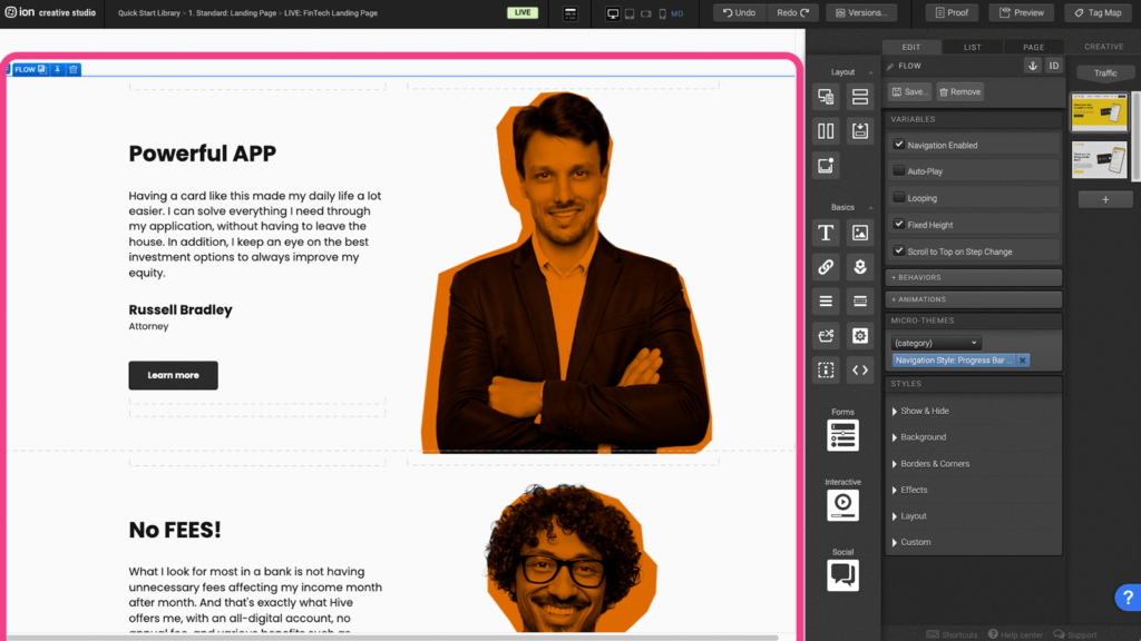
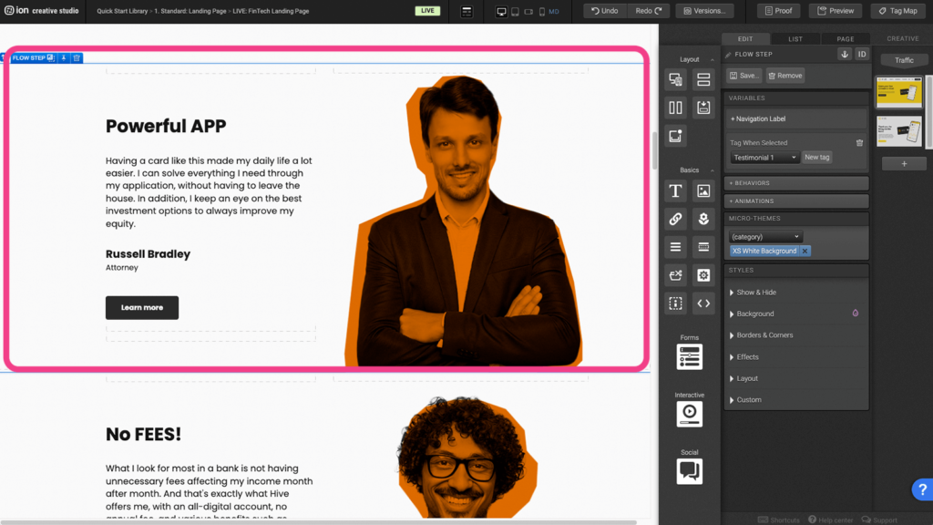
Step 2: Within the Flow, locate the first Flow Step at the top. Within this Flow Step is a one Row and three Column Responsive Grid. You can edit the contents within the columns, add content, or remove all of the content from the Flow Step.
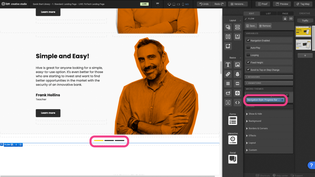
Step 3: At the very bottom of the Flow is a numbered navigation that is used to indicate the active Flow Step and is also used as buttons to navigate through steps. You can remove this by visiting the Variables settings and removing the Microtheme.
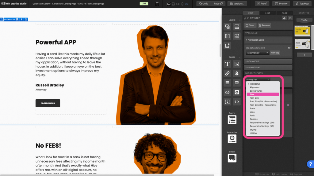
Step 4: You can also change the style of the navigation by choosing the Flow microtheme.
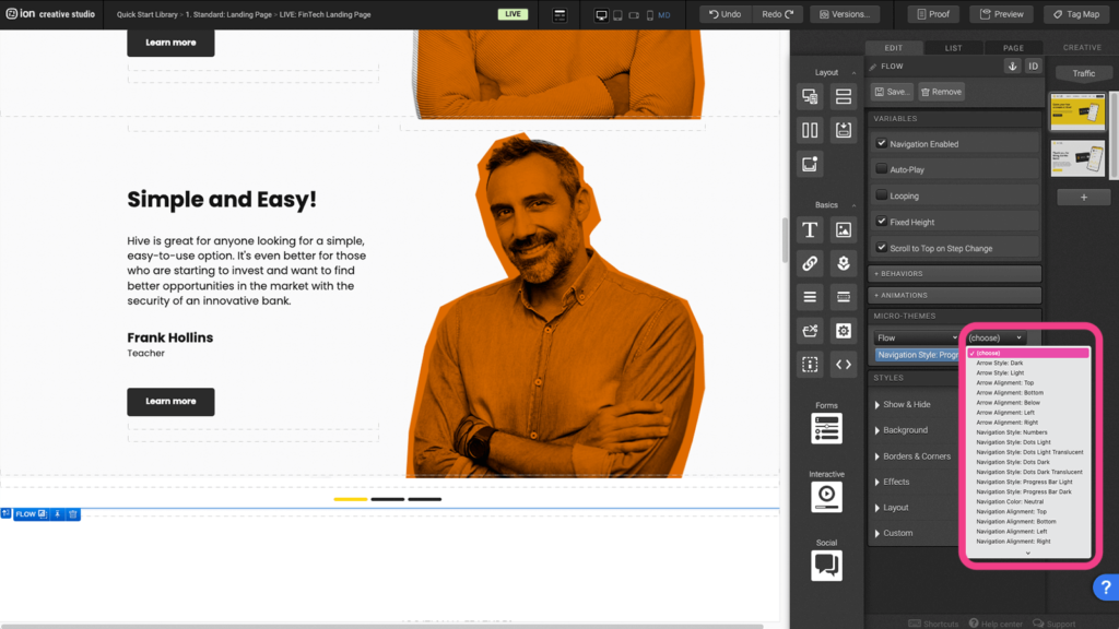
Step 5: After choosing the Flow Microtheme, another dropdown will appear where you can choose from a list of sub-category options.
Form
Step 1: To edit the different Form inputs, select one of the Textboxes.
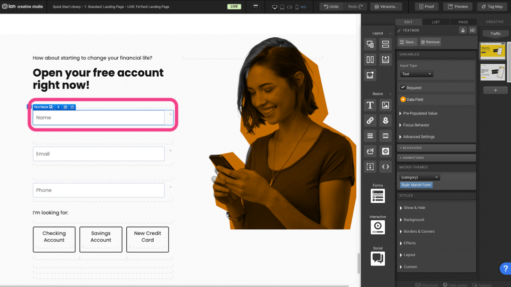
Step 2: Under the Variables panel, click the Data field icon to open up the lists of data fields.
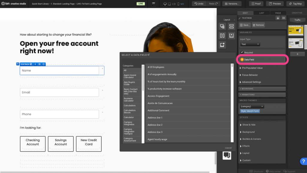
Step 3: Select a category from the Categories panel to the left.
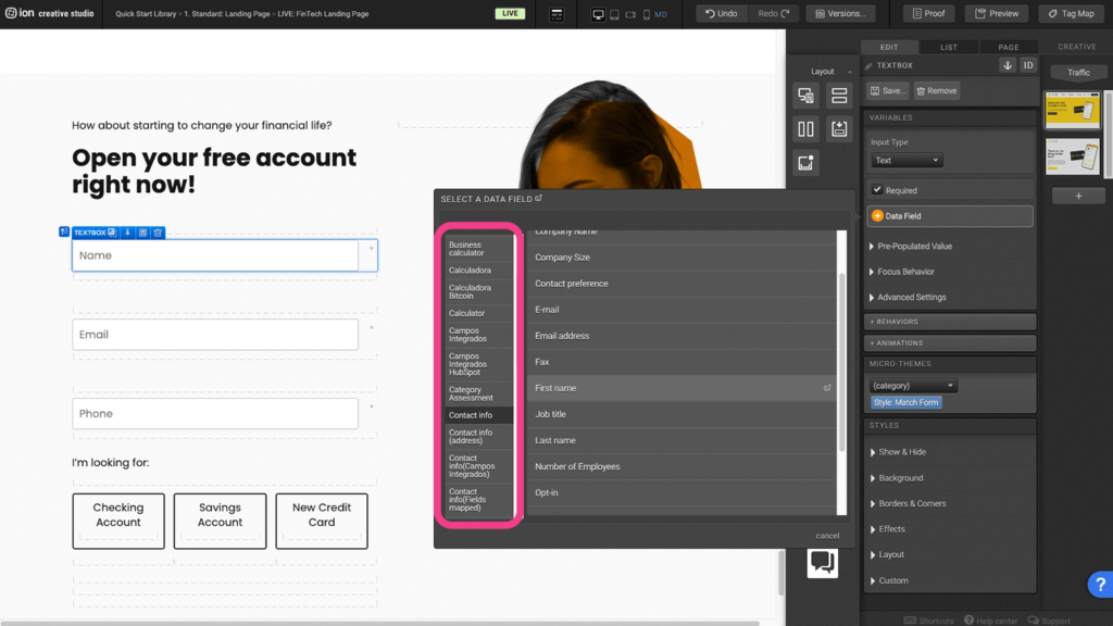
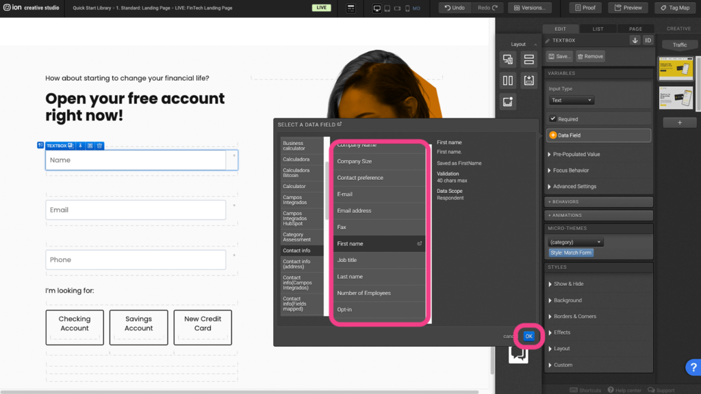
Step 4: Choose your data field then press OK.
Scroll-to Sections
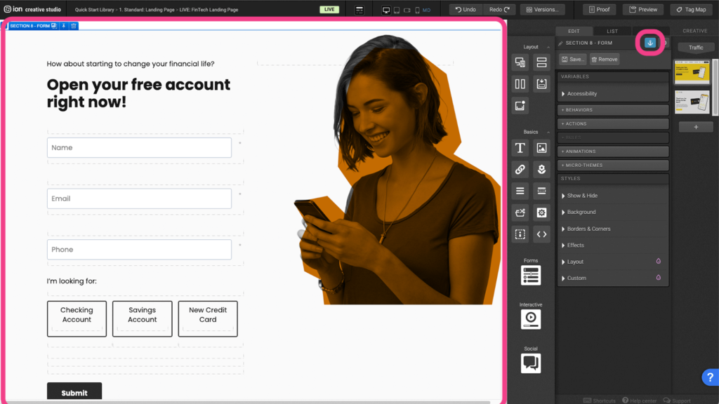
Step 1: Select a section where you want the CTA to scroll to and add an anchor.
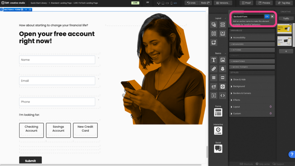
Step 2: Assign the anchor with a unique name (Ex. Section 1 – Topic).
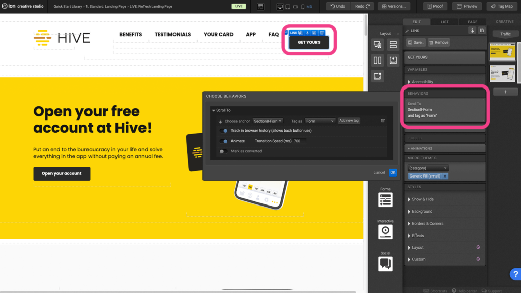
Step 3: Select the button and under the behavior panel, select the anchor and assign a unique tag.
Content Writing Template
Here is the content structure’s template to make it easier for you when providing content guidelines or creating the copy for this template, from understanding the content structure to getting to know the amount of words needed to each text piece.
Related templates
If you like this template, you might want to check out these other similar models.
- Healthcare Landing Page
- Landing Page with Product Selection
- Long Page with Sticky Navigation
- Landing Page with Video Decision Tree
Have a question?
Still have questions or are facing troubles when handling this template? Please do not hesitate to send any additional questions to [email protected], so we can make sure to have this article constantly up to date.



Social Profiles