The Easy Savings Calculator is an interactive experience that allows users to explore their total spending and potential savings. On the landing page of this experience there are micro animations that happen immediately and repeat on scroll, reveal tiles with more information and external links, and a lead gen form at the bottom. The result page shows final calculations, and additional information displayed using tabs. The Easy Savings Calculator encourages users to find their potential savings.
- Type: Calculator
- Complexity: Medium
- Use case: Sales Enablement
Features available
Here are the major features, abilities, and interactive elements used in this template.
- Image Positioning
- Inline Block Images
- Micro Animations
- Reveal Tiles
- Tabs
How-to use
Here is a helpful guide on how to handle all the major features, abilities, and interactive elements available to make the most out of this template.
Image Positioning
Step 1: To change the location where the icon overlays the image select the outer container where the icon is located within. Navigate to the Layout panel and scroll down to Position. The lower the top value, the higher up the icon will move. The lower the right value, the more right the icon will move.

Inline Block Images
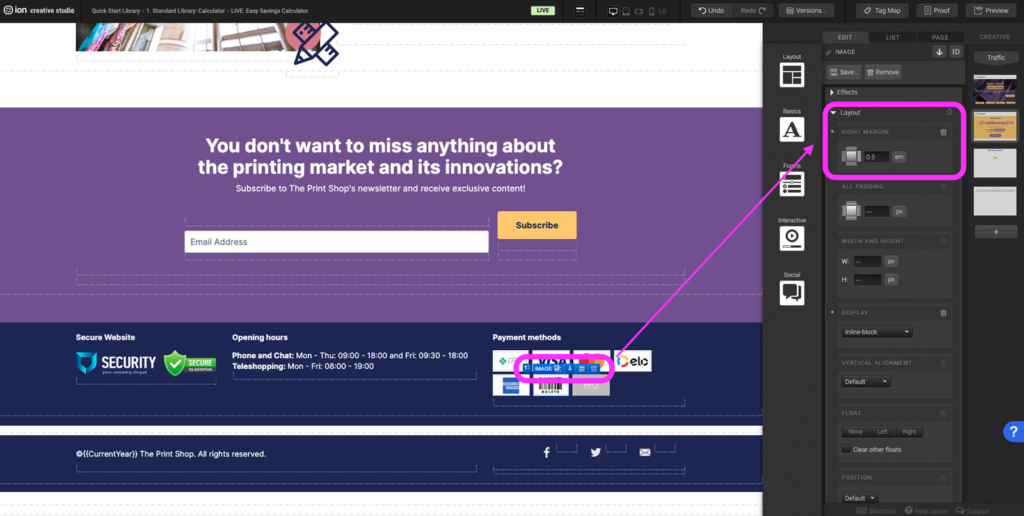
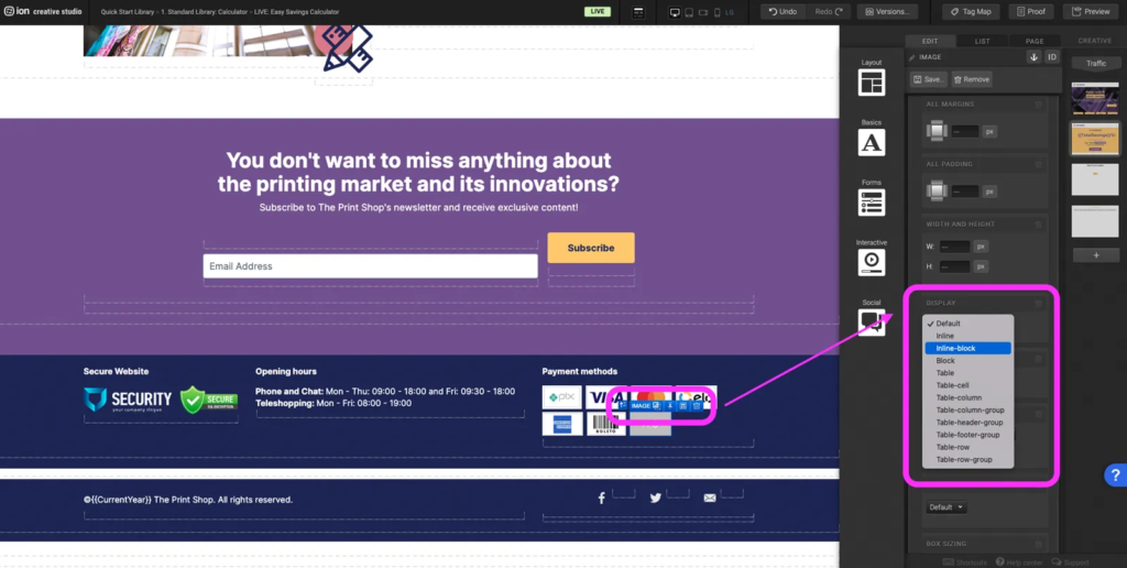
Step 1: Select the image, text or container and navigate to the Layout panel. Scroll down to the Display and set it to Inline-block.

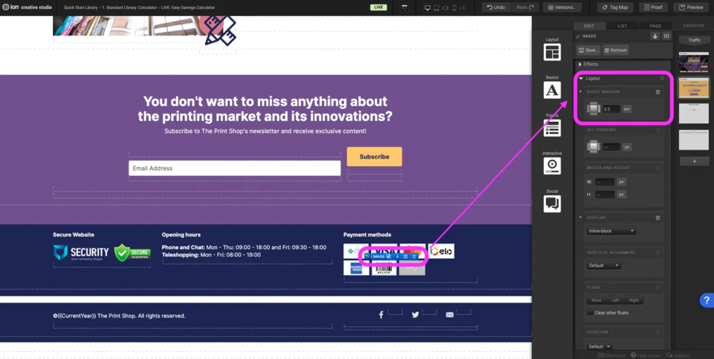
Step 2: Add margins to images and containers so that there is space between two elements. For elements like text a margin may not be needed.
Micro Animations
Step 1: To adjust the animation type select the element with the existing animation. Navigate to the Animation panel on the right hand side, set the trigger to Immediate, scroll into view, or etc., then a second dropdown will appear and select the animation type.
Step 2: To add an animation to an element, select the element and navigate to the Animation panel on the right hand side. Select a trigger and then select the animation type.

Reveal Tiles
Step 1: To replace/change the image icon double click on the image container, on the right hand corner of the image editor select <reselect image and then select Add Images. For a similar look to the other reveal icons, upload an image that is 120px x 120px.

Step 2: To change the background color of the reveal trigger navigate to the Micro-Themes under background change the color. To change the border color for the reveal container select the reveal container and navigate to Borders & Corners. Set a color and set the thickness.

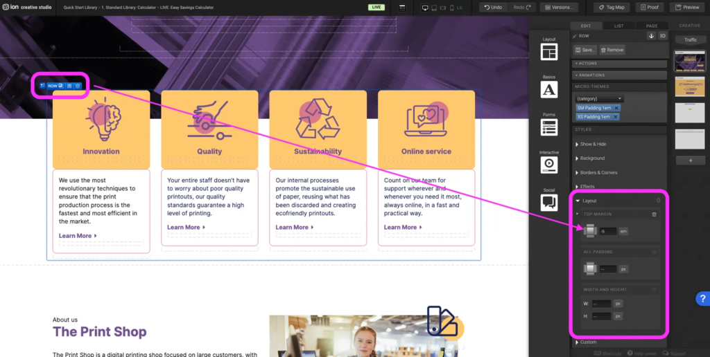
Step 3: To change the height of the reveal overlay on the hero section select the row that all the reveals are within. Navigate to the Layout panel and adjust the top margin. The lower the value, the higher the reveals will shift upwards.
Tabs
Step 1: Select the Tabs container and navigate to the Tabs panel on the right hand side. Expand the next empty tab to add a new tab. Select +label to add a name to the new tab section. *Don’t forget to add a tag for behavior tracking.

Step 2: To remove a Tab container and navigate to the right hand Tab panel. Expand the tab you want to remove and remove using the trash can icon.
Content Writing Template
Here is the content structure’s template to make it easier for you when providing content guidelines or creating the copy for this template, from understanding the content structure to getting to know the amount of words needed to each text piece.
Related templates
If you like this template, you might want to check out these other similar models.
Have a question?
Still have questions or are facing troubles when handling this template? Please do not hesitate to send any additional questions to [email protected], so we can make sure to have this article constantly up to date.

Social Profiles