This Construction Landing Page is tailor made for content heavy creatives, turning a landing page into a seamless experience with a modern and streamlined design and examples of creative use of interactive elements such as tabs, looping flows, animated background, embedded Google Maps, reveals, image flows.
- Type: Landing Page
- Complexity: Low
- Use case: Brand Awareness
Features available
Here are the major features, abilities, and interactive elements used in this template.
- Arrow scroll-to
- Auto-play flow
- Container with animated background
- Embedded Google Maps
- Flow
- Form
- Image flow
- Reveals
- Scroll-to menu navigation
- Tabs
How-to use
Here is a helpful guide on how to handle all the major features, abilities, and interactive elements available to make the most out of this template.
Arrow scroll-to
Step 1: With your arrow placed, you must go to the container or element to anchor the element that is going to be scrolled to. Once selected, on the right, in the Edit panel, you’ll find an anchor icon.
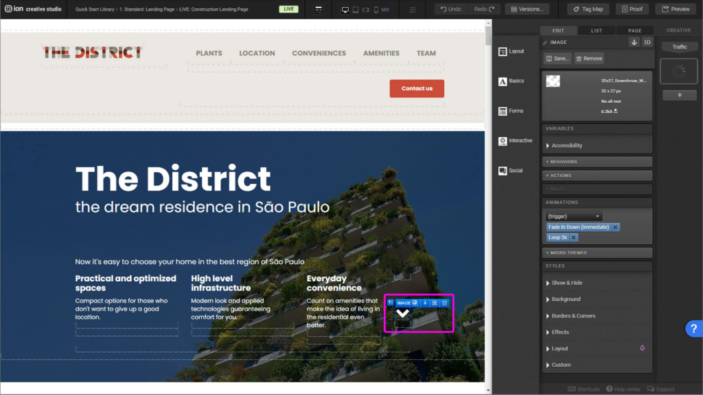
Step 2: Once you click on the icon, properly name it and click “Ok”. One important information: scroll-to won’t work if you name two anchors with the same name. All anchors must be uniquely named.

Step 3: Back to the arrow, select the image. Then, on the right, in the Edit panel, you’ll select “Behaviors”.
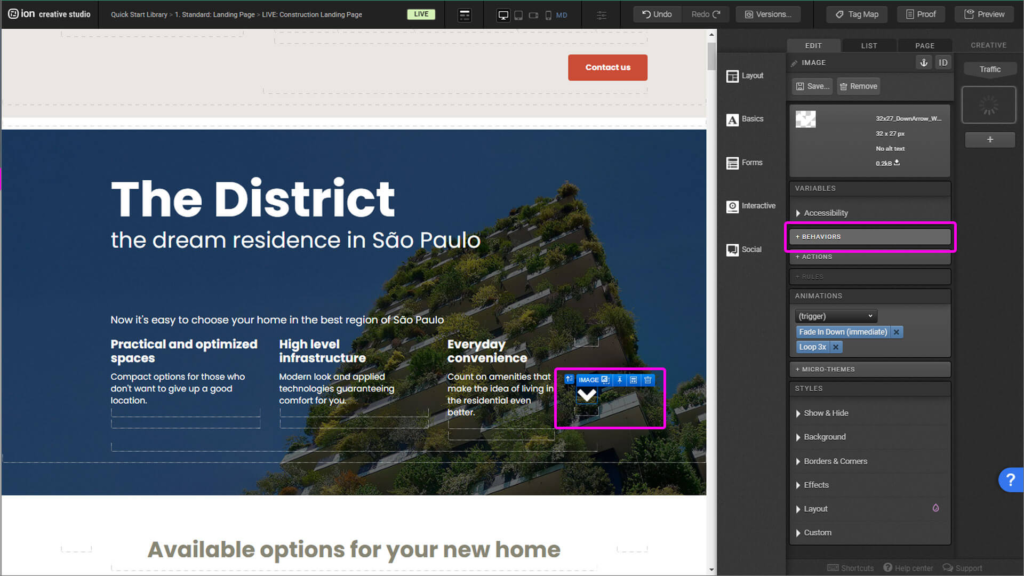
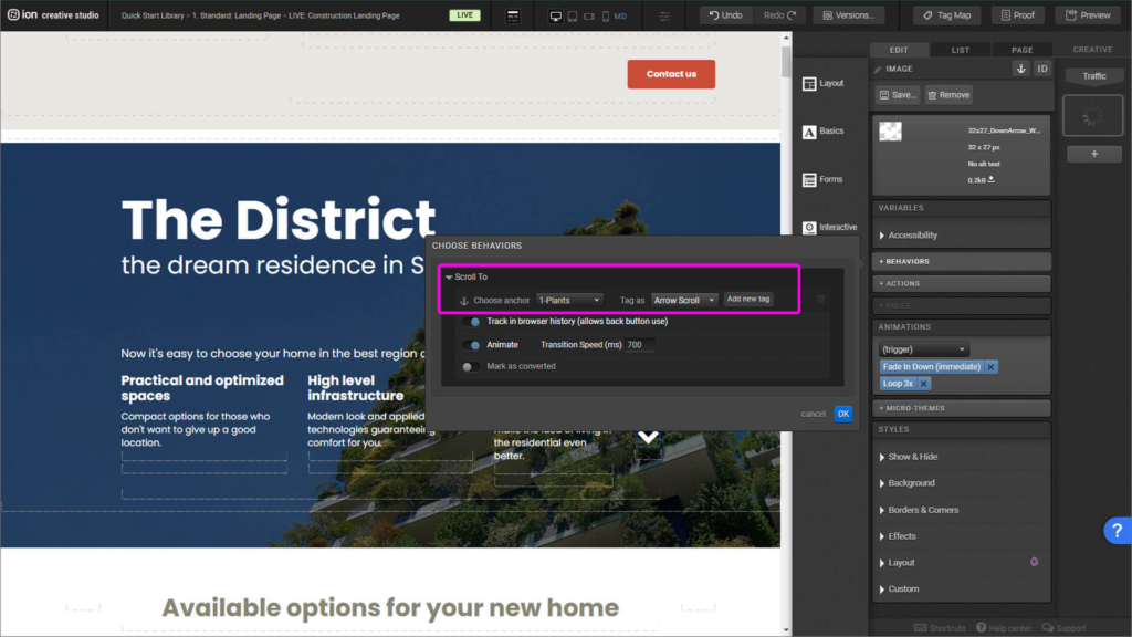
Step 4: Find the anchor you desire to link and uniquely identify it with a tag. Then click ok.
Auto-play flow
Step 1: Let’s show how to edit the current flow, and not how to rebuild the current one.
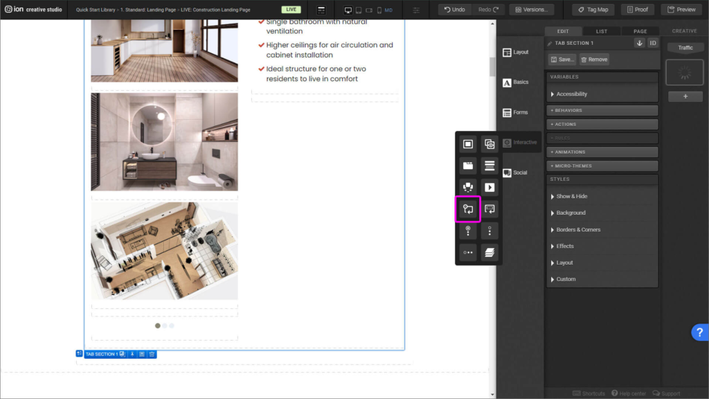
Step 2: Add inside the Flow Steps your images. If you desire to add more images, add more Flow steps, located next to the Flow element.
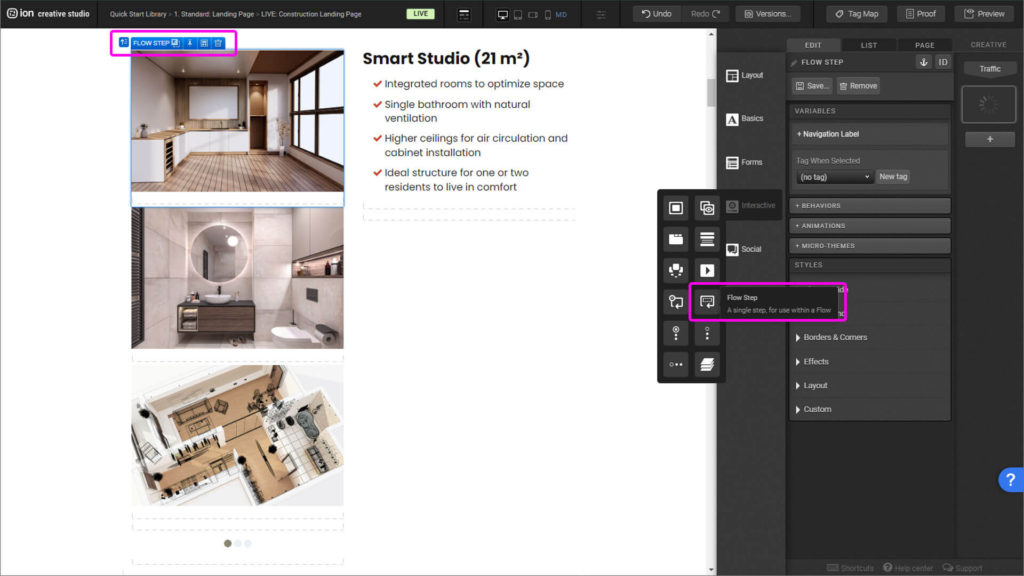
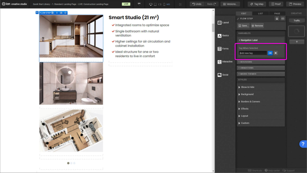
Step 3: Don’t forget to name each step uniquely.
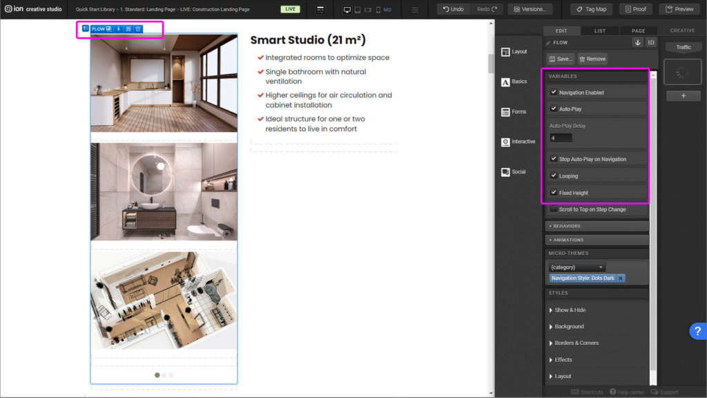
Step 4: Once all your content has been added, select the Flow element, and on the right side of the panel, under the Variables menu, select the items: Auto-play and Looping. With these settings it’ll allow your flow to play automatically non-stop. You can set the time each Flow Step appears in seconds in the Auto-play Delay section.
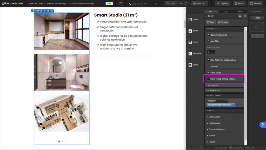
Step 5: It’s important to leave Scroll to Top on Step Change clear, if selected it’ll disrupt negatively your users experience with the creative.
Container with animated background
Step 1: This section is built with 2 elements, one container with the background (named Content) and inside it one container (named Container) with a black transparent background and the content.
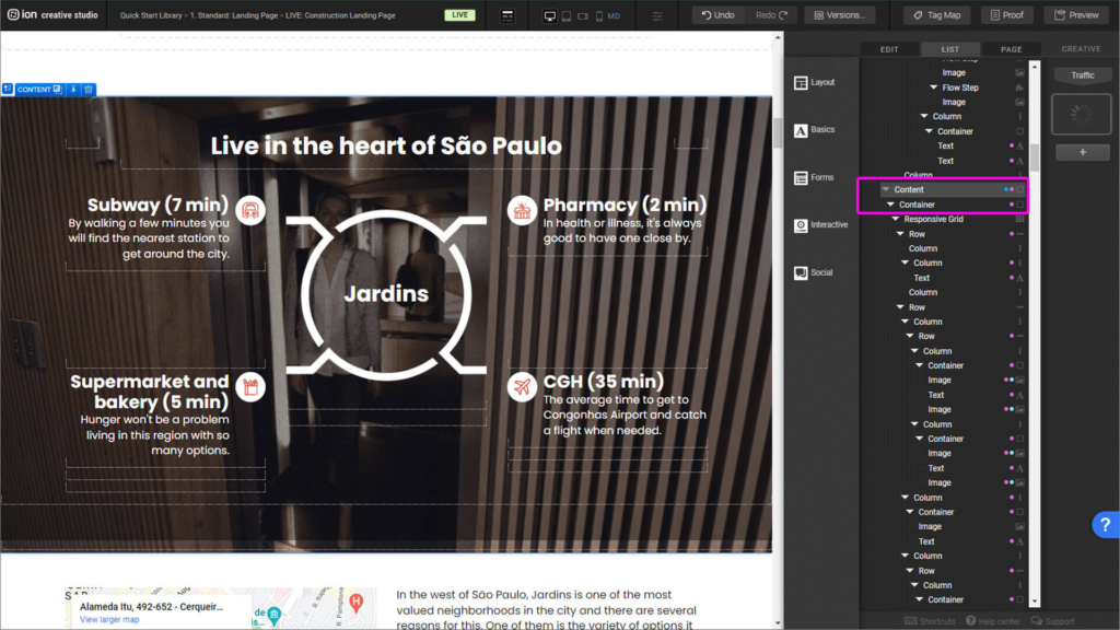
Step 2: You can change your background image by selecting the container element, opening up the Styles dropdown within the Edit tab, and clicking on the background image thumbnail.
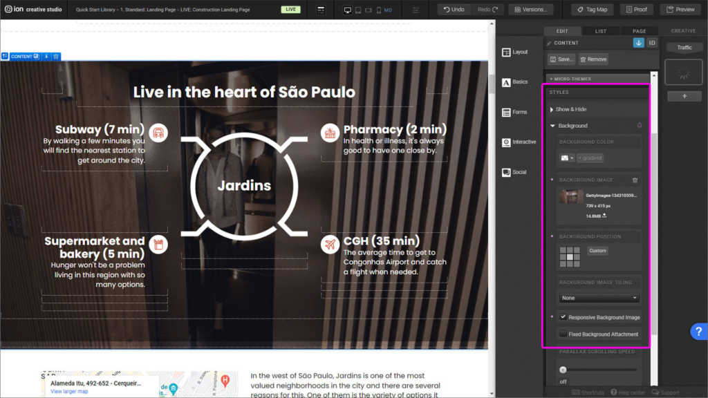
Step 3: An important note is to compress the animated image to make it as light as possible to ensure the best performance.
Embedded Google Maps
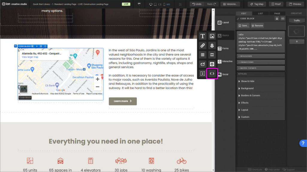
Step 1: Add a Code Block interactive element, located on the Basics panel.
Step 2: To acquire the embed code, on Google Maps find the location you want to share, on the left side of the menu, click on Share and on the pop-up click on Embed Code, lastly click on Copy HTML.
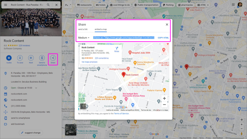
Step 3: Paste the embed code provided from Google Maps. Also add the following code:
<div style=”position:relative;height:0;padding-bottom:55%;”>
And at the end of the code: </div>
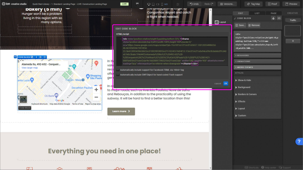
Step 4: Just after the code <iframe, add a space and paste the following code:
style=”position:absolute;top:0;left:0;width:100%;height:100%;border:0;”
Just like the image in the example above. Click ok and save the Code Block.

Form
Step 1: The purpose of this element is to provide feedback to the user once the form has been filled with a thank you message. It’s built with a Flow, and inside the first Flow Step, a Form element.
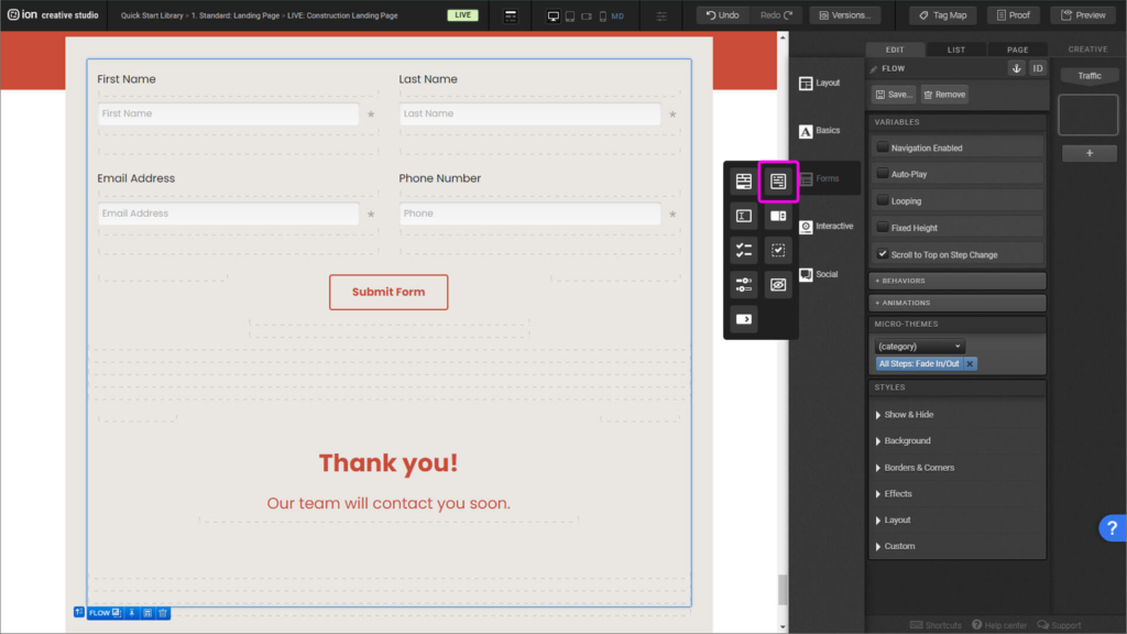
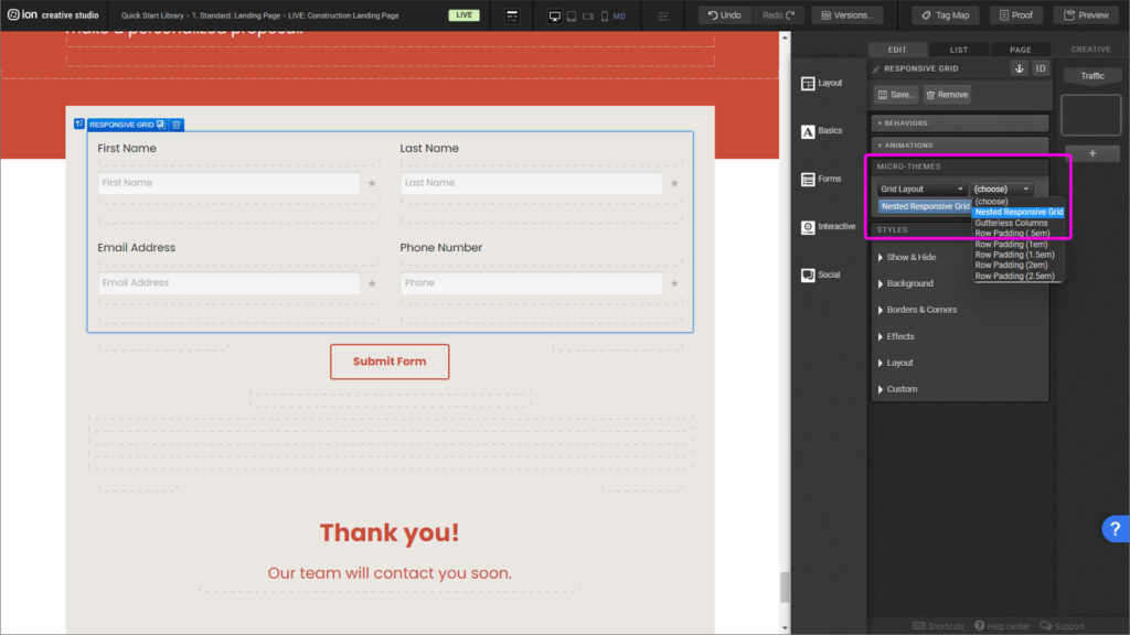
Step 2: Inside the Form, to add the columns, place a Responsive Grid, add a second row. Delete the third column from both rows and divide them in two columns. Apply to the Responsive Grid a Nested Responsive Grid, from the Micro-themes menu.
Step 3: Drag in a Textbox element and place it within the column inside the form.
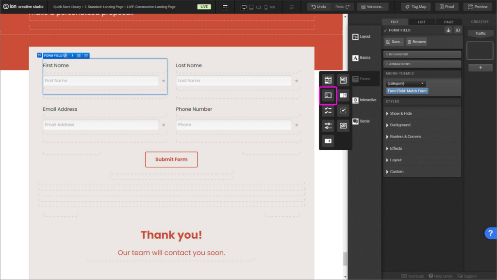
Step 4: To determine what kind of information this field is going to collect you must give this element a label, data field, input type, number settings, and pre-populated values. Copy the Textbox into the remaining columns.
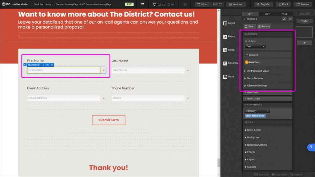
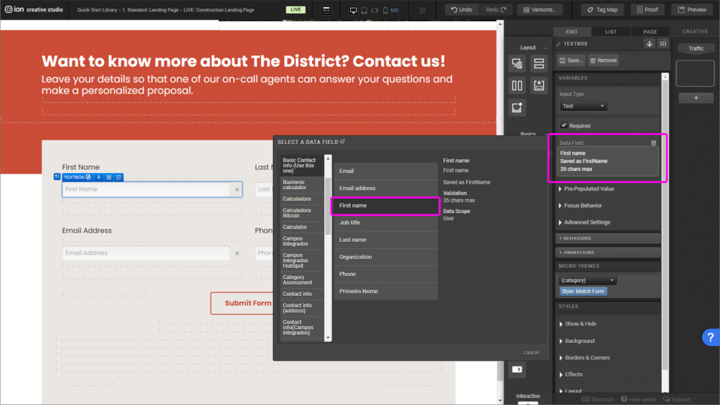
Step 5: To set the form field to gather First Name data, click on the Data Field and select the corresponding field, in this case, First Name.
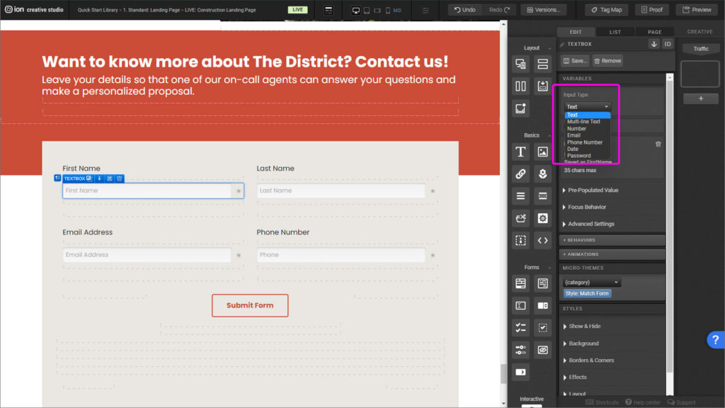
Step 6: The Input Type must always coordinate with the Data Field. Name as text, Email as email, Phone Number as phone number. Though it seems logical it’s an important element to be set.
Step 7: With the Submit button selected, on the Behaviors panel, apply Move to Step > Last.
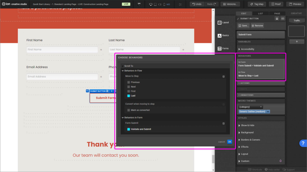
Image flow
Step 1: To change the images simply click on the image and on the Styles menu open the Background dropdown.
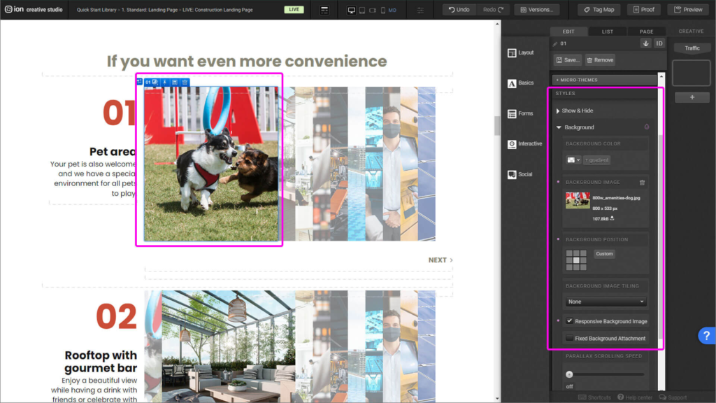
Step 2: Click on the Background image option and reselect the image.
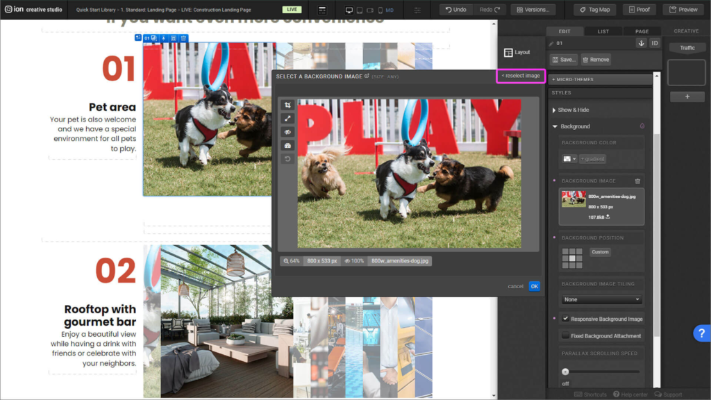
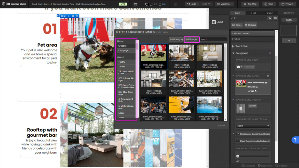
Step 3: Select or upload your new image.
Reveals
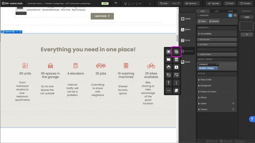
Step 1: To add a new Reveal, Drag and drop the interactive element found in the Interactive menu.
Step 2: On the Reveal trigger you’ll place the first thing the user will see, and on the Reveal container what will be revealed.
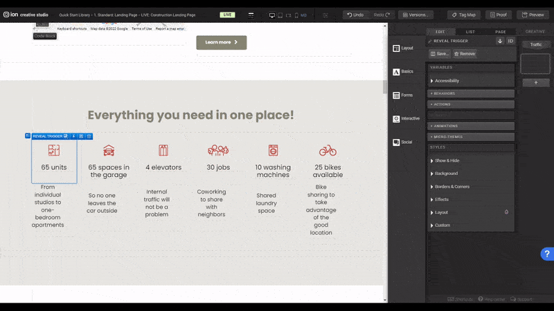
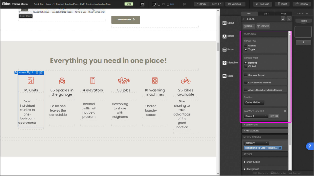
Step 3: To edit the settings of your reveal, first select the Reveal element and the settings menu will appear on the right side.
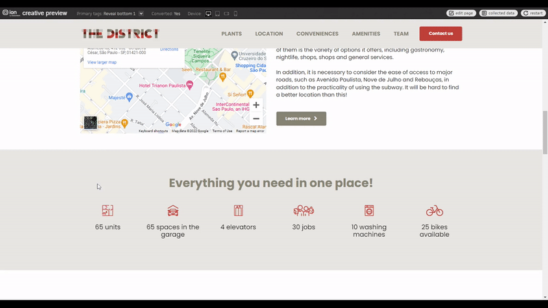
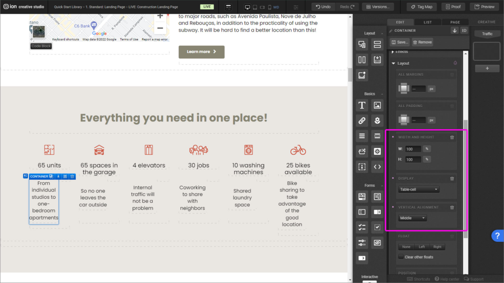
Step 4: In this reveal you can notice that the elements are aligned horizontally and vertically to the center of the container. That’s achievable with the use of Tables. The structure is based on a Table with a set height and width, and one inner Table-cell with set height, width and position of its content.
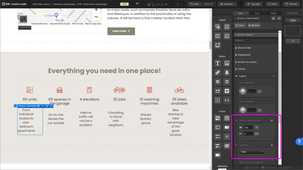
Step 5: The table can be set by selecting the outermost container, in this case the Reveal Container and on the Styles menu, under the Layout accordion, you’ll set your height and width of 100%. Under Display you’ll be able to set the Table feature.
Step 6: Inside the table place all your content inside a container, this is going to be your table-cell. To set it, go to the Layout menu and set height and width 100%, Display as Table-cell and most importantly under Vertical Alignment set it to Middle. Now you’re able to center your content on more Ion projects!
Scroll-to menu navigation
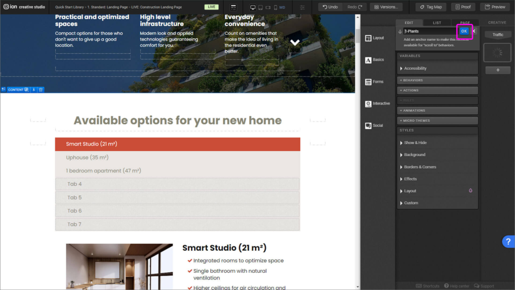
Step 1: With your navigation menu set, you must go to the container or element to anchor the element that is going to be scrolled to. Once selected, on the right, in the Edit panel, you’ll find an anchor icon.

Step 2: Once you click on the icon, properly name it and click “Ok”. Repeat the step for all the navigation elements you desire to link. One important pieces of information: scroll-to won’t work if you name two anchors with the same name. All anchors must be uniquely named.
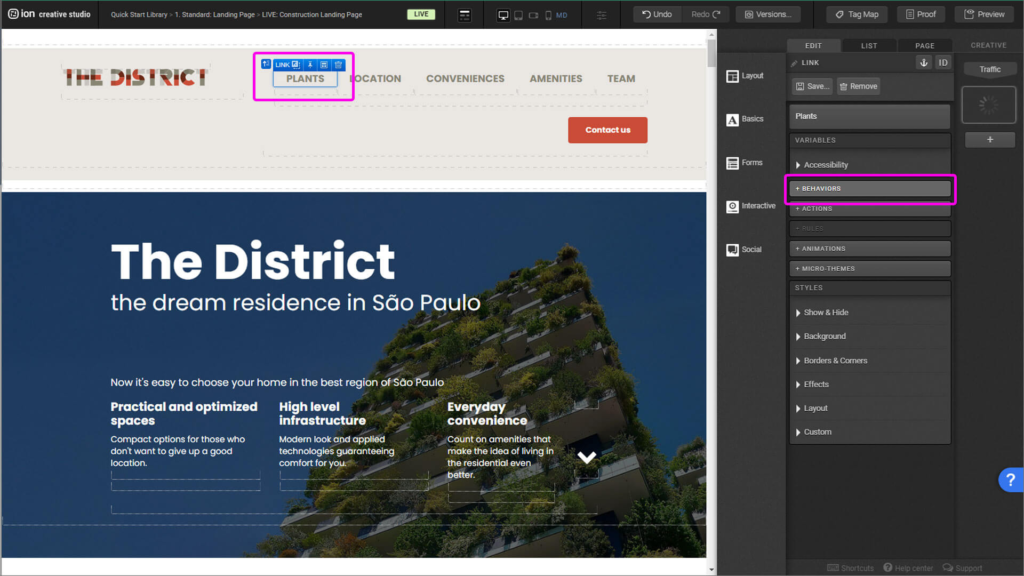
Step 3: Back to the navigation menu, select the link. Then, on the right, in the Edit panel, you’ll select “Behaviors”.
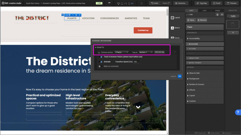
Step 4: Find the anchor you desire to link and uniquely identify it with a tag. Then click ok.
Tabs
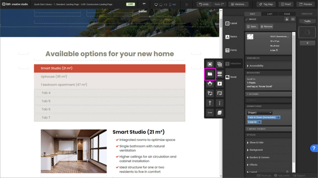
Step 1: Tabs are located on the right side, in the Interactive tab, you’ll find the interactive element Tabs, drag it and place it inside the middle column of the Responsive Grid.
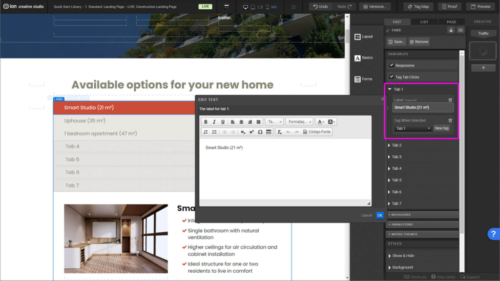
Step 2: Select the first tab, edit its Label and add an unique tag. You’re able to edit the label by either clicking the element twice or on the right side panel.
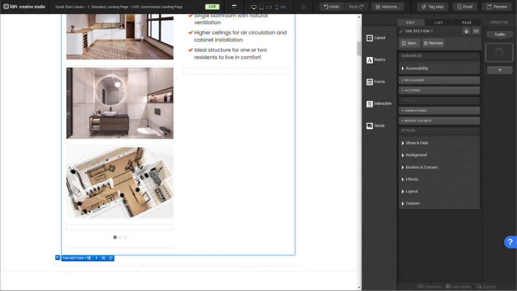
Step 3: You’re now ready to place your content inside the Tab sections, such as flows, images, videos, text, etc.
Content Writing Template
Here is the content structure’s template to make it easier for you when providing content guidelines or creating the copy for this template, from understanding the content structure to getting to know the amount of words needed to each text piece.
Related templates
If you like this template, you might want to check out these other similar models.
Have a question?
Still have questions or are facing troubles when handling this template? Please do not hesitate to send any additional questions to [email protected], so we can make sure to have this article constantly up to date.



Social Profiles