The Battle Cards Infographic is a standard infographic with 6 sections that compares 3 different themes or topics. This full page experience is excellent for comparing different content side by side which will help your viewers understand how each topic can benefit their needs. The side navigation allows the viewer to switch and explore between different categories. Interactive reveals and animations will keep the viewer engaged as they navigate through the experience. At the end of the experience, the viewer has the option to contact your company.
- Type: Infographic
- Complexity: Medium
- Use case: Engagement
Features available
Here are the major features, abilities, and interactive elements used in this template.
- Animations
- Sticky Navigation
How-to use
Here is a helpful guide on how to handle all the major features, abilities, and interactive elements available to make the most out of this template.
Animations
Step 1: To edit or apply an animation, first select the element you want to animate on the canvas.
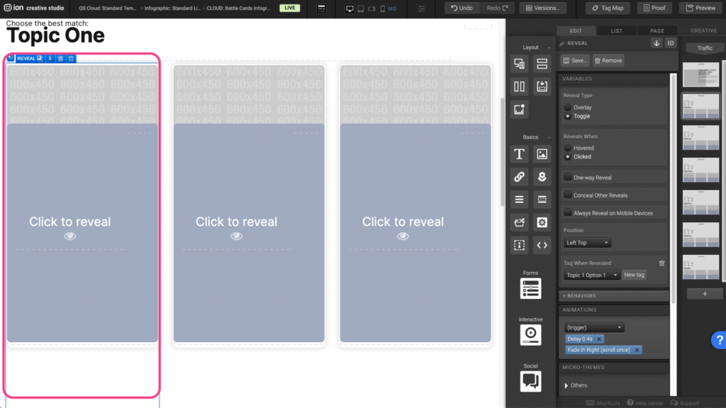
Step 2: Under the Animations panel, expand the (trigger) dropdown to select the animation trigger.
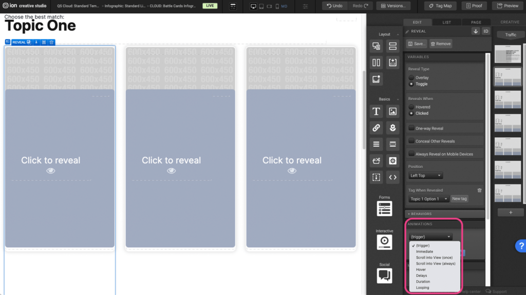
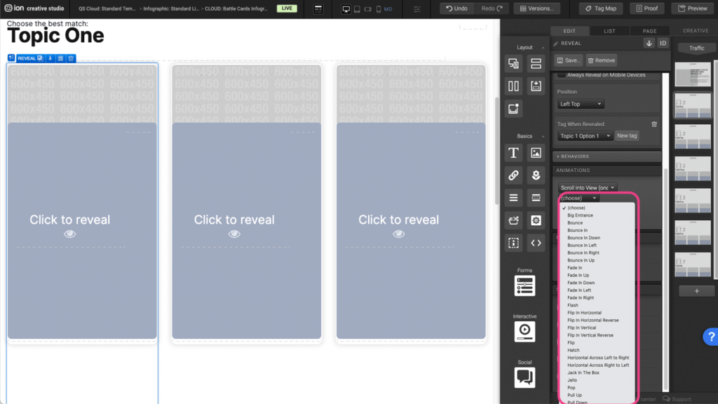
Step 3: After selecting the animation trigger, expand the (choose) dropdown and choose the type of animation you want to apply to the element.
Sticky Navigation
Step 1: To edit the navigation, first select the Sticky Container on the canvas.
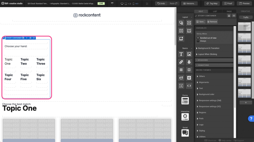
Step 2: Within the sticky container, there are Containers with Text elements and Link elements. Each Link element will lead the user to another page in the creative. To edit the link location, select one of the Link elements.
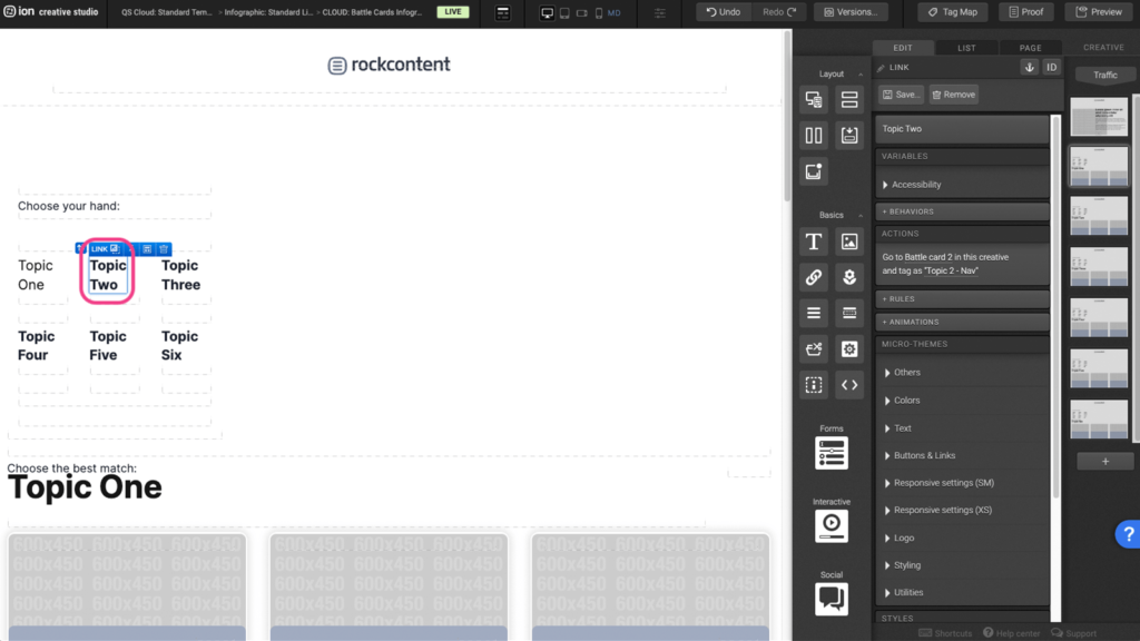
Step 3: Click under the Actions panel, to open up the action settings.
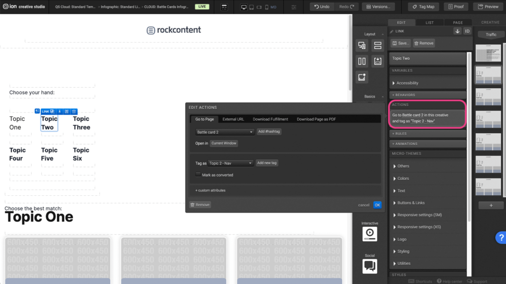
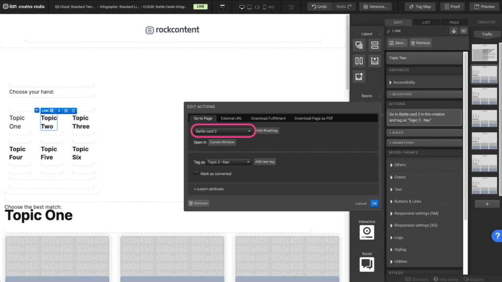
Step 4: Under the Go to Page tab, you can select, from the dropdown, which page the link will go to next. Once you select the page, press OK to save.
Content Writing Template
Here is the content structure’s template to make it easier for you when providing content guidelines or creating the copy for this template, from understanding the content structure to getting to know the amount of words needed to each text piece.
Related templates
If you like this template, you might want to check out these other similar models.
Have a question?
Still have questions or are facing troubles when handling this template? Please do not hesitate to send any additional questions to [email protected], so we can make sure to have this article constantly up to date.


Social Profiles