In this video, we will discuss some of the more advanced features available for freestyle forms including a discussion of styling, error validation, form layout and more.
Freestyle Forms: Textbox
The most commonly used field in a form is a textbox. To add a textbox to your custom form, simply drag the textbox icon into your custom form container.
Field Labels
Your textbox will include a textbox at the top of the field by default. You can double click the label to edit it as needed. The position of your label can be modified with a micro-theme. With your form container selected, you will see the option for label positioning within the “Form” micro-theme category.

The field label can also be removed altogether if you would prefer to use placeholder text for the textbox.
Input Types
After you pull a textbox into your form, you will want to select an input type. The input type controls the formatting of your textbox. When viewed on a mobile device, the input type options allow specific keyboards to be presented to visitors when they select a given textbox. The six input type options are:
- Text – allows anything to be entered into the textbox
- Multi-line Text – a larger textbox will be presented to respondents which in turn gives them an opportunity for a longer response (i.e. comments field)
- Number – only allows numeric values to be submitted
- Email – only allows email addresses to be submitted
- Phone Number – only allows phone numbers to be submitted
- Date – only accepts dates to be submitted and will give visitors a calendar to choose a specific date from
- Password – text will be hidden while respondents enter password into textbox
Required Fields
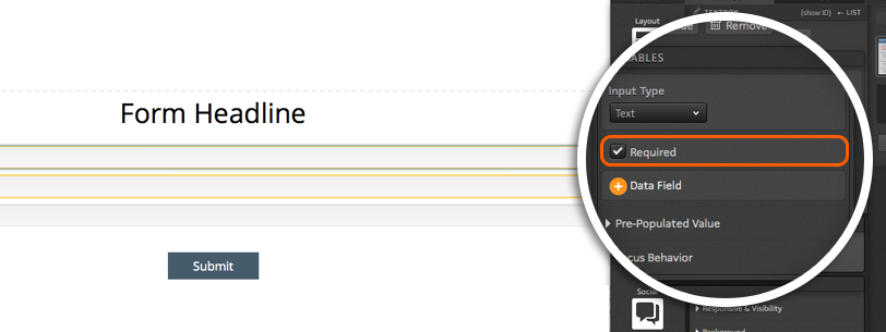
You can make the textboxes in your custom form required like you would within your Form Library. To make a given textbox a required field, simply check the Required checkbox.
Data Field
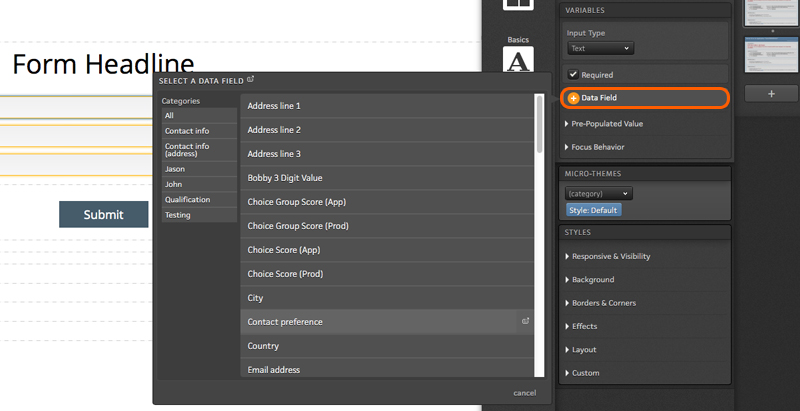
Next, you will want to apply a data field to your textbox so that data is saved to the platform. To assign a data field your textbox, click the Data field button to open a flyout. From here, select the data field category and data field from the flyout to save data from the textbox to that field.
Pre-populated Value
You can set default values and add placeholder text to your textboxes too! As a first step, you will want to define the initial value using the available dropdown. Within the initial value dropdown, you will find three options.
- Respondent data or default value – pre-populates textbox with data that was entered during a previous visit to the page or, if none is available, displays a custom default value
- Default value – pre-populates textbox with an initial value that is manually set within your creative studio
- No value – data will not pre-populate textbox
*Note: If you use one of the first two options listed above, you will see a button available to add a custom initial value. To manually set an initial value that will always be displayed to visitors, simply click this button and enter the desired initial value.
Within the Pre-populated value section, you will also find the option to add placeholder text. Unlike the initial value option, this would not be used to save data to the textbox. Instead, this would allow you to display a field label inside of your textbox that would automatically be removed when a respondent clicks into the textbox.

Focus Behavior
Within the focus behavior section, you will find two options.
Auto-focus – when enabled, the visitor’s cursor will automatically be placed inside this textbox on page load
Select text on focus – when enabled, visitors who click into the textbox will automatically highlight the initial value so that when they start typing, it will overwrite the initial value
Freestyle Forms: Choice Group
When working with forms, you likely have added checkboxes or radio buttons to it. You can add checkboxes and radio buttons to your custom forms too!
Let’s get started
To begin, drag the Choice Group icon into your custom form.

With your Choice Group in place, you will see a few options available within your creative studio.
The first option is to allow visitors to select multiple choices. This option is typically used when presenting visitors with checkboxes. If you are going to turn your Choice Group into radio buttons, you will likely want to uncheck this box.
Next, you will see the option to make this a required field. If you want to ensure respondents select one of your choices, you will want to check this box.
Below the Required checkbox, you will see an option to assign a data field to the Choice Group. This is a very important step as a data field must be defined to properly save which choice(s) respondents are selecting. To assign a data field to your Choice Group, simply click the “+ Data field” button and select the desired field from the flyout.
Finally, you will want to choose an option for the pre-populated value from the available drop down menu. Here you will leave two options:
- Respondent data or choice defaults shows the selection(s) a given respondent selected during a previous visit.
- Choice defaults will show the default state that you have set up for each choice regardless of anything that may have been selected during a previous visit.

Choices
After your choice group variables are set up, you will want to first ensure that you have enough Choices within the group.
By default, your Choice Group will include two Choices. You can remove choices by selecting a given choice and then clicking the remove icon within your creative studio.
You can add more Choices to the group by dragging the Choice icon into your group.

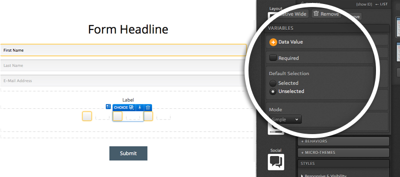
When editing a Choice, you will want to ensure that a data value is applied. You will see a button in your Creative Studio available for applying a value when editing a Choice. The value entered here is what will be saved to the platform when this Choice is selected.
Also in your Creative Studio, you will see a checkbox to make this specific Choice within the group required for form submission.
Next, you will see an option to make your choice selected or unselected by default when visitors land on the page.
Your Choices also have two modes that can be used – simple and expanded. Simple mode will show any content you publish into a given Choice’s container.
If you switch over to the expanded mode, you will have two containers to publish content into for your Choice. The first container is what will be shown to visitors when the page loads. Content published into the second container will be displayed when that Choice is selected. This gives you the ability to apply your own custom on-state to your choices!
Adding Content
When you drag the Choice Group icon into your custom form, you will now see two checkboxes in place by default with containers next to them.
If you want to have text next to each choice, simply drag your text editor icon into the choice container.

If you would like to place an image next to your choices, you can absolutely do that too!
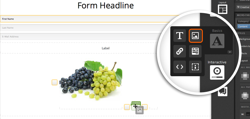
You can even add grids to your Choices for even more control over how content is displayed within your Choices!

Freestyle Forms: Drop down
Drop down menus are a very common way to give respondents multiple options to choose from within a form. Drop down menus can easily be added to your custom forms in ion!
Let’s get started
To begin, drag the Drop Down icon into your custom form.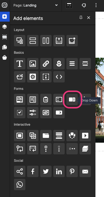
With your Drop Down in place, you will see a few options available within your creative studio.
The first option is to make this a required field. By checking this box, respondents will need to select one of the options from your drop down menu before they can submit the form.
Next, you will be able to assign a data field to your drop down menu. This is a very important step in the process as this is the data field into which information will be saved within your ion console.
You will then see a button that allows you to assign a choice set to your drop down menu. This will function just like when adding a drop down menu to your library forms as your choice set is what will control what options are presented to visitors within the drop down menu. For more information on choice sets, click here.
Finally, you will see the “Show Search” option. When enabled, respondents will see a search bar within their drop down menu that they can use to simply type in the option they are looking for.

Pre-Populated Value
Within the Pre-Populated Value section, you will be presented with a drop down containing three choices.
- Respondent data or default value – This option is your typical default ion form behavior which will allow you to show a default value to unique visitors and data previously selected to return visitors.
- Default value – The same default value will always be shown to unique and return visitors alike.
- No value – Visitors will not see a default value or previous selection but rather will either simply see a blank drop down menu or placeholder text that you can define within your creative studio.
*NOTE: Default values will be saved and can be submitted with form data even if respondents do not select something else in the drop down. Placeholder text will simply show text in the drop down menu when the page loads but visitors would not be saved to the platform upon form submission. If the field is required, respondents will not be able to submit the form with the placeholder text shown as they will need to select an option from within the drop down menu.
Focus Behavior
When auto-focus is enabled from within the Focus Behavior section, visitors will automatically be taken to the drop down menu on page load and would be able to use their keyboard to make a selection without needing to use their mouse.
Freestyle Forms: Create choice set filters
You can use ion’s choice set filters feature to create conditional choice sets as visitors make selections within freestyle form drop down menus.
For example, the first drop down menu could collect a state and the second drop down could show store locations within that state.
Here are the steps involved:
1. Format a .CSV file of your choice set
Column A: [Choice Names] – choices that will be shown in choice set
Column B: [Choice Values] – values stored into ion database
Column C: [Filter 1]
*Note: Column headers are not necessary. Filters are limited to three per choice set.
Ex.
AL, Location 1
CA, Location 2
FL, Location 3
*NOTE: You may also build choice set filters directly in your ion choice set by entering the above information into the corresponding columns when editing a given choice within your choice set.
2. Upload choice set .CSV to ion
- Navigate to Data Management > Data Collection > Choice Sets
- Navigate into an existing choice set category, or add a new category
- Add a new choice set and label it accordingly
- From the Choice Set Actions dropdown in the top right, choose Import Choice Set
- Choose file to import, click ‘save’

3. Create freestyle form
- Add a freestyle form to your ion page with drop down menus. For more information on working with freestyle forms, click here.
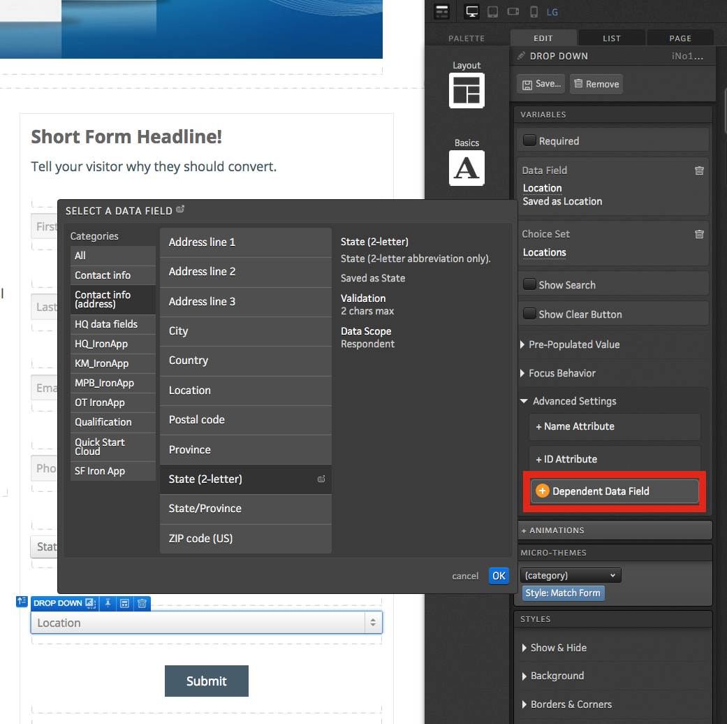
- Within the advanced settings for the second drop down, click the “+Dependent Data Field” button to and select the field you want to make the second drop down menu dependent on. In this example, the State field is selected to make the Location drop down menu dependent on the State field. This will filter the Location drop down menu based on the value collected in the State drop down menu to only show locations relevant for the state selected.
Freestyle Forms: Slider
You can add a slider to your custom forms to give respondents an interactive way for selecting a numeric value. When a Slider is added to a custom form, you will be able to define the beginning and ending range values as well as the incremental steps in between. The ion platform will then automatically save the selected value into a data field of your choosing.
Let’s get started
To add a Slider to your custom form, simply drag the Slider widget into your custom form.
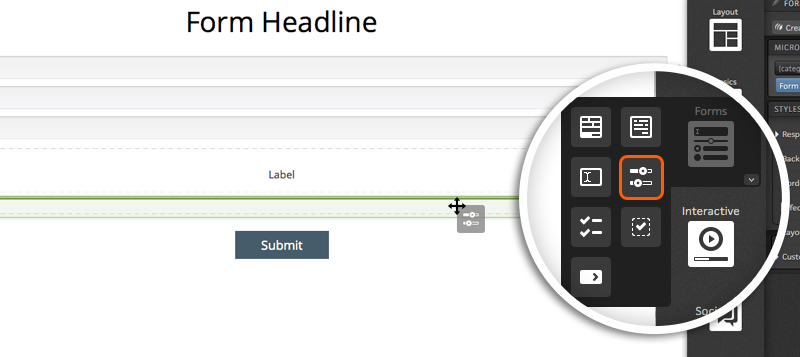
After adding the Slider to your custom form, you will see several options within your creative studio.
Orientation & Data field
The first option you will see is the orientation dropdown. This will allow you to define if you want the Slider to display horizontally or vertically.
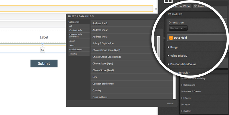
Next, you will see a button to assign your Slider to a data field. This is an important step as the platform will save data to the data field you select. To assign a data field to the Slider, simply click the “+ Data field” button and select the desired data field from the flyout.
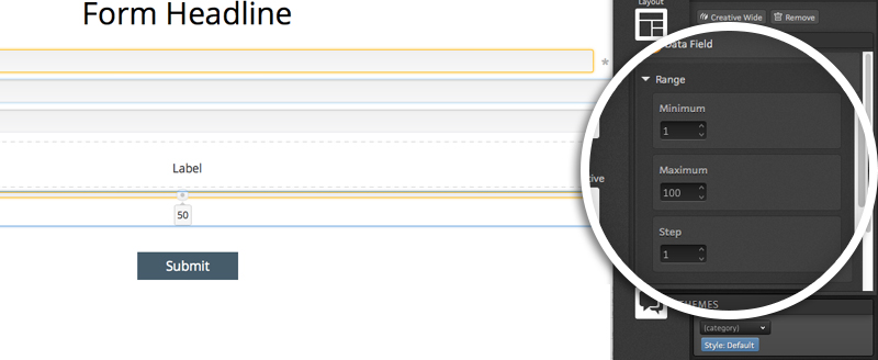
Range
The range options allow you to assign minimum and maximum values for your Slider. You will also find a “Step” option within the Range section. The step is the increments in which your slider will adjust.
For example, if you have a minimum value of 0 and a maximum value of 100 and you set your step value to 10, each move within the Slider will account for an increase of 10 (i.e. 0, 10, 20, etc.).
Pre-populated Value
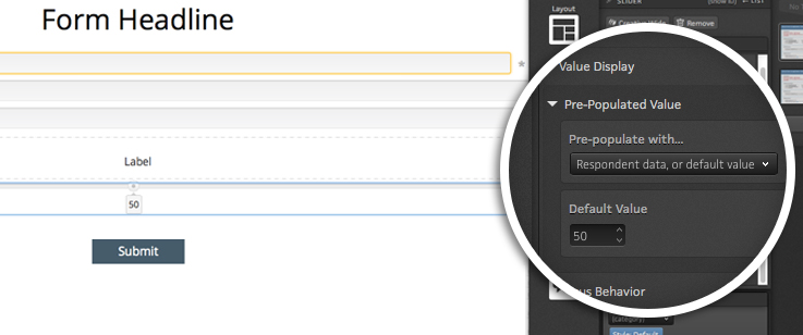
The Pre-populated value gives you three options for your slider:
- Use data field if any, or custom value – pre-selects data that was saved during a previous visit to the page when a given respondent returns to the page.
- When this option is selected, you will also see an option to enter an default value that will be displayed if data has not previously been collected for a given respondent.
- Default value – gives you the ability to enter a value that will always be seen whenever a visitor lands on the page (even if they have previously submitted the form).
- None – all unique and return visitors will be given a slider that starts at the minimum value
Value Display
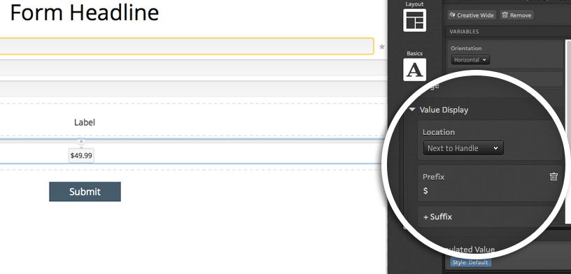
The value display options allow you to define where the selected value is displayed. By default, the value will be displayed beneath the Slider handle but you can have the value displayed on the left or right side of the slider instead if you prefer.
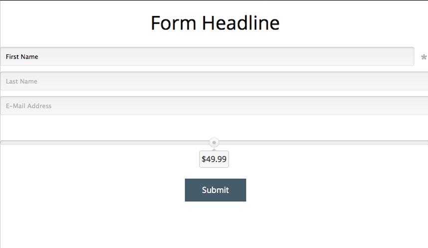
You will also have the option to apply a prefix and/or suffix to your value. This can come in handy if you are allowing respondents to select a price as it allows you to enter a dollar sign as the prefix and or display cents to the right of your value.
Focus Behavior
The focus behavior option allows you to auto-focus on the Slider when the page loads. When this is checked off, respondents will be able to use their keyboard to adjust the Slider as soon ash the page loads without clicking.
Freestyle Forms: Error Messaging
Custom error messaging can be shown within your freestyle form fields. Below, please find steps to add a custom error message to your freestyle form fields.
1. Drag text editor into freestyle form container

2. Enter the desired error message into the text editor and style your text.
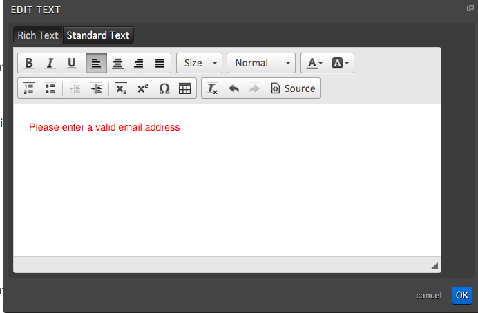
3. With the error message text selected, click into the “Form” micro-theme category and open the next drop down menu. From here, you will see options to show or hide your custom error message when the data entered into the field is valid, invalid, incomplete, validating or unknown.

*NOTE: Error messaging is typically set to show when the data is invalid and/or incomplete. You may assign multiple error message micro-themes to your text to have it show or hide under multiple conditions.


Social Profiles