Ion’s Rich Text Editor gives you the ability to create enticing text styles without using HTML. Simply click and drag the “T” icon from the “Basics” Palette category into your page, or double-click on the Text already added to your page to open the Rich Text Editor.
Here you will see many options similar to those from your favorite word processing software programs. Placed at the top of the Rich Text Editor, the following options can be applied to your text:
- Bold, Italicize, Underline, Alignment, Font Size, Font Color, Highlight and Indent.

Also, available within the Rich Text Editor is the ability to Subscript and Superscript your text (by using the X2 and X2 buttons, respectively). Next to them, you will notice a Ω symbol to insert commonly used Special Characters like copyright, trademark and registered trademark symbols, to name a few.
There is even a Source Button which can be used to place HTML directly into your Rich Text Editor, utilized for specific changes to the HTML and/or to add your YouTube Embed Code to the page. Did you make a mistake? No worries! You can utilize the Undo and Redo buttons to go back a step or to re-apply an addition to your text.
Editing Text with Micro-themes and other settings
Micro-themes for Text
Besides using the Rich Text Editor, you can edit your text by applying Micro-themes. The options from the first dropdown menu include:
- Alignment, Bullet List, Buttons and Directional Buttons, Color, Font Size and Responsive Font Size, Fonts, Responsive Settings and more.
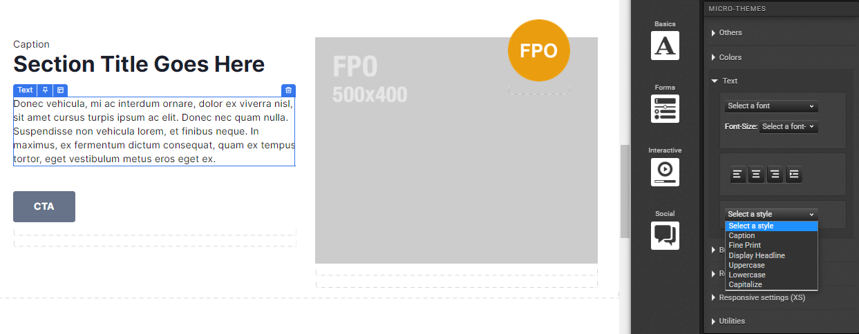
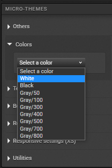
Keep in mind that, if the Rich Text Editor’s Alignment refers to the position of the text inside the text component, on Micro-themes > Alignment it will refer to the position of the text component itself in relation to the Containers that might contain it in Ion’s hierarchy (like a Column). Furthermore, on Micro-themes > Color or Fonts, for example, the options will match the colors and fonts respectively from your Theme and brand, which is great to keep the visual identity throughout the page.
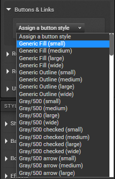
Another great feature is Micro-themes > Buttons, in which you can turn a text into a button (it will look like a button), still with styling that matches the Theme for your brand – on the second dropdown menu, you will choose from many predefined options combining color, size and style.
For more on Micro-themes, please check these. And for more on adapting your Creative to different screen sizes like mobile, check these.
Other settings (Styles) for Text
Working on your text’s Styles can help you edit it on other aspects than those covered by the Rich Text Editor or Micro-themes, like adding a background, margins and a lot more, so we highly encourage you to explore the options available:
- Show & Hide, Background, Borders & Corners, Effects, Layout and Custom for CSS.
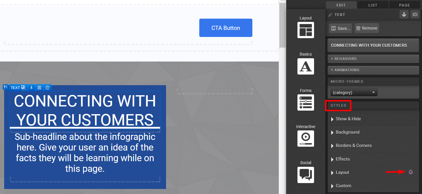
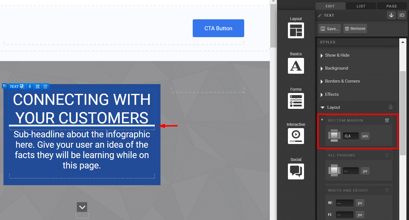
Notice that the purple droplet next to an item on Styles, like Layout on the image above, means there’s a setting there already applied to the text. In this case, it’s a Bottom Margin (using “em” as the unit) – the thick white line on the bottom of the text:
For more on Show&Hide, please check these.
Note that some items offer three options of units: px, % and em. Also, be mindful of applying a fixed Width and Height to any element – it usually works better for side-by-side Columns on a Container, for example. Fixed measurements can impact the responsiveness of those elements.
Very often, text is part of an Interactive Component with its own settings, and it’s worthy to understand that component better by reviewing our articles on it to ensure the settings are supporting your goal of how the experience should look like.
If you have any questions, please contact us on [email protected].


Social Profiles