The One-pager Assessment is an interactive experience that tests a user’s knowledge giving them a total score, and specific percentage score for sub categories. This experience features a vertical navigation, questions using choices, a gated form, scoring, and percentage scoring. The One-pager Assessment is a template ideal for experiences that feature sub category questions, and provide results that are customized to the assessment performance.
- Type: Assessment
- Complexity: High
- Use case: Lead Generation
Features available
Here are the major features, abilities, and interactive elements used in this template.
- Anchors
- Animations
- Icons
- Vertical Navigations
How-to use
Here is a helpful guide on how to handle all the major features, abilities, and interactive elements available to make the most out of this template.
Anchors
Step 1: To add an anchor select the final destination element the user should be sent to.
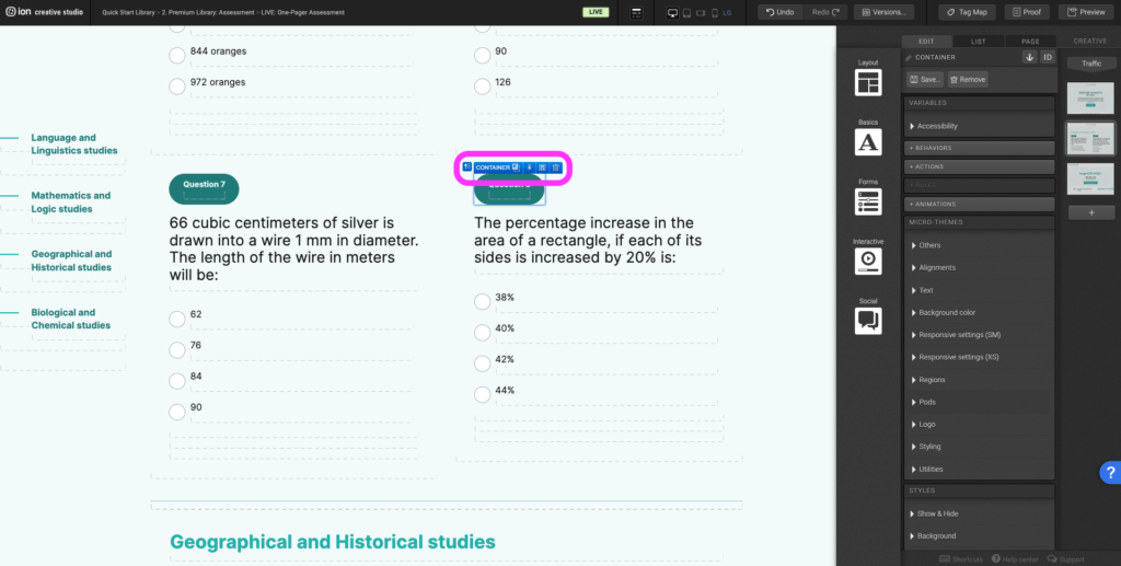
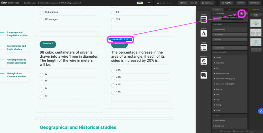
Step 2: On the top right corner of the edit panel select the anchor icon and give the anchor a name.
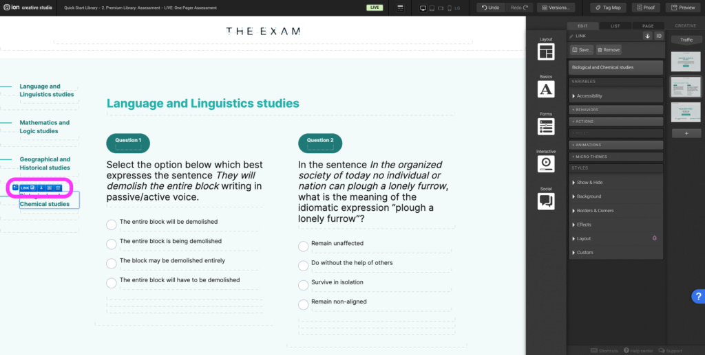
Step 3: Select the element that should take the user to the final destination element when they select it.
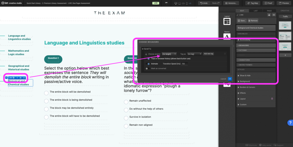
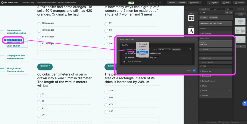
Step 4: Select the +Behaviors panel and expand the Scroll To section. From the (no target) dropdown select the anchor name of the final destination element and assign a tag.
Step 5: To edit or change the final destination, select the element that should take the user to the destination.
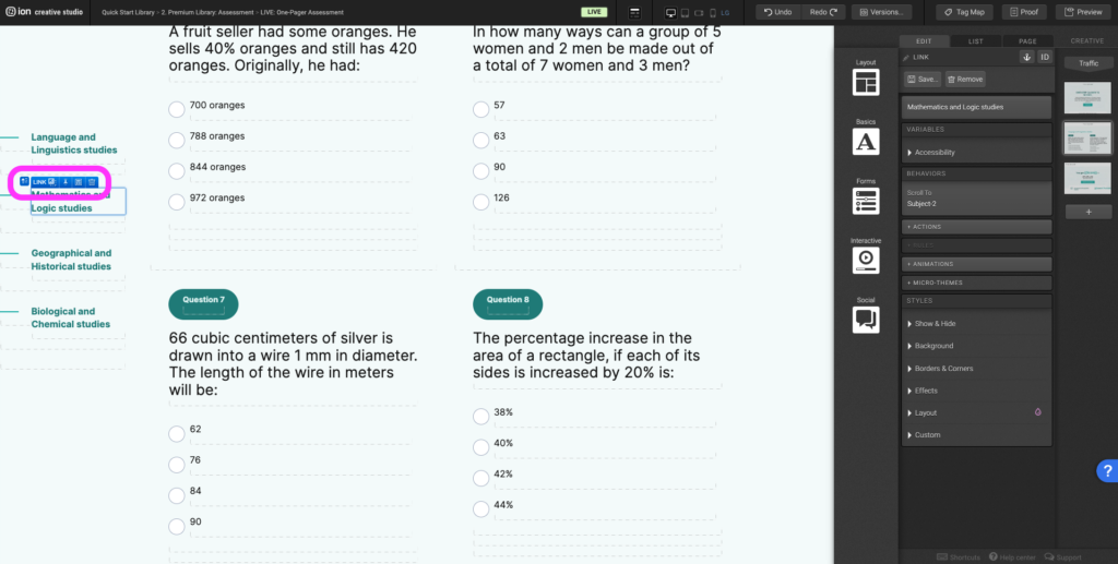
Step 6: Select the Behaviors panel, under the Scroll To section, update the anchor to the new anchor of the final destination.
Animations
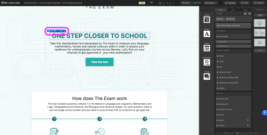
Step 1: To edit or to add an animation, first select the element you want to animate on the canvas.
Step 2: Under the Animations panel, expand the (trigger) dropdown, and select an animation trigger.
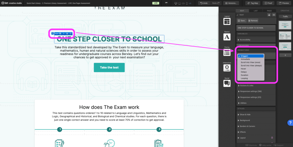
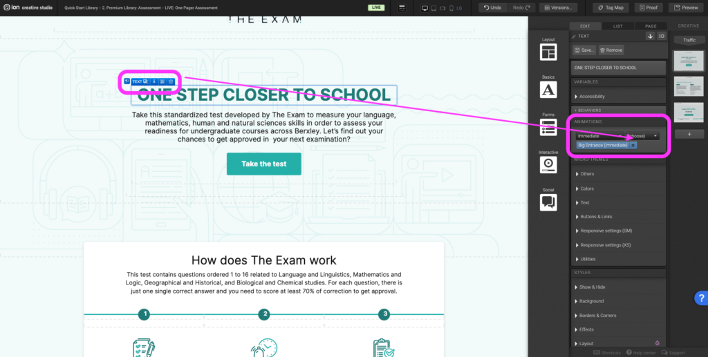
Step 3: After selecting the animation trigger, another (choose) dropdown will appear. Expand the second dropdown to select the type of animation you want to apply.
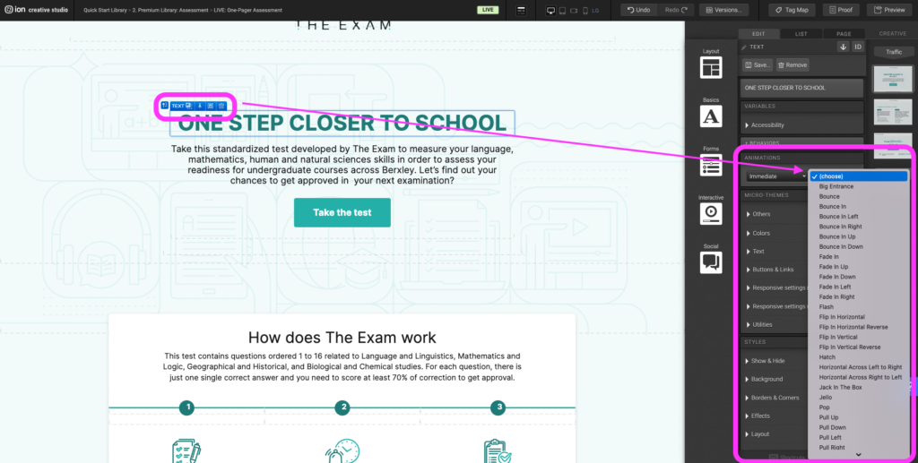
Step 4: To remove an existing animation, click on the X to the right of the blue animation tag.
Icons
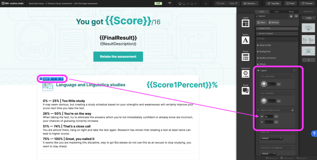
Step 1: To update the icon within the results, begin by selecting the current icon on the canvas.
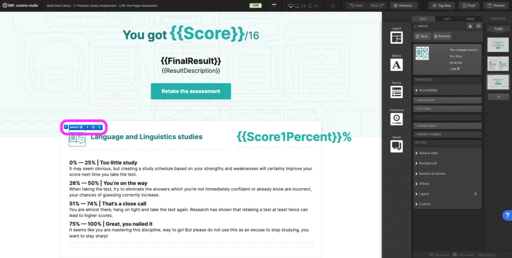
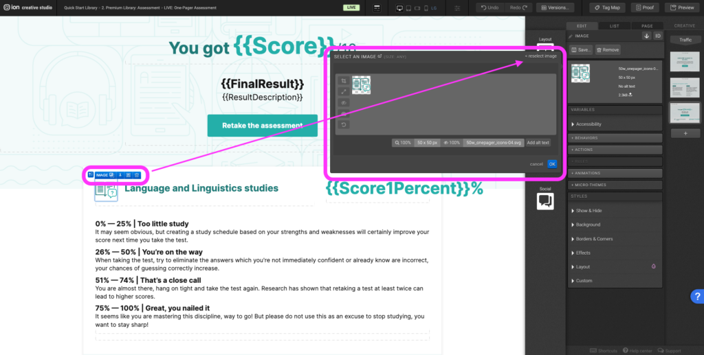
Step 2: Double click on the icon to open the image editor. Select <reselect image on the top right hand corner, on the left hand navigation under Usage select Creative. Upload the new icon on the top right hand corner by selecting Add Images.
Step 3: Edit the image size, expand the Layout panel. Under the Width and height adjust the width.
Vertical Navigations
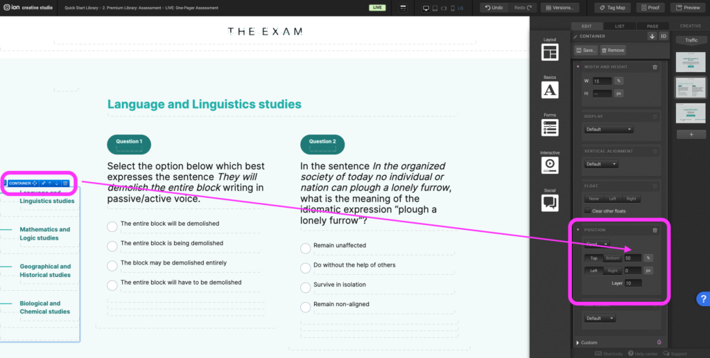
Step 1: To adjust the vertical position of the navigation on the canvas, select the outermost container that the navigation lives within and navigate to the Layout panel.
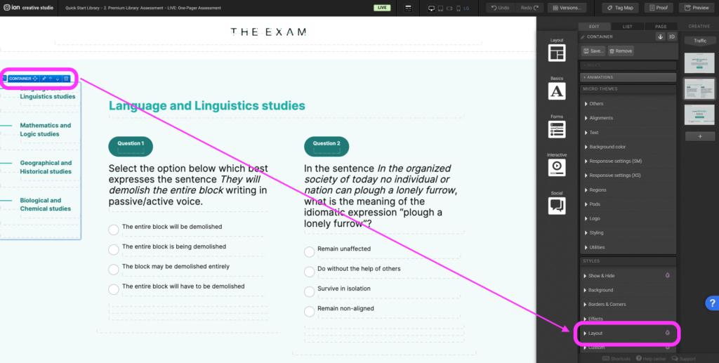
Step 2: Scroll down to the Position category and adjust the Top percentage.
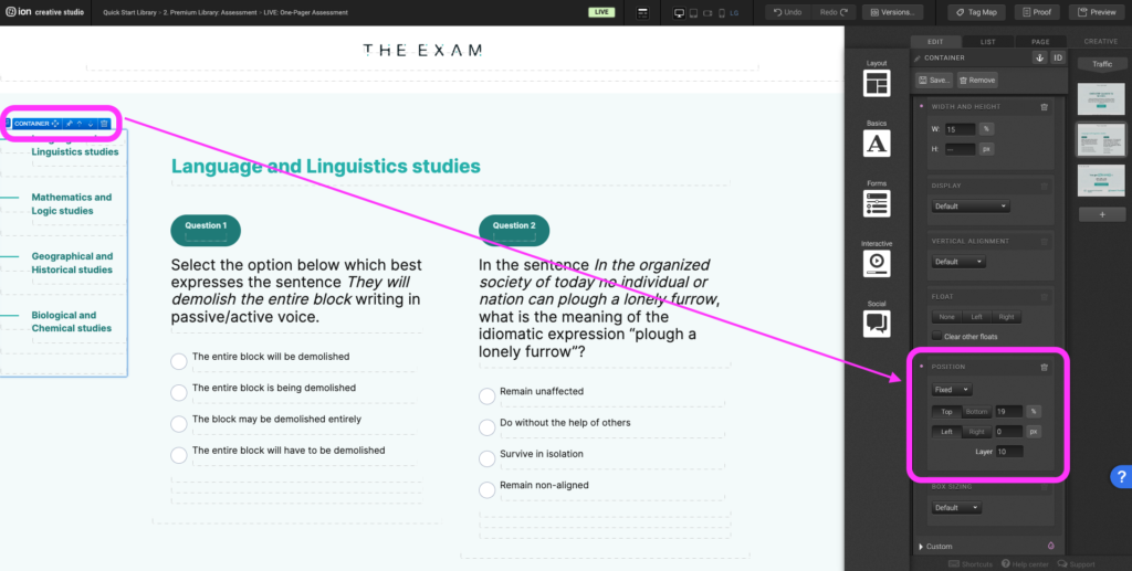
Step 3: The lower the percentage, the higher the navigation will be.
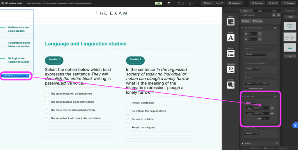
Step 4: The higher the percentage, the lower the navigation will be.
Content Writing Template
Here is the content structure’s template to make it easier for you when providing content guidelines or creating the copy for this template, from understanding the content structure to getting to know the amount of words needed to each text piece.
Related templates
If you like this template, you might want to check out these other similar models.
Have a question?
Still have questions or are facing troubles when handling this template? Please do not hesitate to send any additional questions to [email protected], so we can make sure to have this article constantly up to date.


Social Profiles