The Assessment with Benchmark Results is a complex 16 question, gated assessment where visitors are presented with an in-depth display of their results and a comparison to where they stand with other visitors. The assessment is taken on the landing page and the users can fall within a low, medium or high result bracket. On the landing page, a video background and vertical transitions between questions have been added to keep the visitors engaged and to encourage them to reach the end of the assessment. To gain lead generation, the assessment is designed so that visitors can only view their full results once they fill out the form. Once the form is completed, they can view all the questions along with the answers. An indicator will be displayed next to their answer. Visitors also have the option to retake the assessment if they choose to do so.
- Type: Assessment
- Complexity: Expert
- Use case: Lead Generation
Features available
Here are the major features, abilities, and interactive elements used in this template.
- Animations
- Bar Chart
- Form
- Quiz Questions
- Video Background
How-to use
Here is a helpful guide on how to handle all the major features, abilities, and interactive elements available to make the most out of this template.
Animations
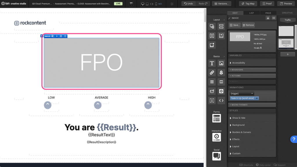
Step 1: On the canvas, select the element you wish to animate
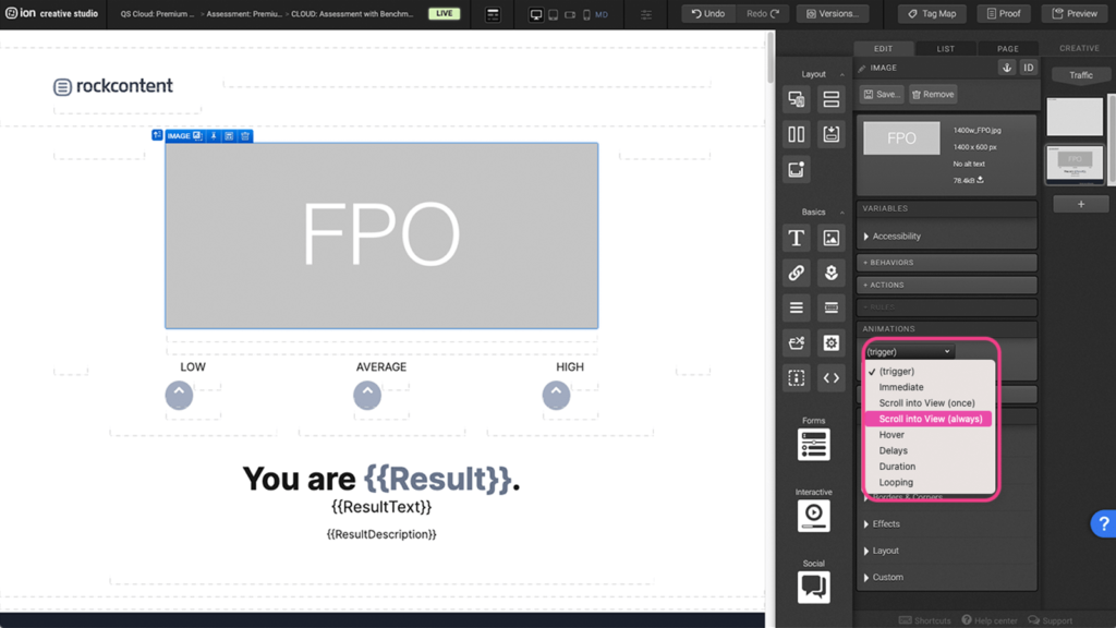
Step 2: Under the Animation panel, choose the type of animation trigger
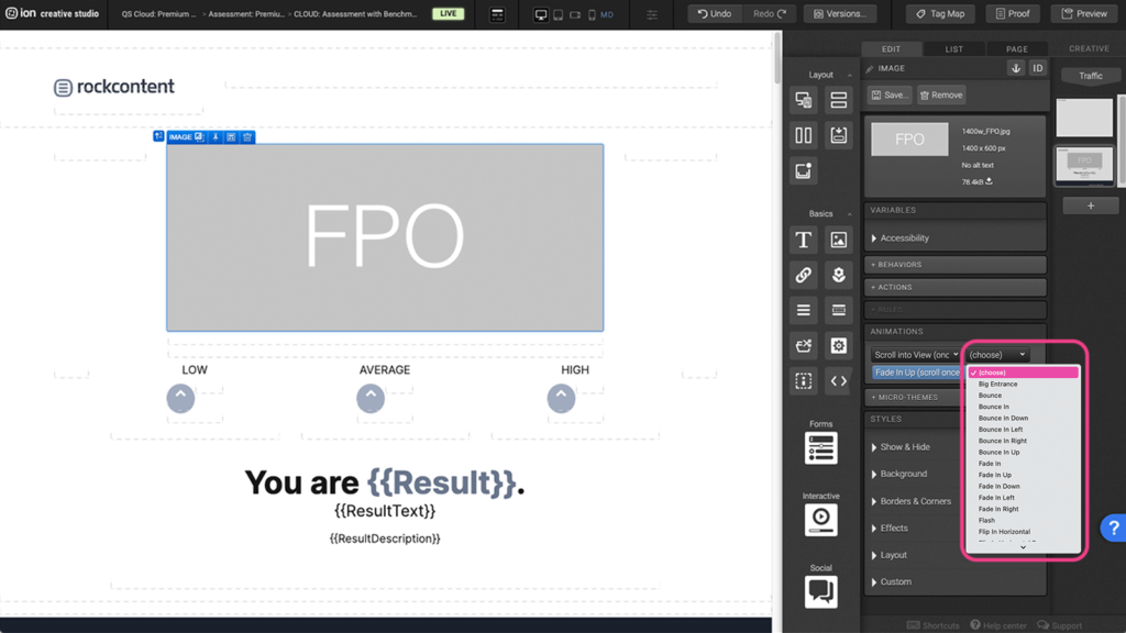
Step 3: From the list of animations, select the desired animation
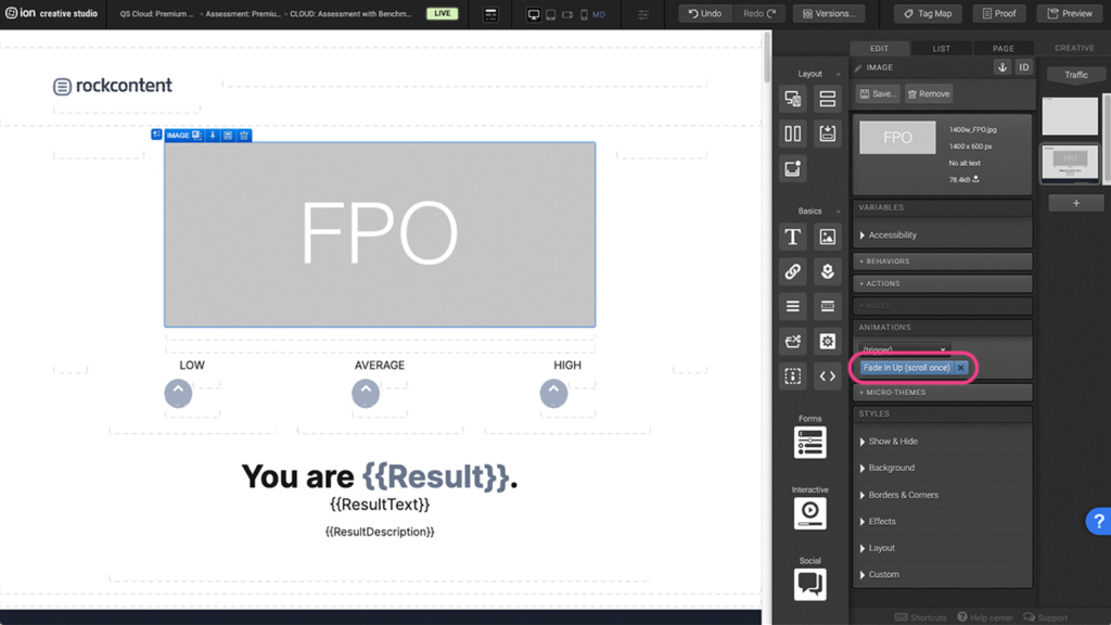
Step 4: If you wish to remove an animation, select the element on the canvas and under the Animation panel, you can exit the blue animation tag.
Bar Chart
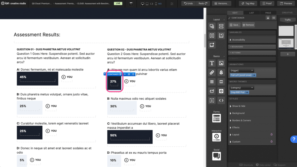
Step 1: To edit the percentage bar, begin by selecting the bar on the canvas.
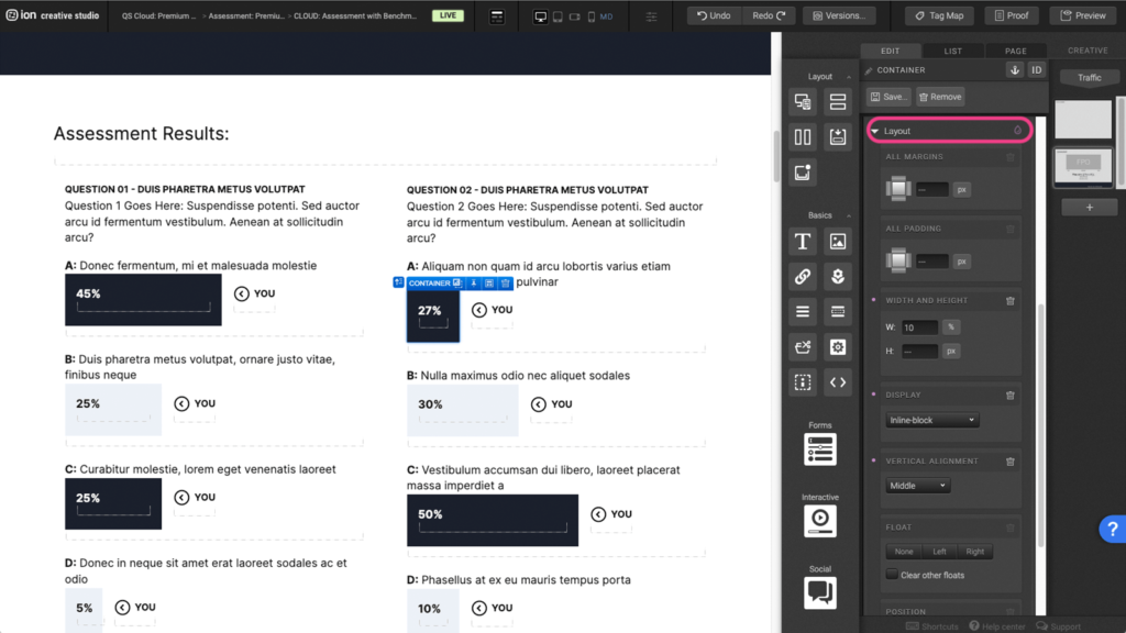
Step 2: Under the Edit panel, expand the Layout tab.
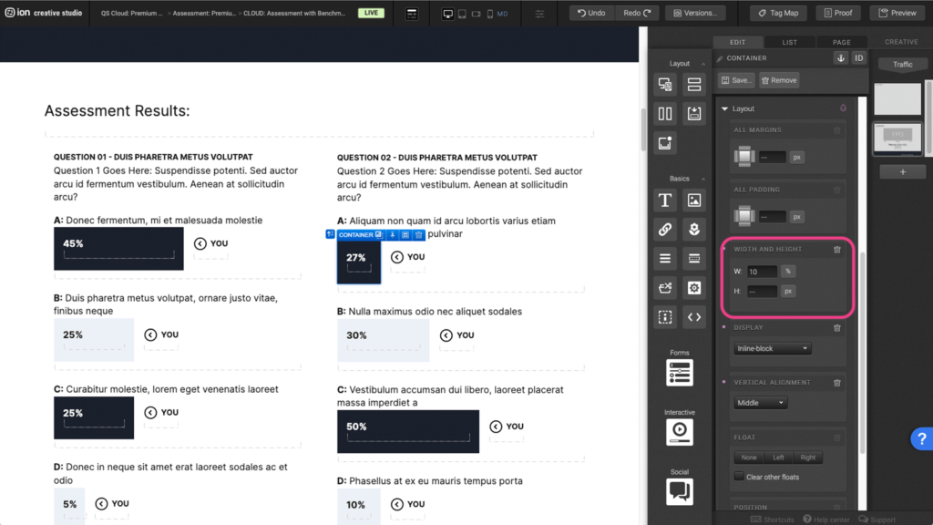
Step 3: Under the Width and Height panel, you can adjust the width and height based on the percentage you wish to display.
Form
Step 1: To change a field within your Form, begin by selecting the Form on the canvas.
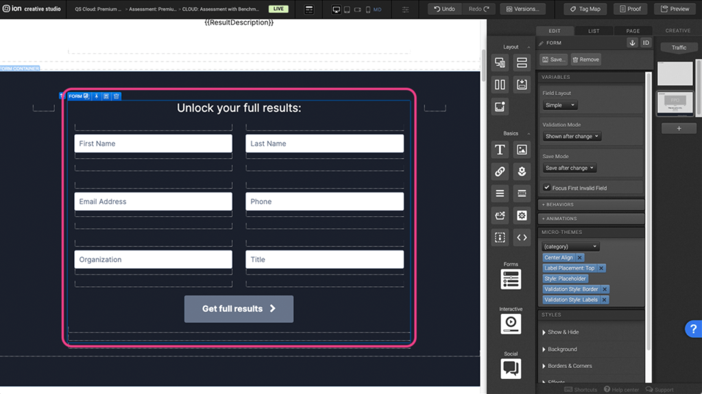
Step 2: Select a field from within the form.
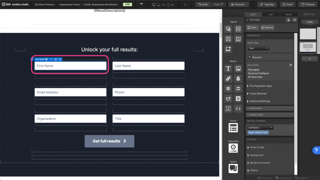
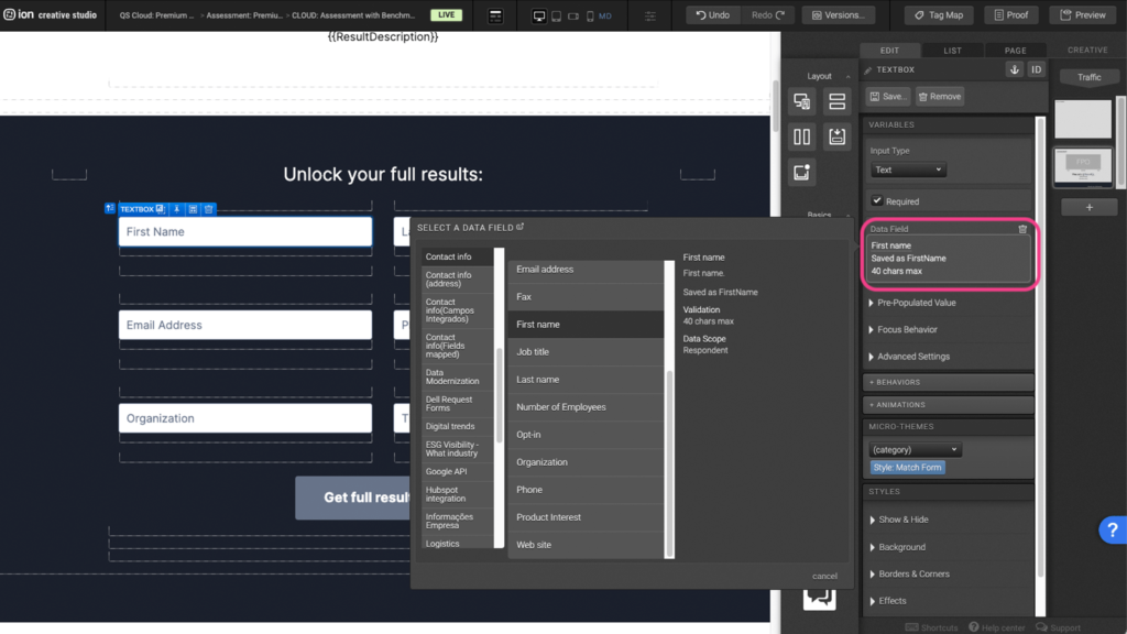
Step 3: Update the input’s Data Field within the Variables settings by clicking on it and then choosing a new Data Field from within the pop-up window.
Quiz Questions
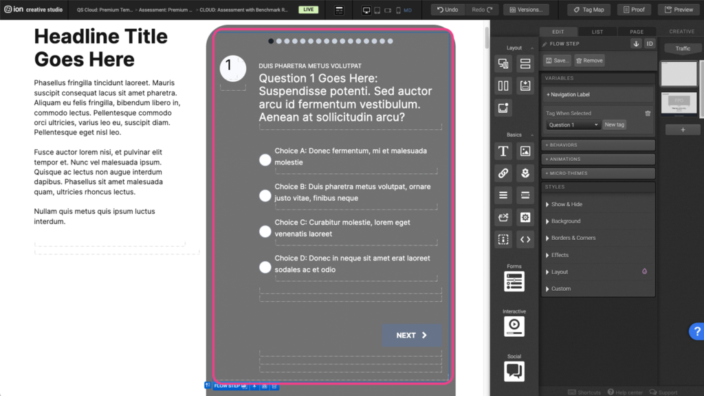
Step 1: For context, each question is set up as a Form element. Within the Form element, is a Form Field that contains a Choice Group. Each Choice Group represents 1 question. Individual choice groups contain Choice(s) which will be the answers to the questions.
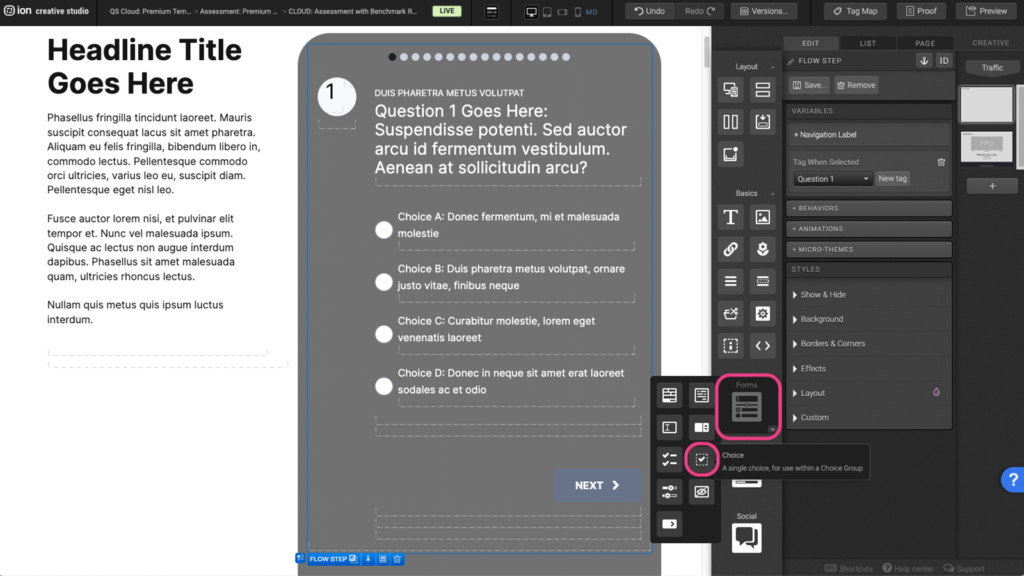
Step 2: To add a new Choice, hover over the Forms icon and drag and drop the Choice icon into the choice group container.
Step 3: Select the new Choice container and add a new Data value under the variables panel.
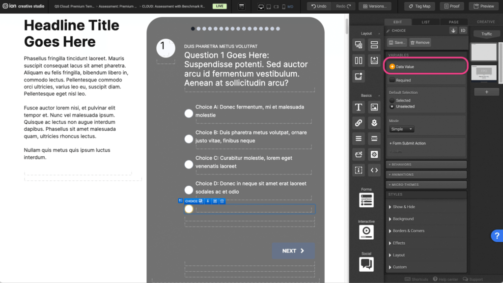
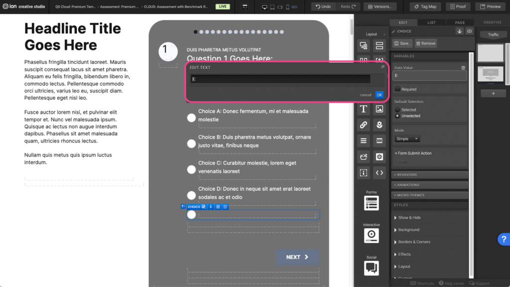
Step 4: Assign a Data Value that can be referenced later in the Page Rules.
Video Background
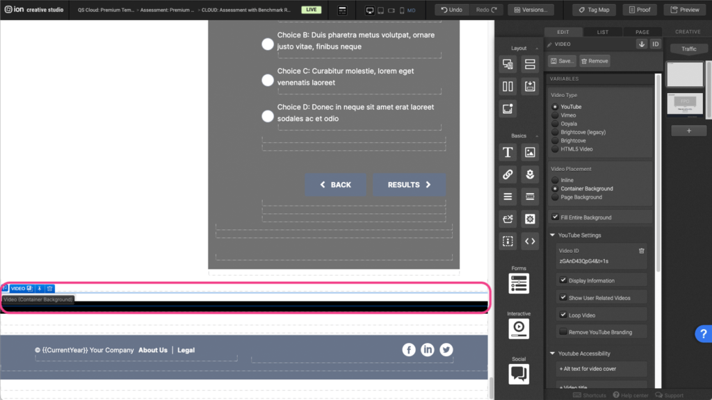
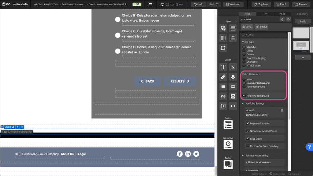
Step 1: Change the video background by selecting the Video (Container Background) element located at the bottom of this experience.
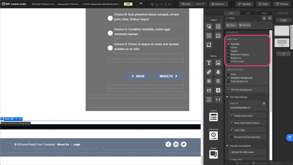
Step 2: Under the Variables panel, select your video type. Each Video Type setting is slightly different.
Step 3: For your Video Placement select Background Container. This will set the video to take up the entire background of the parent container it is sitting in.
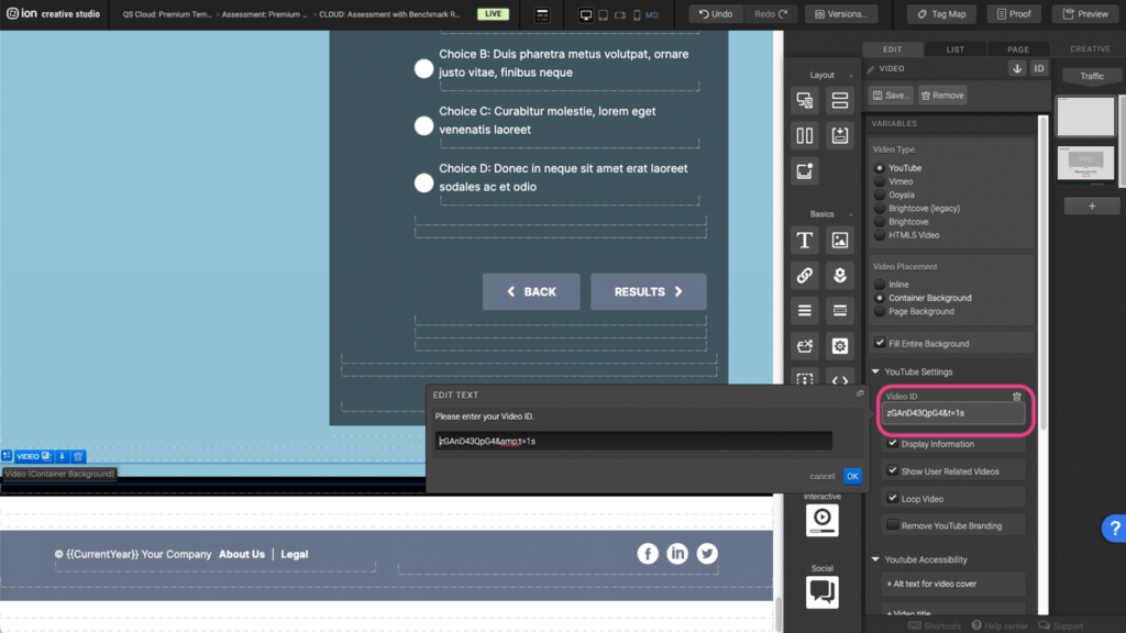
Step 4: Enter in your Video ID. This ID can be found at the end of your YouTube or Vimeo URL string. If your video does not show up after entering your string, you may have the video marked as private or unlisted on YouTube or Vimeo, and this setting will need to be changed there.
Content Writing Template
Here is the content structure’s template to make it easier for you when providing content guidelines or creating the copy for this template, from understanding the content structure to getting to know the amount of words needed to each text piece.
Related templates
If you like this template, you might want to check out these other similar models.
- https://rockcontent.com/gallery/report-card-assessment/
- https://rockcontent.com/gallery/crawl-walk-run-fly/
- https://rockcontent.com/gallery/maturity-assessment/
- https://rockcontent.com/gallery/easy-assessment/
Have a question?
Still have questions or are facing troubles when handling this template? Please do not hesitate to send any additional questions to [email protected], so we can make sure to have this article constantly up to date.

Social Profiles