The Digital Magazine is a medium complexity experience that focuses on user engagement. This template is designed to replicate a magazine. Users are brought to the menu page where they can explore the different chapters to start reading. Each interior page is designed to replicate magazine content layouts sprinkled with interactive reveals to keep it fun and engaging. Each page includes a bottom navigation that allows the user to flip between the previous page, next page and to go back to the top of the page. The Digital Magazine includes video content, reveals and mini quizzes.
- Type: Content Hub
- Complexity: Medium
- Use case: Engagement
Features available
Here are the major features, abilities, and interactive elements used in this template.
- Anchor
- Animation
- Custom Code (Odometer)
- Flow
- Form
- Reveal
- Video
How-to use
Here is a helpful guide on how to handle all the major features, abilities, and interactive elements available to make the most out of this template.
Anchor
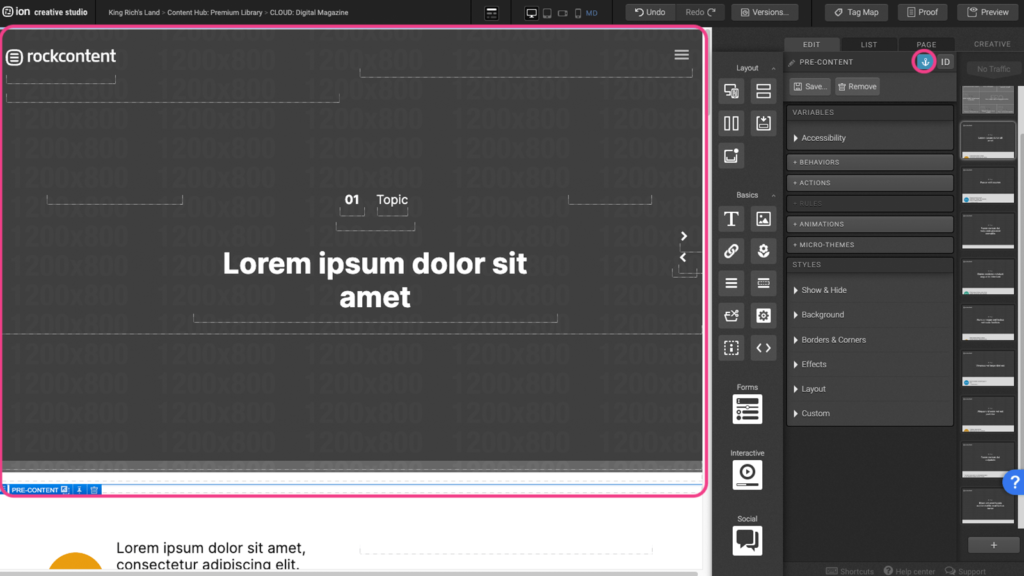
Step 1: Select a section where you want the CTA to scroll to then add an anchor by clicking on the Anchor Icon.
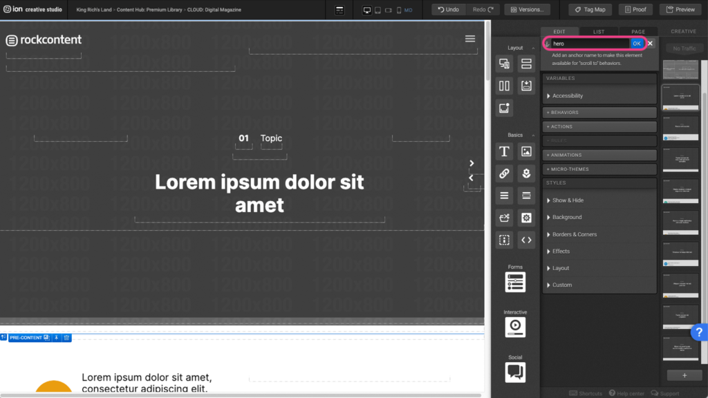
Step 2: Assign a unique name for the anchor and press OK.
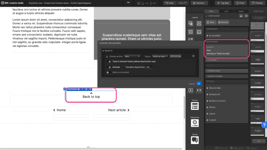
Step 3: Select the element that will link to the anchor and click under the Behaviors panel to open the edit window.
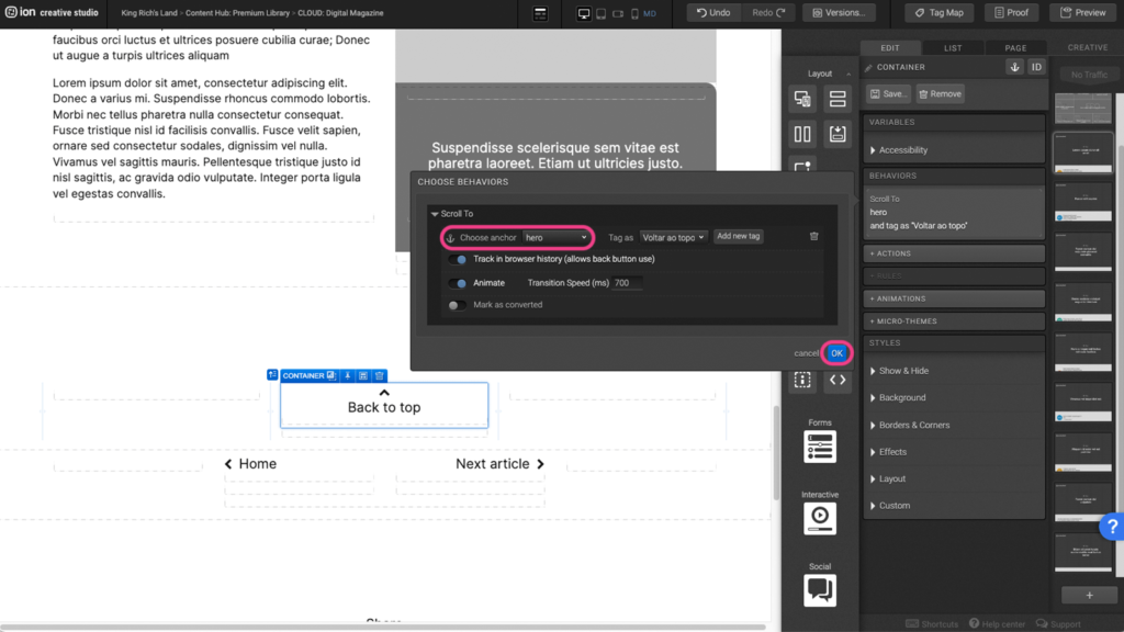
Step 4: Choose the anchor that was previously assigned, from the dropdown menu, then press OK.
Animation
Step 1: To edit or add an animation, first select the element you wish to animate on the canvas.
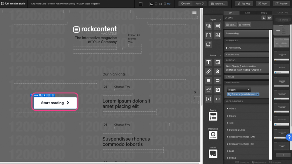
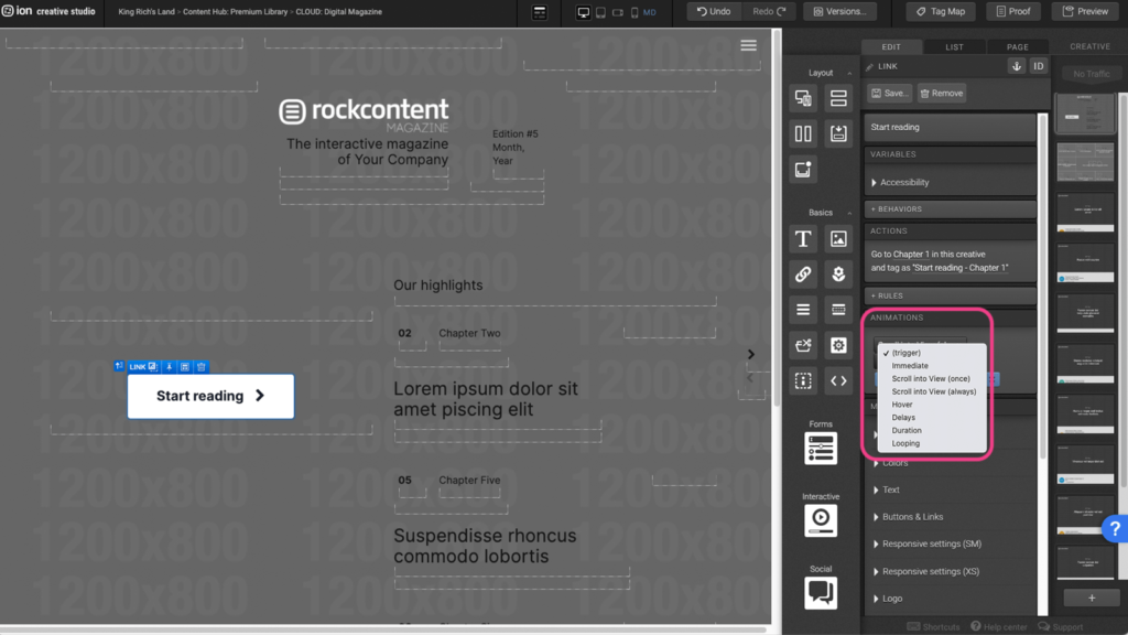
Step 2: Under the Animations panel, click on the (trigger) dropdown menu and select an animation trigger.
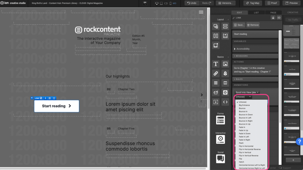
Step 3: After selecting an animation trigger, click on the (choose) dropdown menu and select the animation you wish to apply.
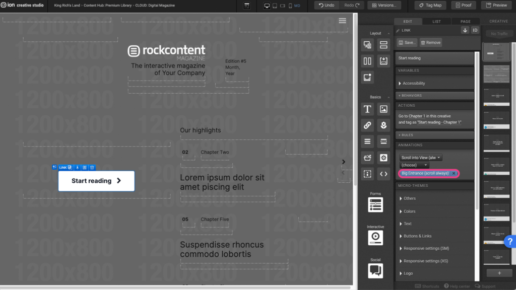
Step 4: To remove an existing animation, click on the X to the right of the blue animation tag.
Odometer (Custom Code)
Step 1: To adjust the odometer values, first locate the odometer Text element on the canvas.
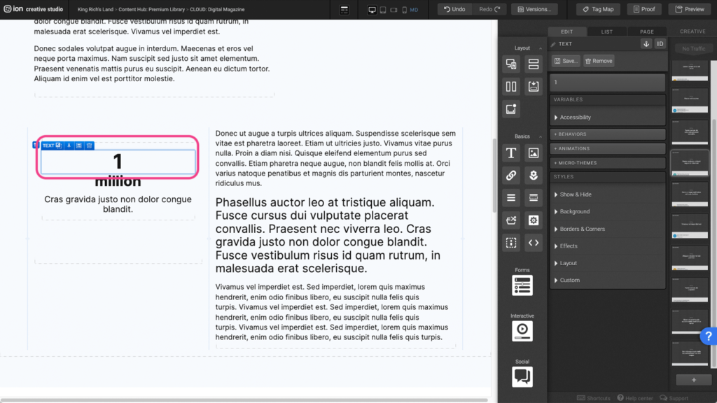
Step 2: Click into the text element to open the edit window.
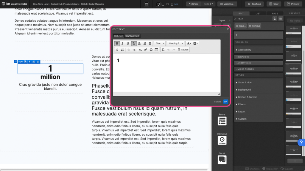
Step 3: In the edit window, click on the Source button to open the odometer settings.
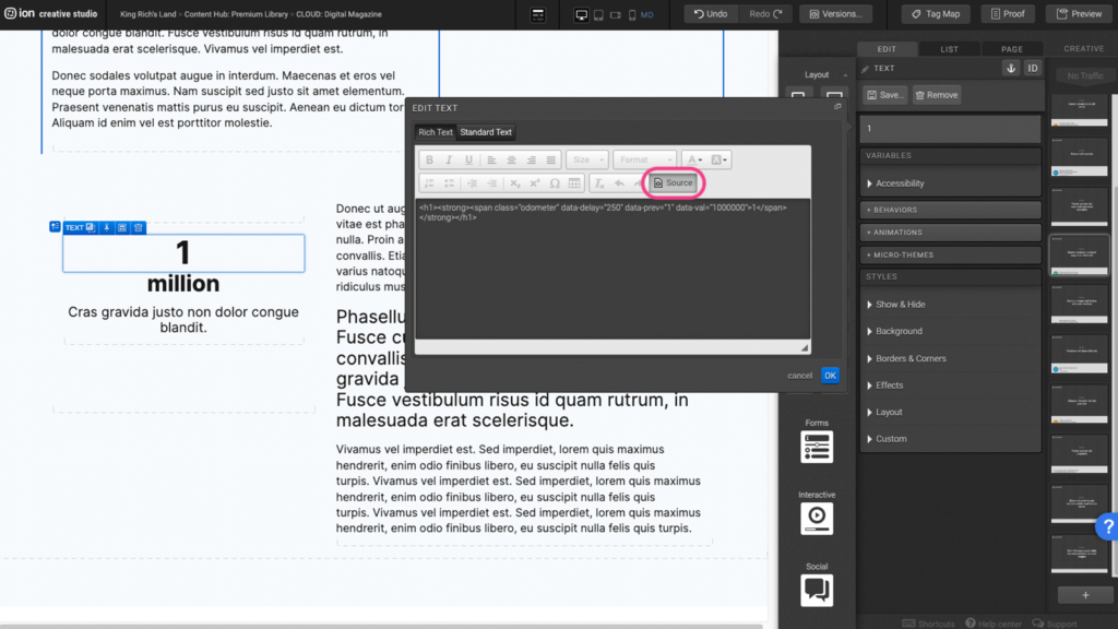
Step 4: To adjust the starting value, change the number within the “ “ in the following line of code: data-prev=”1″.

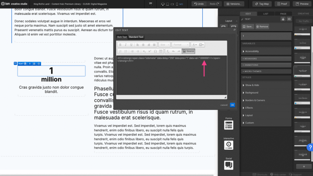
Step 5: To adjust the end value, change the number within the “ “ in the following line of code: data-val=”1000000″ then press OK to save. *Please note that the odometer will only display in preview and on the live page.
Flow
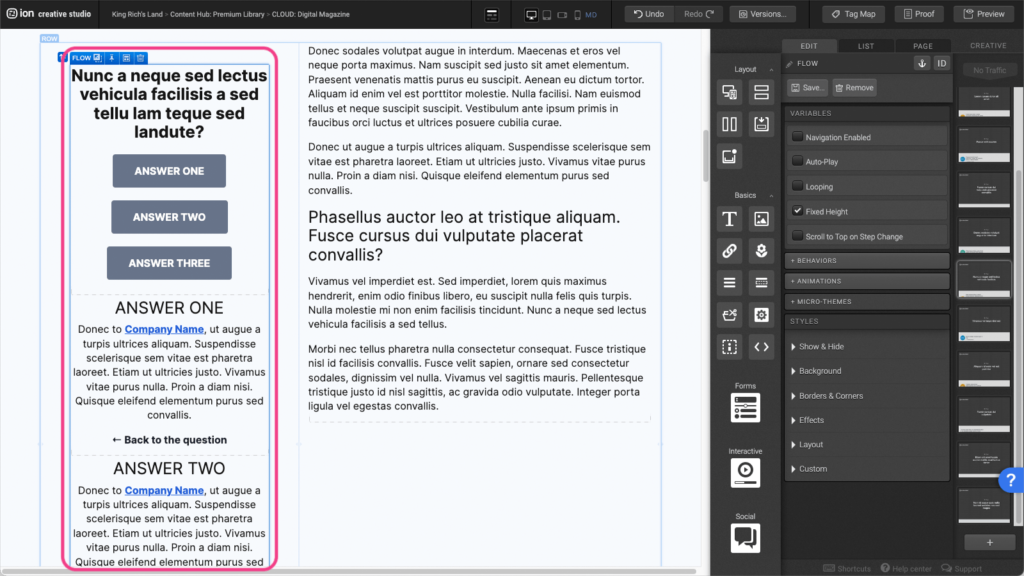
Step 1: To edit the flow, first select the Flow element on the canvas.
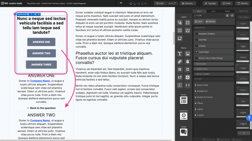
Step 2: If you want to add another flow step you can make a copy on a mac, by holding down the option key (alt key on a windows) to copy and drag the Flow Step to the bottom of the Flow element.
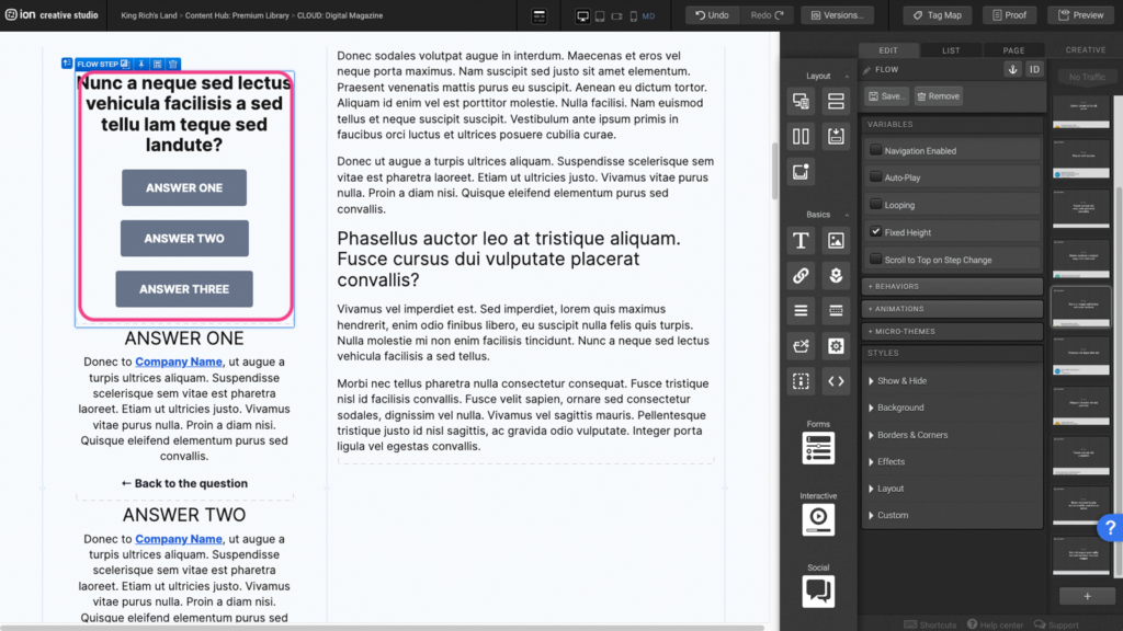
Step 3: Adjust the elements within the new copied flow step to your liking.
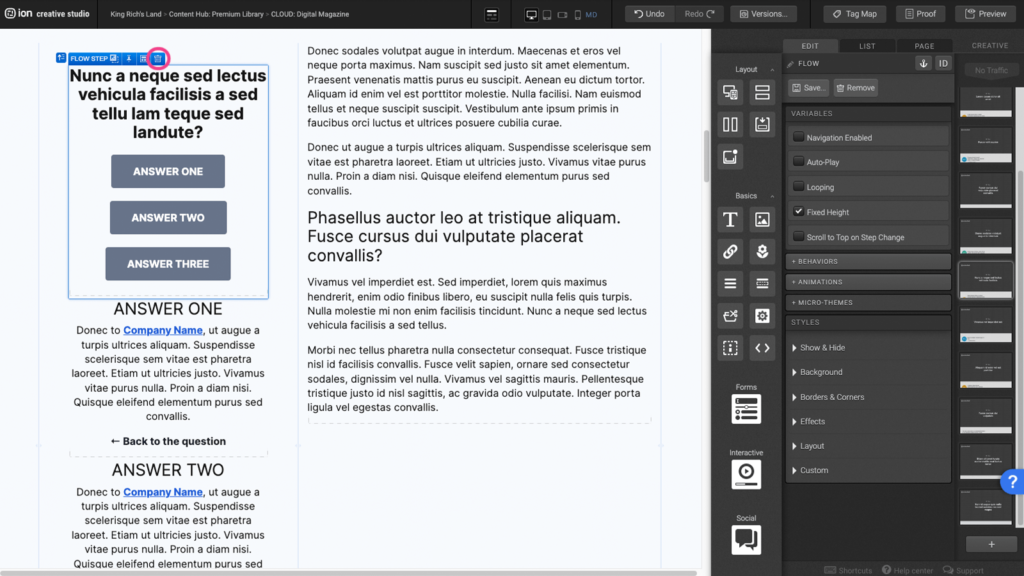
Step 4: If you wish to remove a flow step, select the flow step on the canvas and click the trash can.
Form
Step 1: To edit the form field within your form, locate the Form element on the canvas.
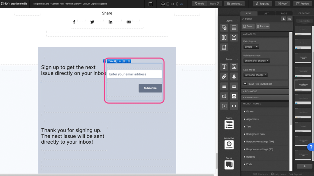
Step 2: Select the Textbox element within the Form field element.
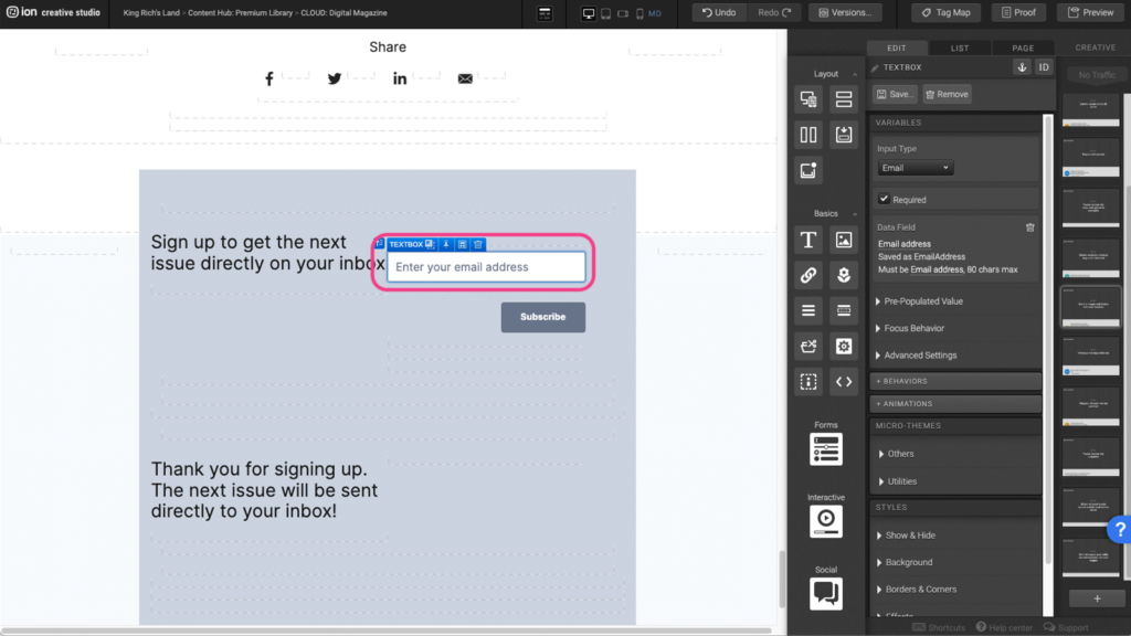
Step 3: Under the Variables panel, click under the Data field panel to open the edit options.
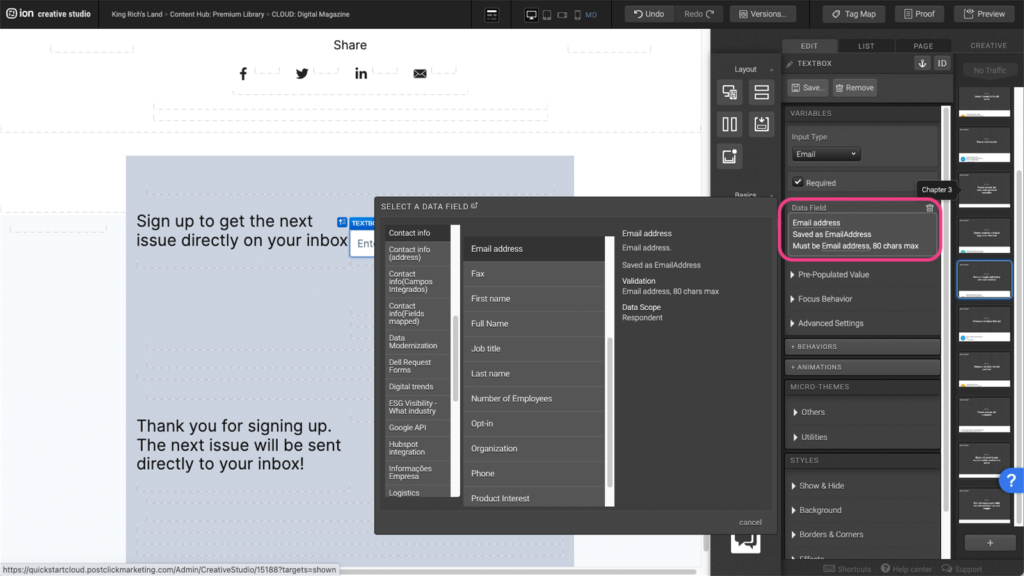
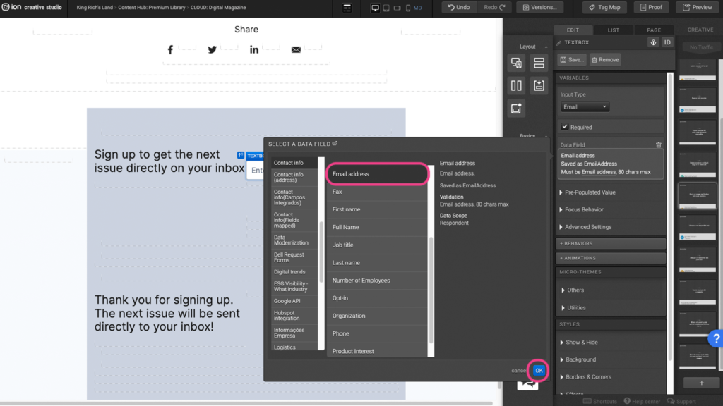
Step 4: Select the data field you wish to apply then press OK to save.
Content Writing Template
Here is the content structure’s template to make it easier for you when providing content guidelines or creating the copy for this template, from understanding the content structure to getting to know the amount of words needed to each text piece.
Related templates
If you like this template, you might want to check out these other similar models.
Have a question?
Still have questions or are facing troubles when handling this template? Please do not hesitate to send any additional questions to [email protected], so we can make sure to have this article constantly up to date.



Social Profiles