This Easy Infographic allows users to scroll through six sections about a specific topic with a downloadable asset. The top navigation includes a CTA that will scroll the user to the bottom of the page where they can fill out a form which allows them to download an asset. Another CTA located in the hero section will scroll the user to the first section of the page to promote page fluidity. The user will encounter different content interactivity within each section and will be asked to complete a simple form, at the bottom, allowing the user to download an asset.
- Experience type: Infographic
- Complexity: Low
- Use case: Engagement
Features available
Here are the major features, abilities, and interactive elements used in this template.
- Accordion
- Animations
- Bar graph
- Flow step
- Form
- Reveal tiles
- Scroll to section
How-to use
Here is a helpful guide on how to handle all the major features, abilities, and interactive elements available to make the most out of this template.
Accordion
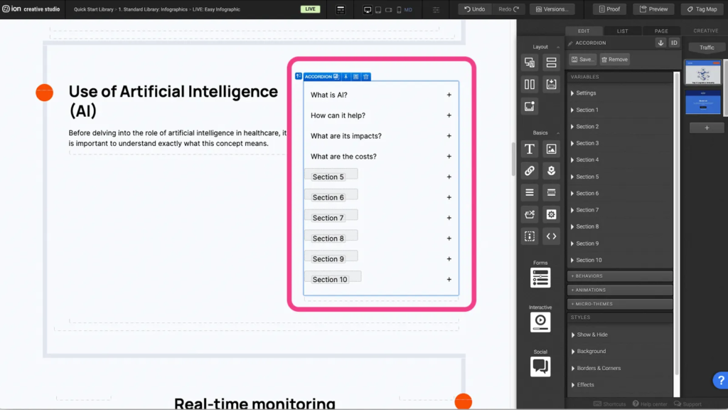
Step 1: To update the content within your Accordion, begin by selecting it on the canvas.
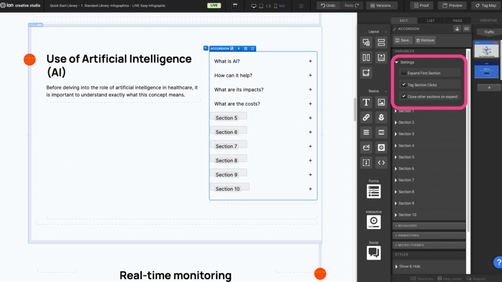
Step 2: As a side note you are able to edit the Settings for the Accordion itself by always having the first section expanded, tagging each accordion section when it is clicked on (which is done by default), and closing an accordion section when another is expanded.
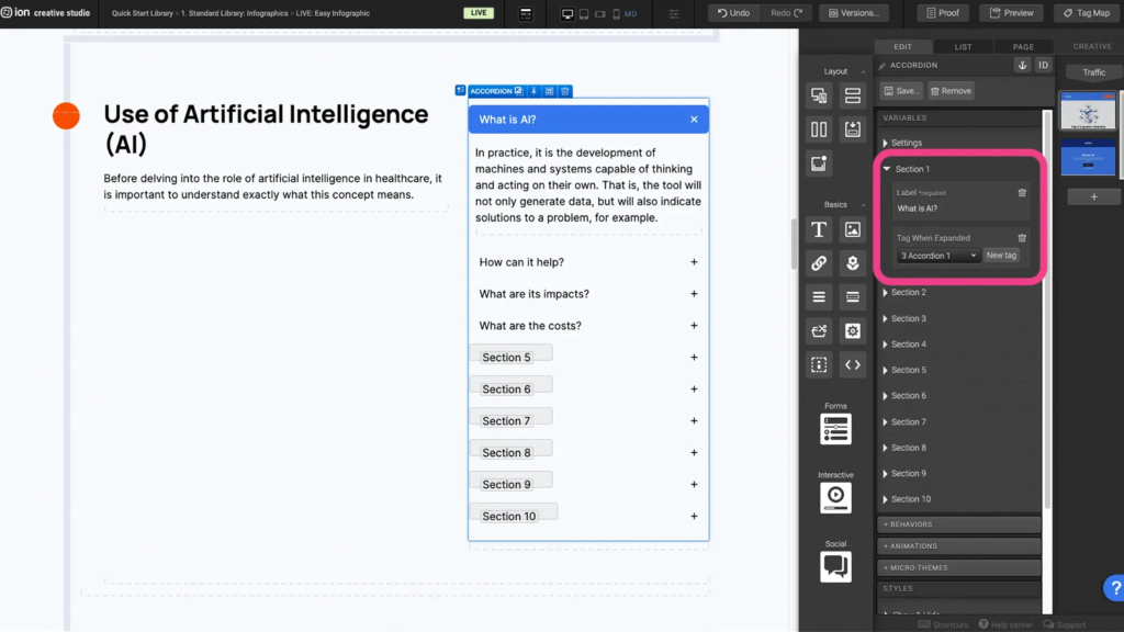
Step 3: Select an Accordion Section by clicking on it on the Canvas or by selecting in the Variables menu. Here in the Variables section you are able to update the Label for the specific Accordion Section, which is the front face title, and you are also able to provide it with a Tag.
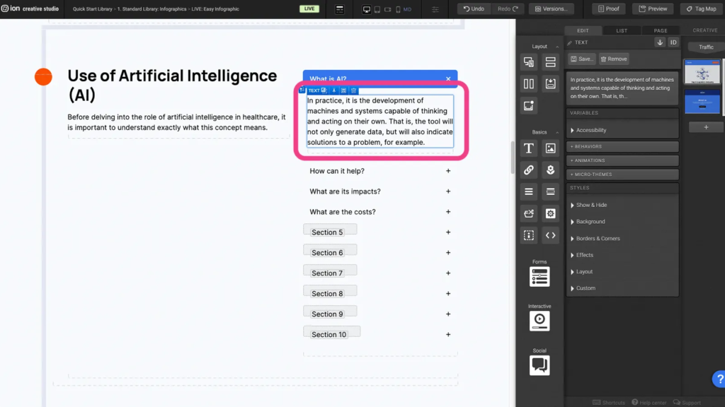
Step 4: With the Accordion Section expanded on the Canvas, you can double-click on and edit the Text element, or add or remove content from within the Section.
Animations
Step 1: Select the element that you wish to animate
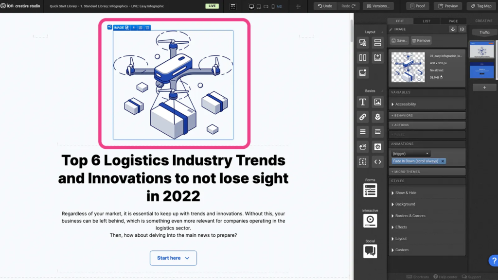
Step 2: Under the animation panel, choose the type of animation trigger
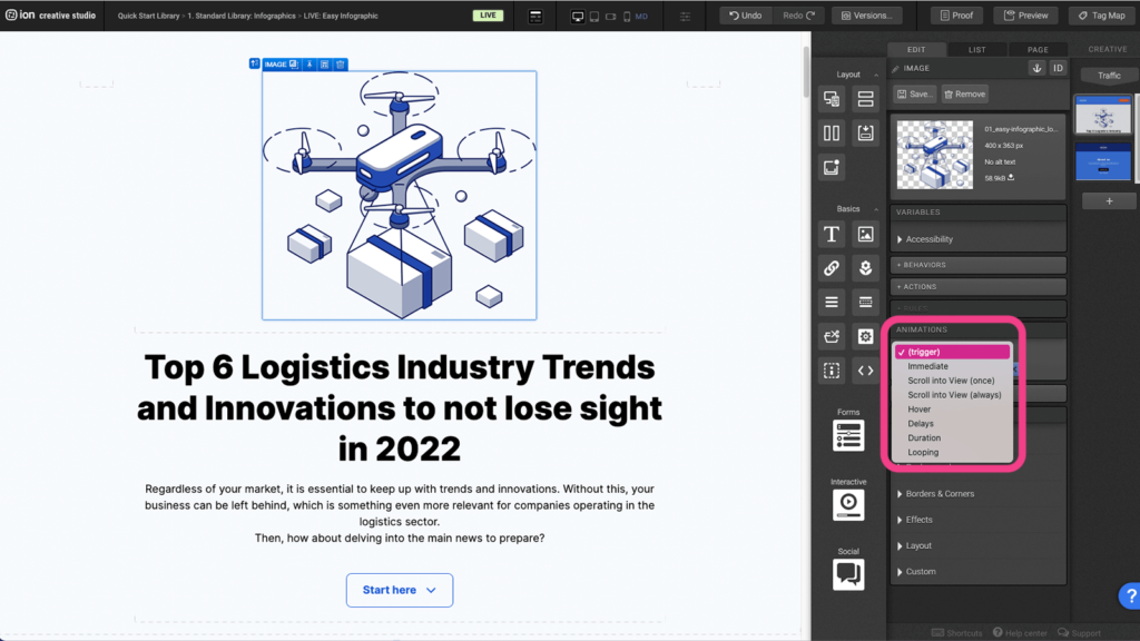
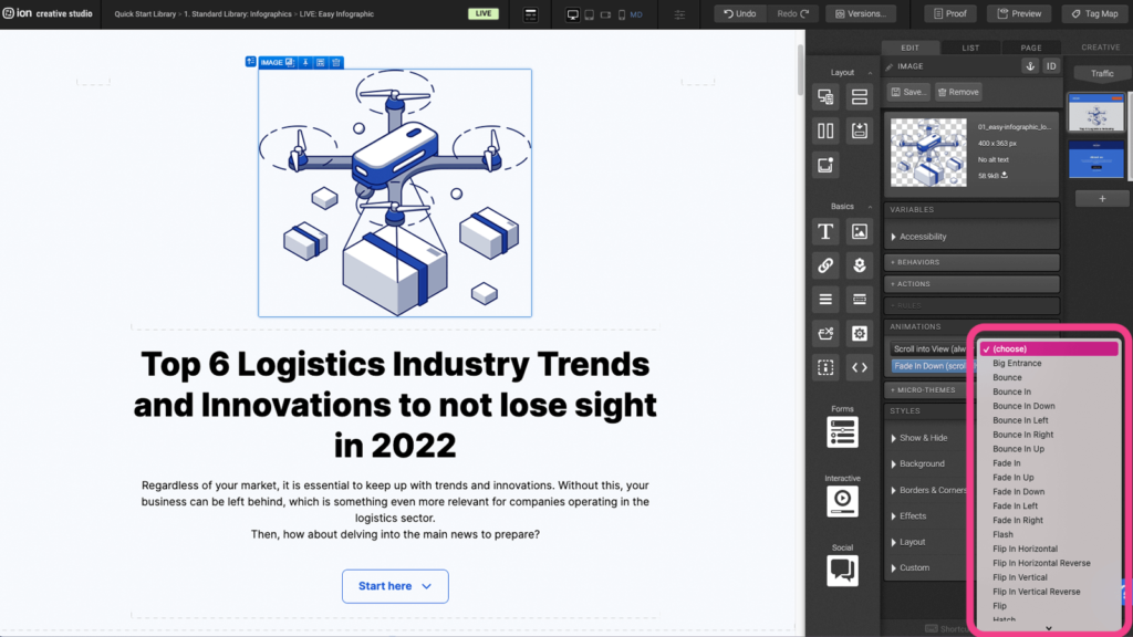
Step 3: From the list of animations, select the desired animation
Bar graph
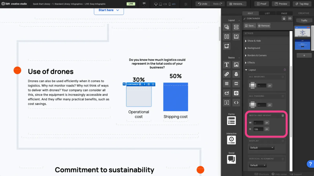
Step 1: To adjust the height of the bar, select the Container to open up the Edit settings. Then click on the Layout tab to expand the layout settings.
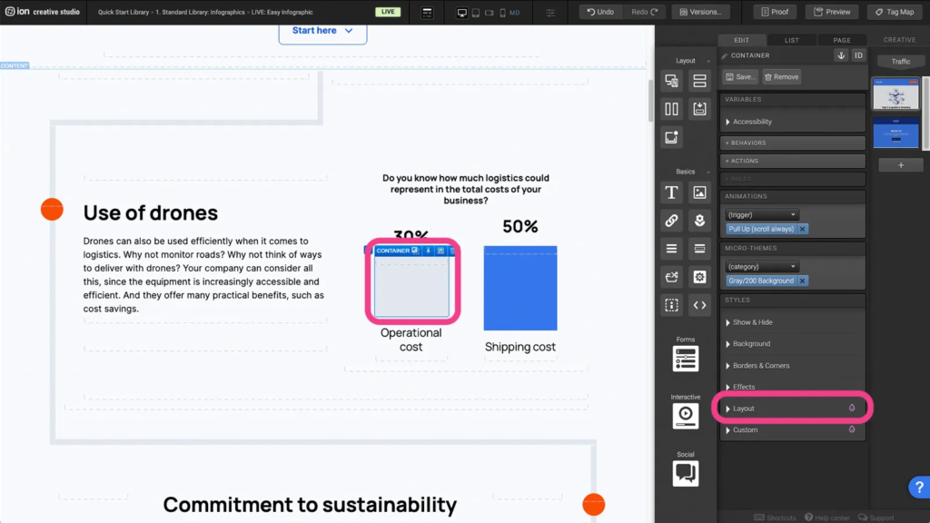
Step 2: Adjust the height or width of the bar under the Width and Height tab.
Flow step
Step 1: Each new flow includes 3 existing flowsteps.
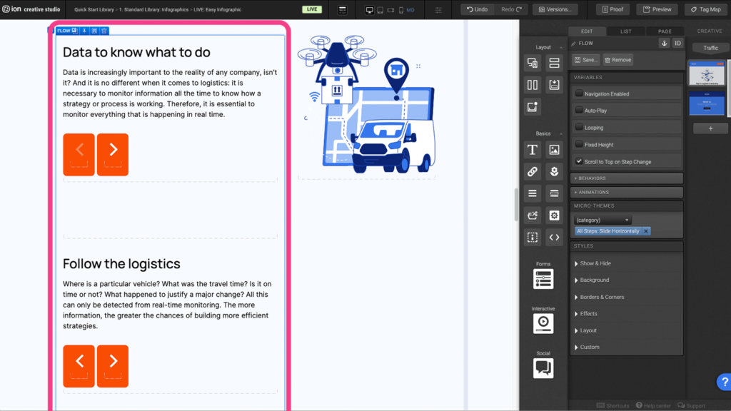
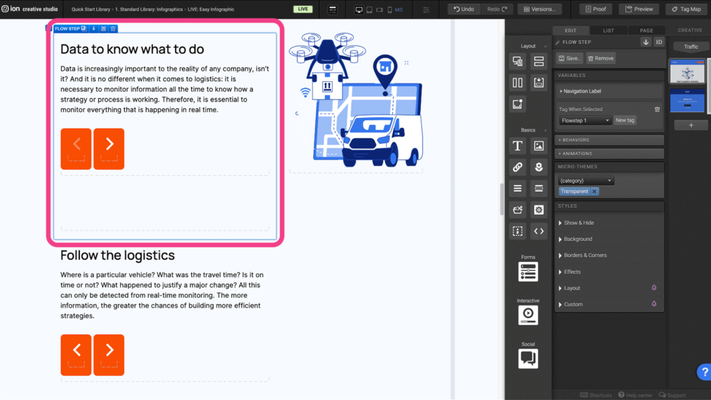
Step 2: Each flowstep should be tagged.
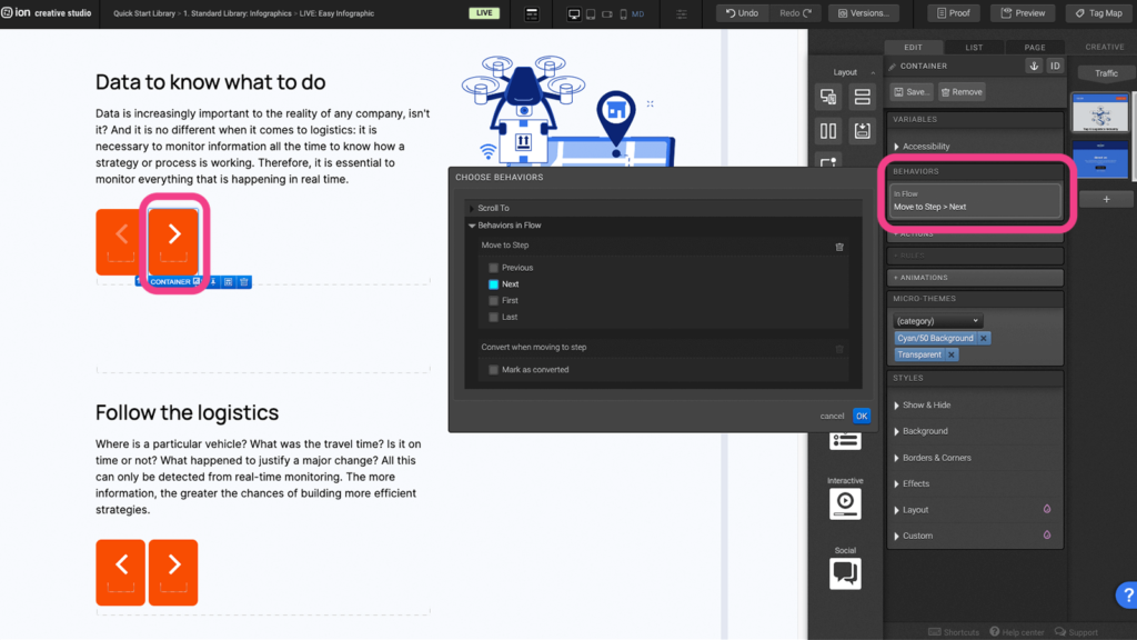
Step 3: Select the element that will bring the user to the next step and expand “Behaviors in flow” tab.
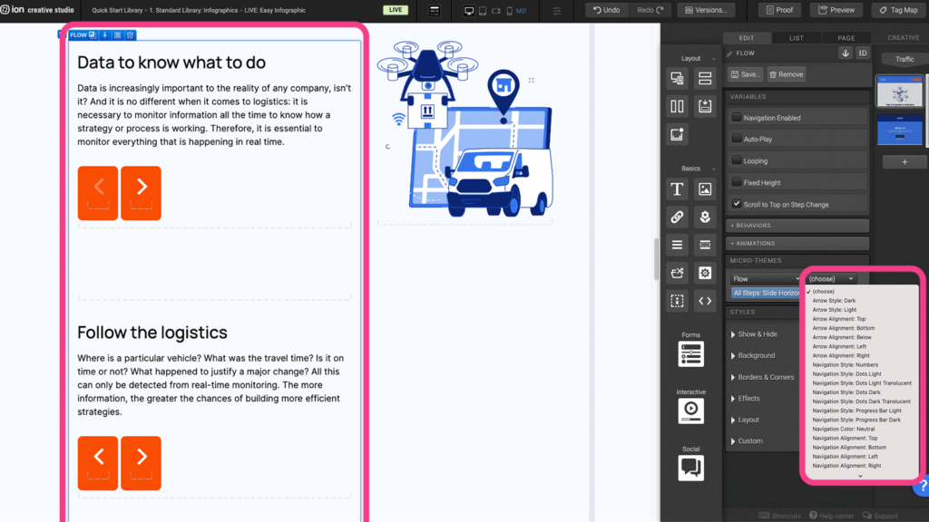
Step 4: You can also change the style of the navigation by choosing the Flow microtheme.
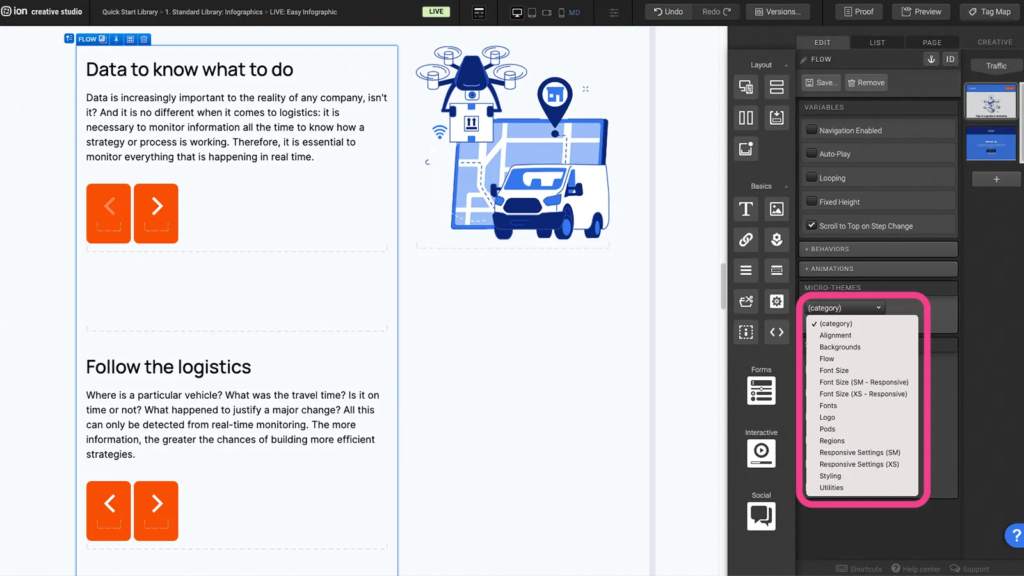
Step 5: After choosing the Flow Microtheme, another dropdown will appear where you can choose from a list of sub-category options.
Form
Step 1: Forms consist of 3 elements. “Form”, “Form Fields” and the “Submit Button”. A form field needs to be within a form in order to function properly and the submit button is a trigger that records the collected information.
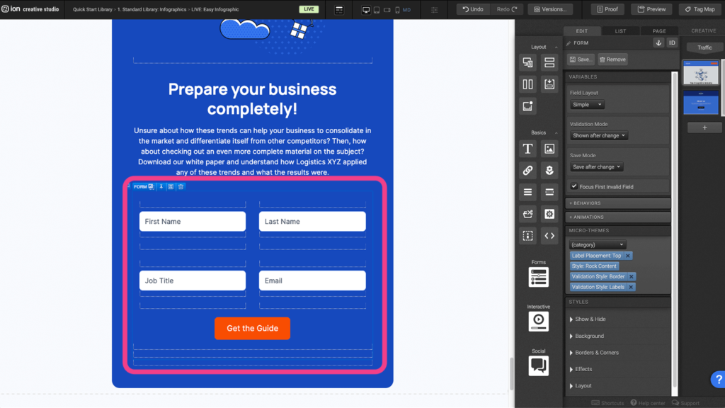
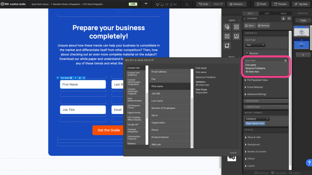
Step 2: Each form field textbox must be assigned a data field to receive user information.
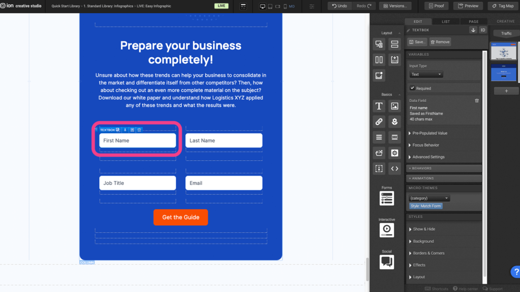
Step 3: Choose from a list of data fields by clicking the orange plus icon next to “Data field”.
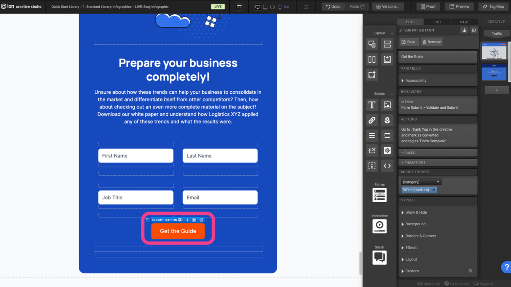
Step 4: To change the Submit Button’s Behaviors begin by selecting it on the Canvas.
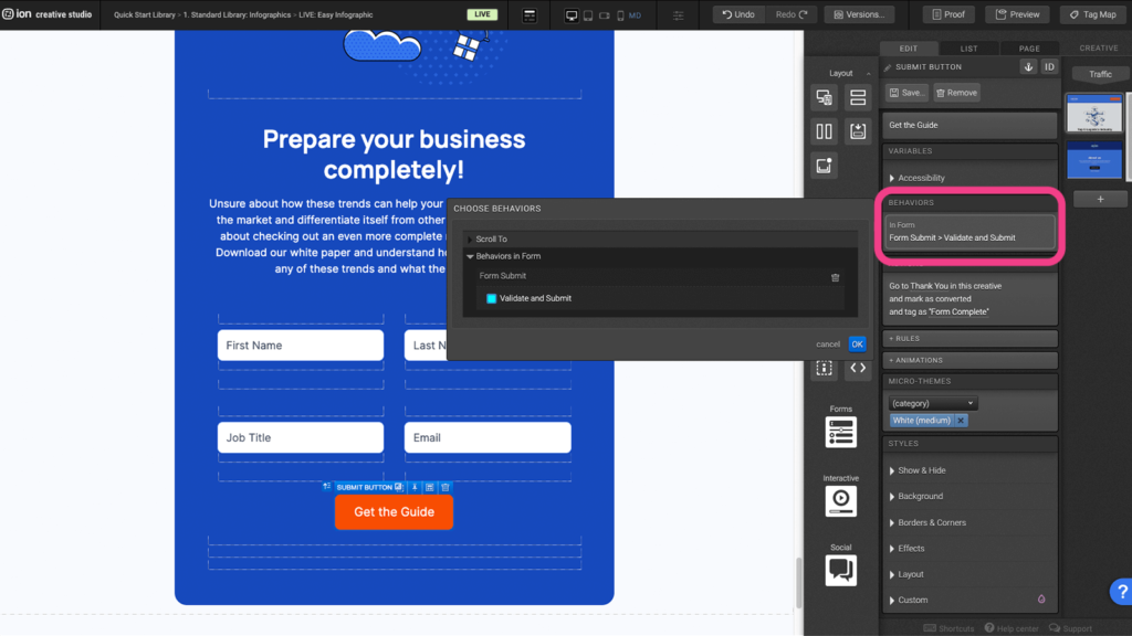
Step 5: Click on the Behaviors from within the Variables settings to Validate and Submit. To remove the Behavior and add an Action, click on the trash can icon and then click on the + Actions button within the Variables settings.
Step 6: Click on the Actions from within the Variables settings to assign the Go to Page location and select the page the button should link to. To remove the Action, click on the trash can icon.
Reveal Tiles
Step 1: Select the Reveal element to display the Edit settings.
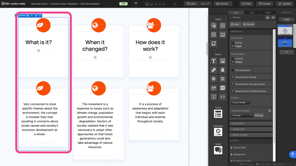
Step 2: You can customize the reveal settings in the Variables tab.
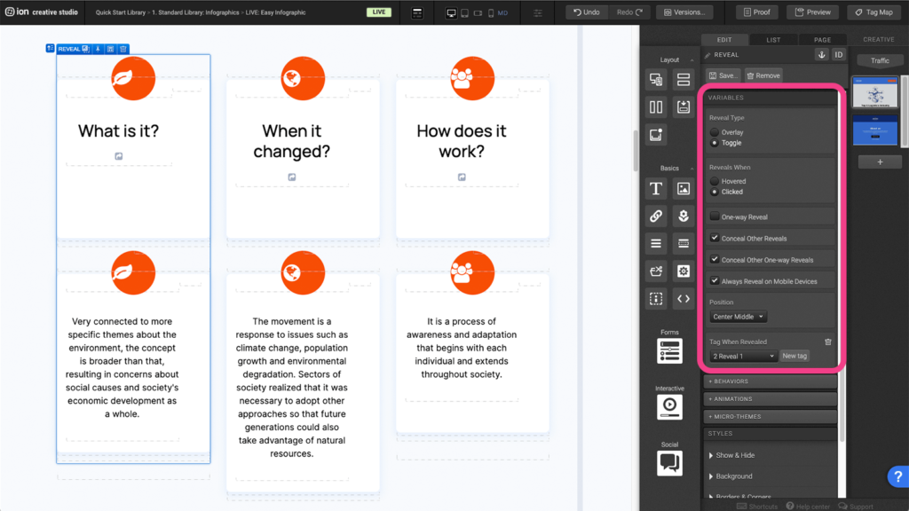
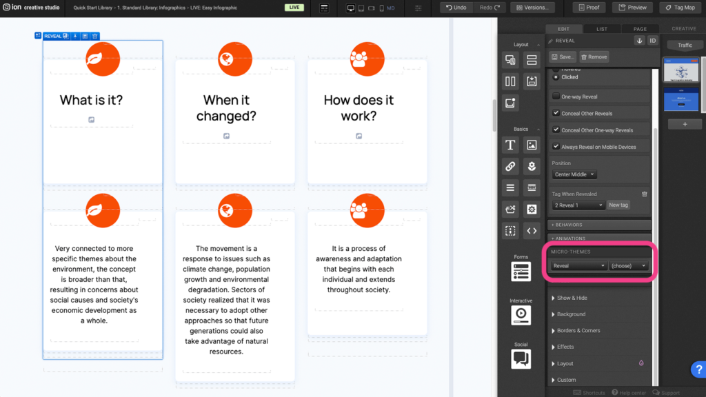
Step 3: Under the Microtheme tab, you can add different reveal settings by selecting Reveal.
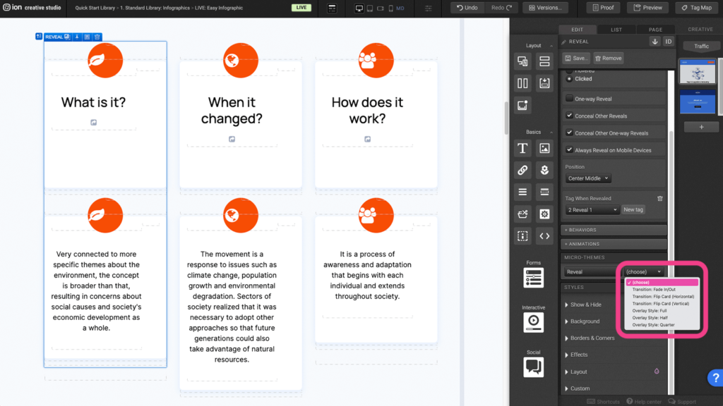
Step 4: Choose one from the list of transition or overlay options.
Scroll to section
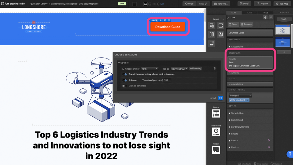
Step 1: Select a section where you want the CTA to scroll to.
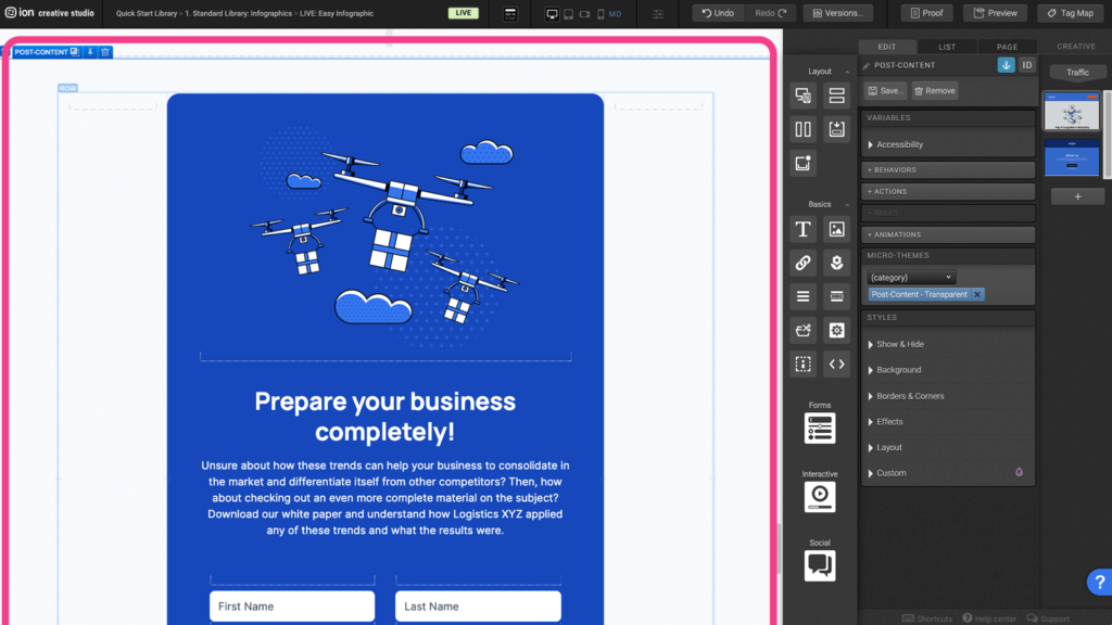
Step 2: Assign an anchor to a specific section where the button will scroll to. (Ei. Section 2 – Topic).
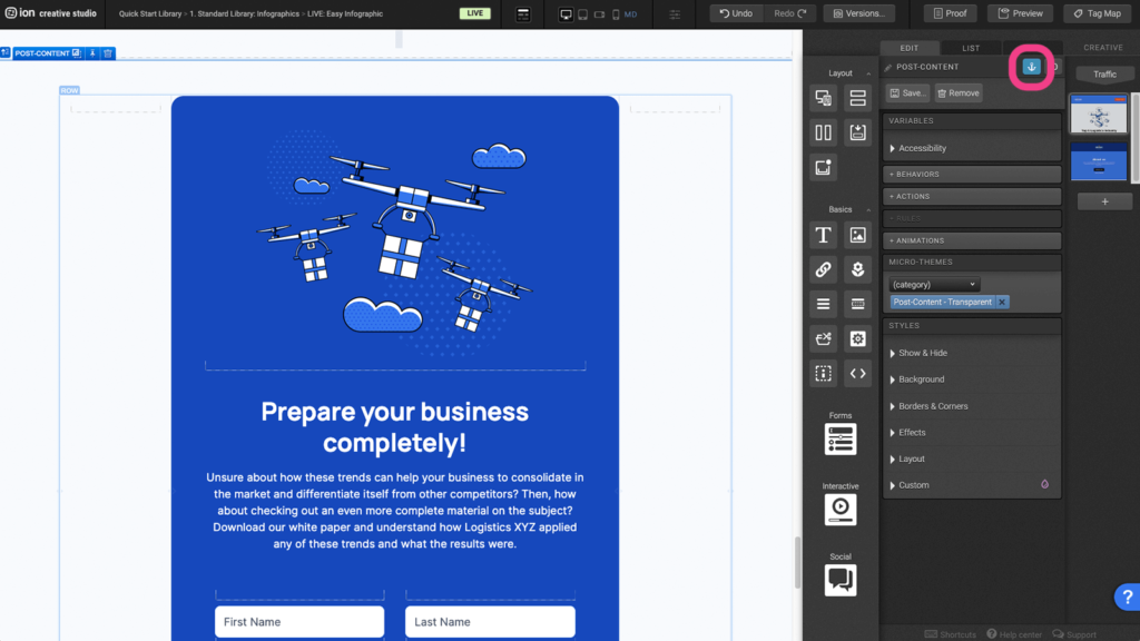
Step 3: Select the button and under the behavior panel, select the anchor and assign a unique tag.
Content Writing Template
Here is the content structure’s template to make it easier for you when providing content guidelines or creating the copy for this template, from understanding the content structure to getting to know the amount of words needed to each text piece.
Related templates
If you like this template, you might want to check out these other similar models.
- https://rockcontent.com/gallery/easy-infographic-with-3-features/
- https://rockcontent.com/gallery/grid-series-infographic/
- https://rockcontent.com/gallery/social-infographic/
- https://rockcontent.com/gallery/gated-infographic/
Have a question?
Still have questions or are facing troubles when handling this template? Please do not hesitate to send any additional questions to [email protected], so we can make sure to have this article constantly up to date.


Social Profiles